Responsive Horizontal Carousel Plugin For jQuery - Carousel.js
| File Size: | 127 KB |
|---|---|
| Views Total: | 9381 |
| Last Update: | |
| Publish Date: | |
| Official Website: | Go to website |
| License: | MIT |
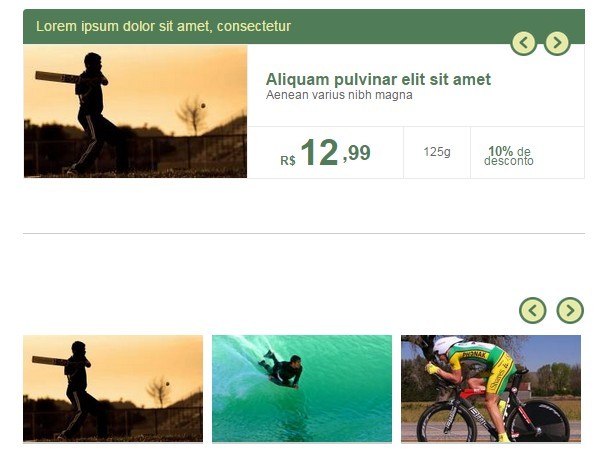
Carousel.js is a lightweight and easy-to-use jQuery plugin for creating a responsive, infinite carousel slider that auto resizes child elements to fit the width of the browser window.
How to use it:
1. Place jQuery library and the jQuery carousel.js script at the end of the document.
<script src="//code.jquery.com/jquery-1.11.3.min.js"></script>
<script src="jquery-carousel.js"></script>
2. The html to create a basic image carousel slider.
<div id="slider-carousel">

  <!-- Slider navigation -->
  <div class="wrapper-setas">
    <a href="#" class="seta-dir setaDir">
      <em class="sprite seta-pag-dir-md"></em>
    </a>
    <a href="#" class="seta-esq setaEsq">
      <em class="sprite seta-pag-esq-md"></em>
    </a>
    <div class="clear"></div>
  </div>

  <!-- Slider content -->
  <div id="container-slider-carousel" class="container">
    <div id="content-silder-carousel" class="content">
      <div class="wrapper-itens">
        <div class="item"><span><img src="l.jpg" alt="" class="img-responsive"></span></div>
        <div class="item"><span><img src="2.jpg" alt="" class="img-responsive"></span></div>
        <div class="item"><span><img src="3.jpg" alt="" class="img-responsive"></span></div>
        <div class="item"><span><img src="4.jpg" alt="" class="img-responsive"></span></div>
      </div>
      <div class="clear"></div>
    </div>
  </div>

</div>
3. Apply the required CSS styles to the carousel slider.
.clear {
  clear: both !important;
  float: none !important;
  margin: 0px !important;
  padding: 0px !important;
  height: 0px !important;
  width: 0px !important
}

.img-responsive {
  height: auto;
  width: 100%;
}

#slider-carousel {
  position: relative;
  width: 100%;
  padding: 10px 0 0 0;
  margin-bottom: 5px;
}

#container-slider-carousel {
  width: 620px;
  position: relative;
  overflow: hidden;
  height: auto;
}

#content-silder-carousel {
  width: 5000px;
  position: relative;
  left: 0;
}

#content-silder-carousel .item {
  width: 200px;
  float: left;
  background-color: #CCC;
  margin-right: 10px;
}

#slider-carousel .wrapper-setas { margin: 0 0 10px 0; }

#slider-carousel .wrapper-setas a {
  float: right;
  margin-left: 10px;
}
4. Call the function with options.
$("#slider-carousel").carousel({

  // callback
  activate: function(){},

  // animation speed
  timerAnimSlide:400,

  // endless looping
  infinite:true,

  // number of items to be moved by clicking on the arrows
  itensMove:1,

  // width of of the carousel items
  resizeItem:{width:50},

  // minimum width of the carousel slider
  responsive:{minWidth:645}

}
Change logs:
2016-08-25
- JS update.
2016-06-09
- Mobile navigation added
2015-12-30
- more responsive
2015-12-29
- fixed navigation arrows.
2015-08-05
- JS update.
This awesome jQuery plugin is developed by jhonsore. For more Advanced Usages, please check the demo page or visit the official website.


