bxSlider: Responsive jQuery Slider, Options & Examples
| File Size: | 171 KB |
|---|---|
| Views Total: | 84728 |
| Last Update: | |
| Publish Date: | |
| Official Website: | Go to website |
| License: | MIT |
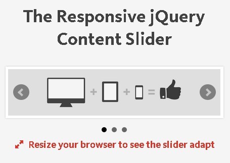
bxSlider is a responsive jQuery slider and carousel plugin for images, video, and arbitrary HTML content.
It requires jQuery and supports horizontal, vertical, and fade modes, touch navigation, autoplay, adaptive height, custom pagers, callbacks, and multi-item carousels.
Features:
- Responsive sliders for images, video, and HTML content.
- Horizontal, vertical, and fade transition modes.
- Touch and swipe navigation with optional keyboard control.
- Autoplay, ticker, adaptive-height, and multi-item carousel layouts.
- Standard, short, generated, and custom pagers with configurable previous and next controls.
- Callbacks for initialization, resize, slide transitions, and autoplay state changes.
- Public methods for navigation, autoplay, redraw, reload, state checks, and teardown.
How To Use bxSlider:
Load bxSlider From CDN
Load the bxSlider stylesheet, jQuery, and the bxSlider script in this order.
<link rel="stylesheet" href="https://cdnjs.cloudflare.com/ajax/libs/bxslider/4.2.17/jquery.bxslider.min.css">

<script src="/path/to/cdn/jquery.min.js"></script>
<script src="https://cdnjs.cloudflare.com/ajax/libs/bxslider/4.2.17/jquery.bxslider.min.js"></script>
Use Local Files
The default stylesheet references images/bx_loader.gif and images/controls.png. Keep the images/ directory next to the stylesheet or update those URLs in your CSS.
<link rel="stylesheet" href="/path/to/jquery.bxslider.css">

<script src="/path/to/cdn/jquery.slim.min.js"></script>
<script src="/path/to/jquery.bxslider.min.js"></script>
Install With NPM
The npm package contains the browser-ready files in its dist/ directory, including jquery.bxslider.css and jquery.bxslider.min.js. Copy those files into your public assets or add them through your existing asset pipeline, then keep jQuery ahead of the bxSlider script.
npm install bxslider
Legacy Bower Install
bower install bxslider
Create The Slider Markup
bxSlider uses the immediate children of the target element as slides by default. A list works well for image sliders, but the slides can contain other HTML content.
<ul class="bxslider">
  <li><img src="images/product-1.jpg" alt="Product view 1"></li>
  <li><img src="images/product-2.jpg" alt="Product view 2"></li>
  <li><img src="images/product-3.jpg" alt="Product view 3"></li>
  <li><img src="images/product-4.jpg" alt="Product view 4"></li>
</ul>
Initialize bxSlider
$(document).ready(function() {
  $('.bxslider').bxSlider();
});
Keep the value returned by .bxSlider() when the page needs to call instance methods later.
var slider = $('.bxslider').bxSlider();

slider.goToNextSlide();
bxSlider Examples:
Autoplay Slider
Set auto to true to rotate slides automatically. pause controls the delay between transitions in milliseconds.
$('.bxslider').bxSlider({
  auto: true,
  pause: 4000,
  autoHover: true,
  stopAutoOnClick: true
});
Vertical Slider
Set mode to vertical for top-to-bottom transitions. bxSlider sets adaptive height internally for vertical mode.
$('.bxslider').bxSlider({
  mode: 'vertical',
  slideMargin: 12
});
Responsive Multi-Item Carousel
Horizontal carousels need a slideWidth. minSlides and maxSlides control how many items bxSlider can show as the viewport changes.
$('.bxslider').bxSlider({
  slideWidth: 280,
  minSlides: 1,
  maxSlides: 3,
  moveSlides: 1,
  slideMargin: 16
});
Adaptive Height Slider
Use adaptive height when slides have different content heights.
$('.bxslider').bxSlider({
  adaptiveHeight: true,
  adaptiveHeightSpeed: 300
});
Custom Thumbnail Pager
<ul class="bxslider">
  <li><img src="images/gallery-1.jpg" alt="Gallery image 1"></li>
  <li><img src="images/gallery-2.jpg" alt="Gallery image 2"></li>
  <li><img src="images/gallery-3.jpg" alt="Gallery image 3"></li>
</ul>

<div id="bx-pager">
  <a data-slide-index="0" href=""><img src="images/thumb-1.jpg" alt=""></a>
  <a data-slide-index="1" href=""><img src="images/thumb-2.jpg" alt=""></a>
  <a data-slide-index="2" href=""><img src="images/thumb-3.jpg" alt=""></a>
</div>
$('.bxslider').bxSlider({
  pagerCustom: '#bx-pager'
});
pagerCustom expects one pager item per slide and does not fit dynamic carousel pagination.
Video Slides
Set video to true when slides contain responsive video embeds. bxSlider calls fitVids() during initialization, so load the jQuery FitVids plugin first.
<script src="/path/to/jquery.min.js"></script>
<script src="/path/to/jquery.fitvids.js"></script>
<script src="/path/to/jquery.bxslider.min.js"></script>
$('.bxslider').bxSlider({
  video: true
});
Options And Defaults:
General Options
mode: Sets the transition type tohorizontal,vertical, orfade. Type: String. Default:'horizontal'.slideSelector: Selects which child elements act as slides. An empty value uses all immediate children. Type: jQuery selector. Default:''.infiniteLoop: Loops from the last page back to the first and from the first back to the last. Type: Boolean. Default:true.hideControlOnEnd: Adds a disabled state to previous or next controls at the ends of a non-looping slider. Type: Boolean. Default:false.speed: Sets the slide transition duration in milliseconds. Type: Number. Default:500.easing: Sets the transition timing function. CSS transition values apply whenuseCSSis enabled. Type: String or null. Default:null.slideMargin: Adds spacing between slides in pixels. Type: Number. Default:0.startSlide: Sets the initial zero-based slide index. Type: Number. Default:0.randomStart: Starts on a random slide. Type: Boolean. Default:false.captions: Builds image captions from each imagetitleattribute. Type: Boolean. Default:false.ticker: Runs the slider as a continuous ticker. Type: Boolean. Default:false.tickerHover: Pauses ticker mode on hover. This option does not work with CSS transitions. Type: Boolean. Default:false.adaptiveHeight: Changes the viewport height to match the active slide. Type: Boolean. Default:false.adaptiveHeightSpeed: Sets the adaptive-height transition duration in milliseconds. Type: Number. Default:500.video: Runs FitVids on the slider for responsive video embeds. FitVids must be loaded before initialization. Type: Boolean. Default:false.useCSS: Uses CSS transitions for horizontal and vertical slide motion. Set it tofalseto use jQuery animation. Type: Boolean. Default:true.preloadImages: Controls the image preload wait. Use'visible'for initially visible slides,'all'for every slide, or'none'to skip the preload wait. Type: String. Default:'visible'.responsive: Recalculates slider dimensions on window resize. Type: Boolean. Default:true.slideZIndex: Sets the base z-index used by fade mode. Type: Number. Default:50.wrapperClass: Sets the class name on the generated outer wrapper. Type: String. Default:'bx-wrapper'.
Touch Options
touchEnabled: Enables touch swipe transitions. Type: Boolean. Default:true.swipeThreshold: Sets the minimum swipe distance in pixels before bxSlider changes slides. Type: Number. Default:50.oneToOneTouch: Moves non-fade slides with the finger during a swipe. Type: Boolean. Default:true.preventDefaultSwipeX: Prevents the page from moving along the x-axis during a slider swipe. Type: Boolean. Default:true.preventDefaultSwipeY: Prevents the page from moving along the y-axis during a slider swipe. Type: Boolean. Default:false.
Accessibility Options
ariaLive: Addsaria-live="polite"to the slider viewport when ticker mode is off. Type: Boolean. Default:true.ariaHidden: Adds or updatesaria-hiddenon non-visible slides and cloned loop slides. Type: Boolean. Default:true.
Keyboard Option
keyboardEnabled: Enables keyboard control when the slider is visible. Type: Boolean. Default:false.
Pager Options
pager: Adds pager navigation. Type: Boolean. Default:true.pagerType: Uses a pager item for every page with'full'or anx / ycounter with'short'. Type: String. Default:'full'.pagerShortSeparator: Sets the separator used by the short pager. Type: String. Default:' / '.pagerSelector: Places the generated pager inside a custom element. Type: jQuery selector or null. Default:null.buildPager: Returns custom markup for each generated pager item. The callback receives the zero-based slide index. Type: Function or null. Default:null.pagerCustom: Uses an existing element as the pager. Its links need matchingdata-slide-indexvalues. Type: jQuery selector or null. Default:null.
Control Options
controls: Adds previous and next controls. Type: Boolean. Default:true.nextText: Sets the text for the next control. Type: String. Default:'Next'.prevText: Sets the text for the previous control. Type: String. Default:'Prev'.nextSelector: Places the next control inside a custom element. Type: jQuery selector or null. Default:null.prevSelector: Places the previous control inside a custom element. Type: jQuery selector or null. Default:null.autoControls: Adds autoplay start and stop controls. Type: Boolean. Default:false.startText: Sets the text for the autoplay start control. Type: String. Default:'Start'.stopText: Sets the text for the autoplay stop control. Type: String. Default:'Stop'.autoControlsCombine: Shows only the control that applies to the current autoplay state. Type: Boolean. Default:false.autoControlsSelector: Places the autoplay controls inside a custom element. Type: jQuery selector or null. Default:null.
Autoplay Options
auto: Enables automatic slide transitions. Type: Boolean. Default:false.pause: Sets the time between autoplay transitions in milliseconds. Type: Number. Default:4000.autoStart: Starts autoplay when the slider loads. Type: Boolean. Default:true.autoDirection: Sets autoplay direction to'next'or'prev'. Type: String. Default:'next'.stopAutoOnClick: Stops autoplay after a user activates a slider control. Type: Boolean. Default:false.autoHover: Pauses autoplay while the pointer is over the slider. Type: Boolean. Default:false.autoDelay: Delays the first autoplay start in milliseconds. Type: Number. Default:0.autoSlideForOnePage: Starts autoplay even when the slider contains only one calculated page. Type: Boolean. Default:false.
Carousel Options
minSlides: Sets the minimum number of slides shown in carousel mode. Type: Number. Default:1.maxSlides: Sets the maximum number of slides shown in carousel mode. Type: Number. Default:1.moveSlides: Sets the number of slides moved per transition. A value of0uses the number of visible slides. Type: Number. Default:0.slideWidth: Sets the width of each slide. Horizontal multi-item carousels need this option. Type: Number. Default:0.shrinkItems: Shrinks carousel items to fit whole items within the configured slide range. Type: Boolean. Default:false.
Callbacks:
Pass callbacks in the same settings object used to initialize the slider.
$('.bxslider').bxSlider({
  // Runs after the slider finishes initialization.
  onSliderLoad: function(currentIndex) {
    // currentIndex is the active zero-based slide index.
  },

  // Runs after bxSlider handles a resize.
  onSliderResize: function(currentIndex) {
    // currentIndex is the active zero-based slide index.
  },

  // Runs immediately before a slide transition.
  onSlideBefore: function($slideElement, oldIndex, newIndex) {
    // Return false to cancel the transition.
  },

  // Runs after a slide transition completes.
  onSlideAfter: function($slideElement, oldIndex, newIndex) {
  },

  // Runs before a Next transition.
  onSlideNext: function($slideElement, oldIndex, newIndex) {
    // $slideElement is the destination slide.
  },

  // Runs before a Prev transition.
  onSlidePrev: function($slideElement, oldIndex, newIndex) {
    // $slideElement is the destination slide.
  },

  // Runs after autoplay starts or stops.
  onAutoChange: function(state) {
    // state is true while autoplay is running and false after it stops.
  }
});
Public Methods:
Save the value returned by .bxSlider() when the page needs runtime slider control.
var slider = $('.bxslider').bxSlider();

// Go to a zero-based slide or page index.
slider.goToSlide(2);

// Move forward or backward.
slider.goToNextSlide();
slider.goToPrevSlide();

// Start or stop autoplay.
slider.startAuto();
slider.stopAuto();

// Pass true to leave the auto-control UI unchanged.
slider.startAuto(true);
slider.stopAuto(true);

// Get the active zero-based slide/page index.
var currentIndex = slider.getCurrentSlide();

// Get the active slide as a jQuery object.
var $currentSlide = slider.getCurrentSlideElement();

// Get a specific slide as a jQuery object.
var $thirdSlide = slider.getSlideElement(2);

// Get the total number of original slides.
var slideCount = slider.getSlideCount();

// Check the slide-transition state.
var isMoving = slider.isWorking();

// Recalculate dimensions and positions.
slider.redrawSlider();

// Rebuild the slider with its original initialization settings.
slider.reloadSlider();

// Rebuild it with a new settings object.
slider.reloadSlider({
  mode: 'fade',
  pager: false
});

// Remove bxSlider-generated wrappers, controls, cloned slides, and handlers.
slider.destroySlider();
Alternatives And Related Resources:
- 10 Best Carousel Plugins In jQuery/JavaScript/CSS (2026 Update)
- Tiny SEO-Friendly Carousel jQuery Plugin - jCarouselLite
- Full-featured Slider/Carousel Plugin – Splide
- Copy-Paste React Carousel with Tailwind and shadcn/ui – Carouselcn
- Slick.js: Fully Responsive & Flexible jQuery Carousel Slider Plugin
- 10 Best Carousel Plugins In jQuery/JavaScript/CSS
- Glide.js: Responsive JavaScript Slider & Carousel with CSS3 Transitions
- Swiper Slider: Responsive Mobile Touch Slider for JavaScript & jQuery
Changelog:
v4.2.14
- Fixed
stopAuto()API behavior. - Fixed pointer handling issues on Android 6.
- Moved event binding from
jQuery.fn.bindtojQuery.fn.on.
v4.2.13
- Added the
onAutoChangecallback. - Fixed pager quantity and division-by-zero issues.
- Improved Firefox PointerEvent compatibility.
v4.2.6
- Added jQuery 3 support.
- Moved the development build process to Gulp.
v4.2.4
- Added the
shrinkItemscarousel option. - Added ARIA-related slider behavior.
- Improved slider access from the jQuery object and expanded public API support.
- Fixed multiple reload, ticker, text-only slider, and infinite-loop issues.
v4.2.2
- Added keyboard arrow navigation.
- Added transition cancellation through callbacks that return
false. - Fixed autoplay, touch, responsive resizing, ticker, pager, and infinite-loop issues.
v4.1
- Reworked carousel behavior around
minSlides,maxSlides, andslideWidth. - Added configurable image preloading through
preloadImages.
This awesome jQuery plugin is developed by stevenwanderski. For more Advanced Usages, please check the demo page or visit the official website.