Feature Rich Image Slider/Slideshow Plugin With jQuery - simplr-fade
| File Size: | 10.6 KB |
|---|---|
| Views Total: | 996 |
| Last Update: | |
| Publish Date: | |
| Official Website: | Go to website |
| License: | MIT |
The simplr-fade jQuery plugin allows you create automatic, highly customizable image carousel/slider/slideshow with ease.
Key features:
- Supports jQuery UI effects.
- Supports jQuery easing effects.
- Supports Animate.css powered CSS3 animations.
- Supports jQuery's animate method.
- Custom animation duration and transition delay.
- Pagination and autoplay controls.
- Allows multiple instances on one page.
- Cross-browser and highly customizable.
Basic usage:
1. Load jQuery library and the jQuery simplr-fade plugin's script in the html file.
<script src="//code.jquery.com/jquery.min.js"></script>
<script src="jquery.simplr.fade.js" ></script>
2. Load the following JavaScript and CSS files as per your needs:
<!-- For additional jQuery UI Effects -->
<script src="jquery-ui.min.js"></script>
<!-- For additional Easing Effects -->
<script src="jquery.easing.min.js"></script>
<!-- For additional CSS3 Animations -->
<link href="amimate.css" rel="stylesheet">
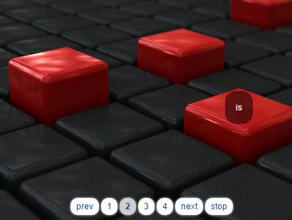
3. The basic HTML structure for the slider plugin.
<div id="fader-demo">
  <div class="item">
    <p class="p1">this</p>
    <img src="1.jpg" alt="">
  </div>
  <div class="item">
    <p class="p2">is</p>
    <img src="2.jpg" alt="">
  </div>
  <div class="item">
    <p class="p3">some</p>
    <img src="3.jpg" alt="">
  </div>
  <div class="item">
    <p class="p4">HTML</p>
    <img src="4.jpg" alt="">
  </div>
</div>
4. Add custom slider controls to the slider.
<ul id="controls-demo" class="controls">
  <li><a href="#" class="prev">prev</a></li>
  <li>
    <ul class="nav">
      <li><a href="#">1</a></li>
      <li><a href="#">2</a></li>
      <li><a href="#">3</a></li>
      <li><a href="#">4</a></li>
    </ul>
  </li>
  <li><a href="#" class="next">next</a></li>
  <li><a href="#" class="stop">stop</a></li>
</ul>
5. Initialize the plugin to generate a default slider.
var myFader = $('#fader-demo .item').srFade()
6. Active the slider controls.
// go to the previous item
$('#controls-demo .prev').on('click', function () {
  myFader.prev()
  return false
})
// go to the next item
$('#controls-demo .next').on('click', function () {
  myFader.next()
  return false
})
// go to item within the fader by clicking in the navigation
$('#controls-demo .nav a').on('click', function () {
  myFader.fadeTo($('#controls-demo .nav a').index(this))
  return false
})
7. The basic CSS styles for the slider.
#fader-demo { position: relative; }

#fader-demo .item { position: absolute; }

#fader-demo {
  width: 500px;
  height: 313px;
  position: relative;
  z-index: 2;
  box-shadow: 0px 0px 5px #cacaca;
  margin: 0 0 20px 0;
}

#fader-demo .item {
  width: 500px;
  height: 313px;
}

#fader-demo .item p {
  color: #fff;
  text-align: center;
  position: absolute;
  z-index: 10;
  border-radius: 15px;
  padding: 15px;
}

#fader-demo .item img {
  width: 100%;
  height: 100%;
  position: absolute;
  top: 0;
  left: 0;
  z-index: 1;
}

#fader-demo .item .p1 {
  top: 83px;
  right: 166px;
}

#fader-demo .item .p2 {
  top: 130px;
  right: 107px;
}

#fader-demo .item .p3 {
  top: 57px;
  right: 84px;
}

#fader-demo .item .p4 {
  bottom: 120px;
  left: 86px;
}

.controls {
  text-align: center;
  position: relative;
  z-index: 100;
  cursor: default;
}

.controls li { display: inline; }

.controls a {
  display: inline-block;
  text-align: center;
  background: #fff;
  border-radius: 10px;
  box-shadow: 0px 0px 5px #cacaca;
  padding: 4px 8px;
}

.controls a:hover {
  background: #dcdcdc;
  text-decoration: none;
}

.controls .stop { }

.controls .prev { }

.controls .next { }

.controls .start { font-weight: bold; }

.controls .nav { display: inline; }

.controls .nav a.active {
  background: #cecece;
  font-weight: bold;
}

#controls-demo {
  position: absolute;
  top: 300px;
  left: 157px;
  z-index: 10;
}
8. All default slider options.
$('#fader-demo .item').srFade({

  // duration of animation
  duration : 400,

  // transition delay
  delay    : 5000,

  // easing effect
  easing   : 'swing',

  // autoplay
  auto     : true,

  // jQuery animation
  animate  : {opacity: 'hide'},

  // jQuery UI effects
  effect   : null,

  // Animate.css animations
  css3     : null,

  // event handlers
  onFade : null,
  onAfterFade : null

})
This awesome jQuery plugin is developed by simov. For more Advanced Usages, please check the demo page or visit the official website.


