Awesome & Fully Responsive jQuery Slider - FlexSlider
| File Size: | 2.15 MB |
|---|---|
| Views Total: | 87517 |
| Last Update: | |
| Publish Date: | |
| Official Website: | Go to website |
| License: | MIT |
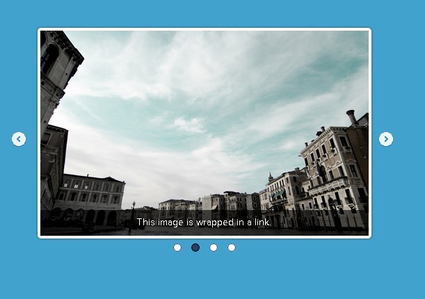
FlexSlider is An Awesome & Fully Responsive jQuery Slider plugin with Simple, semantic markup. It is supported in all major browsers and comes with Horizontal/vertical slide and fade animations, Multiple slider support, Callback API, and more.
Licensed under the GPL-2.0.
How to use it:
1. Add these items to the <head> of your document
<link rel="stylesheet" href="flexslider.css" type="text/css">
<script src="https://ajax.googleapis.com/ajax/libs/jquery/1.6.2/jquery.min.js"></script>
<script src="jquery.flexslider.js"></script>
2. Markup
<div class="flexslider">
  <ul class="slides">
    <li>
      <img src="slide1.jpg" />
    </li>
    <li>
      <img src="slide2.jpg" />
    </li>
    <li>
      <img src="slide3.jpg" />
    </li>
  </ul>
</div>
3. Call the function
<!-- Place in the <head>, after the three links -->
<script type="text/javascript" charset="utf-8">
  $(window).load(function() {
    $('.flexslider').flexslider();
  });
</script>
4. Customize your slider
// Prefix string attached to the class of every element generated by the plugin
namespace: "flex-",

// Selector
// Must match a simple pattern. '{container} > {slide}'
// Ignore pattern at your own peril
selector: ".slides > li",

// Select your animation type
// "fade" or "slide"
animation: "fade",

// Determines the easing method used in jQuery transitions.
// jQuery easing plugin is supported!
easing: "swing",

// Select the sliding direction
// "horizontal" or "vertical"
direction: "horizontal",

// Reverse the animation direction
reverse: false,

// Should the animation loop?
// If false, directionNav will received "disable" classes at either end
animationLoop: true,

// Allow height of the slider to animate smoothly in horizontal mode
smoothHeight: false,

// The slide that the slider should start on. Array notation
// (0 = first slide)
startAt: 0,

// Animate slider automatically
slideshow: true,

// Set the speed of the slideshow cycling, in milliseconds
slideshowSpeed: 7000,

// Set the speed of animations, in milliseconds
animationSpeed: 600,

// Set an initialization delay, in milliseconds
initDelay: 0,

// Randomize slide order
randomize: false,

// Fade in the first slide when animation type is "fade"
fadeFirstSlide: true,

// Whether or not to put captions on thumbnails when using the "thumbnails" controlNav.
thumbCaptions: false,

// Pause the slideshow when interacting with control elements,
// highly recommended.
pauseOnAction: true,

// Pause the slideshow when hovering over slider,
// then resume when no longer hovering
pauseOnHover: false,

// Pause the slideshow when tab is invisible, resume when visible.
// Provides better UX, lower CPU usage.
pauseInvisible: true,

// Slider will use CSS3 transitions if available
useCSS: true,

// Allow touch swipe navigation of the slider on touch-enabled devices
touch: true,

// If using video in the slider, will prevent CSS3 3D Transforms to avoid graphical glitches
video: false,

// Create navigation for paging control of each slide?
// Note: Leave true for manualControls usage
controlNav: true,

// Create navigation for previous/next navigation?
directionNav: true,

// Set the text for the "previous" directionNav item
prevText: "Previous",

// Set the text for the "next" directionNav item
nextText: "Next",

// Allow slider navigating via keyboard left/right keys
keyboard: true,

// Allow keyboard navigation to affect multiple sliders.
// Default behavior cuts out keyboard navigation with more than one slider present.
multipleKeyboard: false,

// Requires jquery.mousewheel.js
// (https://github.com/brandonaaron/jquery-mousewheel)
// Allows slider navigating via mousewheel
mousewheel: false,

// Create pause/play dynamic element
pausePlay: false,

// Set the text for the "pause" pausePlay item
pauseText: "Pause",

// Set the text for the "play" pausePlay item
playText: "Play",

// jQuery Object/Selector: Declare which container the navigation elements should be appended too.
// Default container is the FlexSlider element.
// Example use would be $(".flexslider-container").
// Property is ignored if given element is not found.
controlsContainer: "",

// jQuery Object/Selector: Custom prev / next button.
// Must be two jQuery elements.
// In order to make the events work they have to have the classes "prev" and "next" (plus namespace)
customDirectionNav: "",

// jQuery Object/Selector: Declare custom control navigation.
// Examples would be $(".flex-control-nav li") or "#tabs-nav li img", etc.
// The number of elements in your controlNav should match the number of slides/tabs.
manualControls: "",

// Mirror the actions performed on this slider with another slider.
// Use with care.
sync: "",

// Internal property exposed for turning the slider into a thumbnail navigation for another slider
asNavFor: "",

// Box-model width of individual carousel items, including horizontal borders and padding.
itemWidth: 0,

// Margin between carousel items.
itemMargin: 0,

// Minimum number of carousel items that should be visible.
// Items will resize fluidly when below this.
minItems: 1,

// Maxmimum number of carousel items that should be visible.
// Items will resize fluidly when above this limit.
maxItems: 0,

// Number of carousel items that should move on animation.
// If 0, slider will move all visible items.
move: 0,

// Whether or not to allow a slider comprised of a single slide
allowOneSlide: true,

// Fires when the slider loads the first slide
start: function(){},

// Fires asynchronously with each slider animation
before: function(){},

// Fires after each slider animation completes
after: function(){},

// Fires when the slider reaches the last slide (asynchronous)
end: function(){},

// Fires after a slide is added
added: function(){},

// Fires after a slide is removed
removed: function(){},

// Fires after the slider is initially setup
init: function() {}
Changelog:
v2.7.2 (2019-03-08)
- Refactor jQuery HTML output for img attributes.
v2.7.1 (2018-06-16)
- Fixes RTL firefox issues. Adds isFirefox param.
v2.7.0 (2018-02-02)
- update
v2.6.4 (2017-08-12)
- Fixes resize method call for orientationchange.
v2.6.3 (2016-09-07)
- Rollback fade fixes, due to harsh fade reports.
v2.6.2 (2016-08-22)
- Fixes overflow issue with varying height images.
- Fixes the visibility of the pagination and the navigation in the "fade" mode.
v2.6.1 (2016-05-12)
- SmoothHeight now uses innerHeight() instead of height() to account for padding in calculation .
- Defining var altText to prevent error.
- bower.json add fonts folder on main field.
- Changed true to false in order to make sure whether or not to allow a slider comprised of a single slide
v2.6.0 (2015-11-17)
- Adds composer json file keywords
- Scope fix for focused keyword
- Fixes bower demo folder exclusion
- z-index fix for disabled nav arrow
- play/pause accessibility fix
- itemMargin fix for slider items margins
- Fixes accessibility for in focus elements and pagination controls
- Firefox fix for text selection on slider carousel
- Adds data-thumb-alt image alt attribute
v2.5.0 (2015-05-23)
- CSS fix for pausePlay play icon.
- Firefox touchstart event fix.
- Compatibility change for jQuery to 1.7.0+
- Adds customDirectionNav param for custom navigation controls
2015-04-08
- Update for improved standards. Adds classes to li nav elements. Reset for li elements in stylesheet.
2015-02-11
- Fix for pauseInvisible attribute for Chrome and the Page Visibility API
2014-04-14
- Adding timeout event to ensure animation wrap-up when transitionEnd event failed to fire.
2014-02-12
- Fixed Images out of order in slider
2013-12-13
- Fixed for IE 10
This awesome jQuery plugin is developed by woocommerce. For more Advanced Usages, please check the demo page or visit the official website.
