Professional jQuery Content Slider Plugin - Slider Pro
| File Size: | 166 KB |
|---|---|
| Views Total: | 47554 |
| Last Update: | |
| Publish Date: | |
| Official Website: | Go to website |
| License: | MIT |
Slider Pro is a professional JavaScript plugin that allows you to display a group of mixed content in a responsive and touch compatible slider.
Key Features:
- Fully responsive with custom JS breakpoint.
- Touch swipe, keyboard, and thumbnails navigation.
- Fullscreen and auto height support.
- CSS3 powered transitions.
- Infinite loop like a carousel.
- Image lazy load.
- Retina image support.
- Galley lightbox enabled.
- Automatic video handling.
- Deep linking.
- Supports mixed content, not only images.
- Compatible with both jQuery and Vanilla JavaScript.
Basic Usage:
1. Load the jQuery Slider Pro plugin's stylesheet & script in the document.
<!-- jQuery Version -->
<link rel="stylesheet" href="./dist/css/slider-pro.min.css" />
<script src="http://code.jquery.com/jquery.min.js"></script>
<script src="/dist/js/jquery.sliderPro.min.js"></script>

<!-- Vanilla JavaScript -->
<link rel="stylesheet" href="./build/slider-pro.css" />
<script src="./build/slider-pro.js"></script>
2. The basic markup structure.
<div id="demo" class="slider-pro">
  <div class="sp-slides">
    <div class="sp-slide"> <img class="sp-image" src="1.jpg"> </div>
    <div class="sp-slide"> <img class="sp-image" src="2.jpg"> </div>
    <div class="sp-slide">
      <img class="sp-image" src="3.jpg">
      <h3 class="sp-layer">Text layer</h3>
      <p class="sp-layer">Text layer</p>
    </div>
  </div>
</div>
3. Initialize the slider by calling the function on the parent element.
// jQuery Version
$('#demo').sliderPro({
  // options here
});

// Vanilla JavaScript
const slider = new SliderPro('#demo', {
      // options here
});
4. All default options to customize the slider.
// Width of the slide
width: 500,

// Height of the slide
height: 300,

// Indicates if the slider is responsive
responsive: true,

// The aspect ratio of the slider (width/height)
aspectRatio: -1,

// The scale mode for images (cover, contain, exact and none)
imageScaleMode: 'cover',

// Indicates if the image will be centered
centerImage: true,

// Indicates if the image can be scaled up more than its original size
allowScaleUp: true,

// Indicates if height of the slider will be adjusted to the
// height of the selected slide
autoHeight: false,

// Will maintain all the slides at the same height, but will allow the width of the slides to be variable if the orientation of the slides is horizontal and vice-versa if the orientation is vertical.
autoSlideSize: false,

// Indicates the initially selected slide
startSlide: 0,

// Indicates if the slides will be shuffled
shuffle: false,

// Indicates whether the slides will be arranged horizontally
// or vertically. Can be set to 'horizontal' or 'vertical'.
orientation: 'horizontal',

// Indicates if the size of the slider will be forced to 'fullWidth' or 'fullWindow'
forceSize: 'none',

// Indicates if the slider will be loopable
loop: true,

// The distance between slides
slideDistance: 10,

// The duration of the slide animation
slideAnimationDuration: 700,

// The duration of the height animation
heightAnimationDuration: 700,

// Sets the size of the visible area, allowing the increase of it in order
// to make more slides visible.
// By default, only the selected slide will be visible.
visibleSize: 'auto',

// Breakpoints for allowing the slider's options to be changed
// based on the size of the window.
breakpoints: null,

// Indicates whether the selected slide will be in the center of the slider, when there are more slides visible at a time.
// If set to false, the selected slide will be in the left side of the slider.
centerSelectedSlide: true,

// Indicates if the direction of the slider will be from right to left, instead of the default left to right.
rightToLeft: false,

// Indicates if fade will be used.
fade: 'false',

// Indicates if the previous slide will be faded out (in addition to the next slide being faded in).
fadeOutPreviousSlide: true,

// Sets the duration of the fade effect.
fadeDuration: 500,

// Indicates whether or not autoplay will be enabled.
autoplay: true,

// Sets the delay/interval (in milliseconds) at which the autoplay will run.
autoplayDelay: 5000,

// Indicates whether autoplay will navigate to the next slide or previous slide.
// 'normal' and 'backwards'
autoplayDirection: 'normal',

// Indicates if the autoplay will be paused or stopped when the slider is hovered.
// 'pause', 'stop' and 'none'
autoplayOnHover: 'pause',

// Indicates whether the arrow buttons will be created.
arrows: false,

// Indicates whether the arrows will fade in only on hover.
fadeArrows: true,

// Indicates whether the buttons will be created.
buttons: true,

// Indicates whether keyboard navigation will be enabled.
keyboard: true,

// Indicates whether the slider will respond to keyboard input only when the slider is in focus.
keyboardOnlyOnFocus: false,

// Indicates whether the touch swipe will be enabled for slides.
touchSwipe: true,

// Sets the minimum amount that the slides should move.
touchSwipeThreshold: 50,

// Indicates whether or not the captions will be faded.
fadeCaption: true,

// Sets the duration of the fade animation.
captionFadeDuration: 500,

// Indicates whether the full-screen button is enabled.
fullScreen: false,

// Indicates whether the button will fade in only on hover.
fadeFullScreen: true,

// Indicates whether the slider will wait for the layers to disappear before going to a new slide.
waitForLayers: false,

// Indicates whether the layers will be scaled automatically.
autoScaleLayers: true,

// Sets a reference width which will be compared to the current slider width in order to determine how much the layers need to scale down.
// By default, the reference width will be equal to the slide width.
// However, if the slide width is set to a percentage value, then it's necessary to set a specific value for 'autoScaleReference'.
autoScaleReference: -1,

// If the slider size is below this size, the small version of the images will be used.
smallSize: 480,

// If the slider size is below this size, the medium version of the images will be used.
mediumSize: 768,

// If the slider size is below this size, the large version of the images will be used.
largeSize: 1024,

// Indicates whether the hash will be updated when a new slide is selected.
updateHash: false,

// Sets the action that the video will perform when its slide container is selected.
// 'playVideo' and 'none'
reachVideoAction: 'none',

// Sets the action that the video will perform when another slide is selected.
// 'stopVideo', 'pauseVideo', 'removeVideo' and 'none'
leaveVideoAction: 'pauseVideo',

// Sets the action that the slider will perform when the video starts playing
// 'stopAutoplay' and 'none'
playVideoAction: 'stopAutoplay',

// Sets the action that the slider will perform when the video is paused.
'startAutoplay' and 'none'
pauseVideoAction: 'none'

// Sets the action that the slider will perform when the video ends.
// 'startAutoplay', 'nextSlide', 'replayVideo' and 'none'
endVideoAction: 'none',

// Sets the width of the thumbnail.
thumbnailWidth: 100,

// Sets the height of the thumbnail.
thumbnailHeight: 80,

// 'top', 'bottom', 'right' and 'left'
thumbnailsPosition: 'bottom',

// Indicates if a pointer will be displayed for the selected thumbnail
thumbnailPointer: false,

// Indicates whether the thumbnail arrows will be enabled
thumbnailArrows: false,

// Indicates whether the thumbnail arrows will be faded
fadeThumbnailArrows: true,

// Indicates whether the touch swipe will be enabled for thumbnails
thumbnailTouchSwipe: true,

// Called when the slider is initialized
init: function() {},

// Called when the slider is updates
update: function() {},

// Called when the slider is resized
sliderResize: function() {},

// Called when a new slide is selected
gotoSlide: function() {},

// Called when the navigation to the newly selected slide is complete
gotoSlideComplete: function() {},

// Called when a breakpoint is reached
breakpointReach: function() {},

// Called when a video starts playing
videoPlay: function() {},

// Called when a video is paused
videoPause: function() {},

// Called when a video ends.
videoEnd: function() {},

// Called when all animated layers become visible
showLayersComplete: function() {},

// Called when all animated layers become invisible
hideLayersComplete: function() {},

// Called when the thumbnails are updated
thumbnailsUpdate: function() {},

// Called when a new thumbnail is selected
gotoThumbnail: function() {},

// Called when the thumbnail scroller has moved
thumbnailsMoveComplete: function() {},
5. Public methods.
// Scrolls to the slide at the specified index.
gotoSlide( index )

// Scrolls to the next slide.
nextSlide()

// Scrolls to the previous slide.
previousSlide()

// Gets all the data of the slide at the specified index.
// Returns an object that contains all the data specified for that slide.
getSlideAt( index )

// Gets the index of the selected slide.
getSelectedSlide()

// This is called by the plugin automatically when a property is changed.
// You can call this manually in order to refresh the slider after changing its HTML markup
// (i.e., adding or removing slides).
update()

// This is called by the plugin automatically when the slider changes its size.
// You can also call it manually if you find it necessary to have the slider resize itself.
resize()

// Gets the total number of slides.
getTotalSlides()

// Adds an event listener to the slider.
// More details about the use of this method will be presented in the 'Callbacks' chapter.
on( eventType, callback )

// Removes an event listener from the slider.
off( eventType )

// Destroys a slider by removing all the visual elements and functionality added by the plugin.
// Basically, it leaves the slider in the state it was before the plugin was instantiated.
destroy()
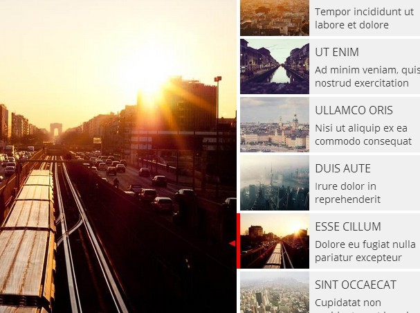
6. More examples to learn about the awesome slider plugin.
Changelog:
v1.6.2 (2023-01-19)
- clear timers when the slider is destroyed
v1.6.1 (2022-12-16)
- JS & CSS updated
v1.6.0 (2021-06-15)
- JS & CSS updated
v1.5.0 (2018-10-24)
- update lazy loading to check if the selected slide is centered
v1.3.0 (2016-07-11)
- update
v1.2.5 (2016-07-01)
- add rtl support
v1.2.5 (2016-03-03)
- update
v1.2.4 (2015-11-13)
- add 'allowfullscreen' to youtube and vimeo videos
v1.2.3 (2015-10-16)
- update.
v1.2.1 (2015-03-16)
- update.
v1.2.0 (2015-01-30)
- update.
v1.1.0 (2014-12-12)
- improve retina support
v1.0.9 (2014-12-07)
- replace font icons with CSS shapes for thumbnail pointers
v1.0.8 (2014-12-03)
- fix unnecessary image swapping in Conditional Images module
v1.0.7 (2014-12-01)
- refactor CSS for the thumbnail pointer
v1.0.6 (2014-11-22)
- fix thumbnails position for the 'top' option
v1.0.5 (2014-11-19)
- fix thumbnails inheritance
v1.0.3 (2014-11-04)
- fix incorrect margin after exiting full screen
v1.0.2 (2014-11-03)
- fix dppx value from 192 to 2 in retina module
This awesome jQuery plugin is developed by bqworks. For more Advanced Usages, please check the demo page or visit the official website.


