Simple Content Slider/Carousel With Smooth Crossfade Effect
| File Size: | 538 KB |
|---|---|
| Views Total: | 1818 |
| Last Update: | |
| Publish Date: | |
| Official Website: | Go to website |
| License: | MIT |
Do you have a collection of images and descriptions you'd like to show to your audience in a appealing way?
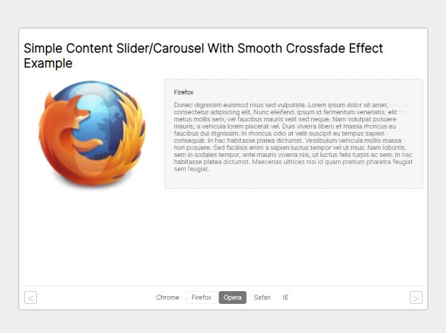
This is a jQuery based slideshow/slider/carousel with a super smooth crossfade effect. It uses CSS3 transitions to animate between slides. Perfectly fits for any content slider, elegant style, SEO-friendly and highly lightweight.
How to use it:
1. Add a list of images together with descriptions to the slider.
<ul class="slideset">
  <li class="active">
    <img src="11.png" alt="" />
    <div class="description">
      Description 1
    </div>
  </li>
  <li>
    <img src="2.png" alt="" />
    <div class="description">
      Description 2
    </div>
  </li>
  <li>
    <img src="3.png" alt="" />
    <div class="description">
      Description 3
    </div>
  </li>
  ... more slides here
</ul>
2. Add the slider controls (tab navigation & next/prev arrows) to the slider.
<div class="control-links">
<a class="btn-prev" href="#"><</a>
<div class="switcher-holder">
<ul class="switcher">
<li><a href="#">Chrome</a></li>
<li><a href="#">Firefox</a></li>
<li><a href="#">Opera</a></li>
<li><a href="#">Safari</a></li>
<li><a href="#">IE</a></li>
</ul>
</div>
<a class="btn-next" href="#">></a>
</div>
3. The main CSS styles for the slider.
.slideset {
  position: relative;
  list-style: none;
  height: 256px;
  padding: 0;
  margin: 0;
}
.slideset li {
  position: absolute;
  overflow: hidden;
  background: #fff;
  height: 256px;
  top: 0;
  left: 0;
  z-index: 1;
  -webkit-transition: opacity 1.5s;
  -o-transition: opacity 1.5s;
  transition: opacity 1.5s;
  opacity: 0;
}
.slideset li.active {
  z-index: 2;
  opacity:1;
}
.slideset li img {
  margin: 0 0 0 25px;
  width: 256px;
  height: auto;
}
.slideset .description {
  border: 1px dotted #ccc;
  border-radius: 5px;
  background: #f5f5f5;
  padding: 20px;
  float: right;
  width: 60%;
}
4. Style the slider controls.
{
  border: 1px solid #bababa;
  border-radius: 5px;
  background: #fff;
  font-size: 14px;
  margin: 100px auto;
  padding: 10px;
  width: 900px;
}
.control-links {
  border-top: 1px dotted #ddd;
  text-align: center;
  overflow: hidden;
  margin: 10px 0 0;
  padding: 10px 1px 0;
}
.control-links .switcher-holder {
  display: inline-block;
}
.btn-prev, .btn-next {
  border-radius: 5px;
  border: 1px solid #ccc;
  width: 26px;
  height: 26px;
  color: #ccc;
  font-size: 24px;
  line-height: 28px;
  text-align: center;
  float: left;
}
.btn-next {
  float: right;
}
.btn-prev:hover, .btn-next:hover {
  text-decoration: none;
  border-color: #000;
  color: #000;
}
.btn-prev:active, .btn-next:active {
  margin: 1px -1px -1px 1px;
}
.switcher {
  overflow: hidden;
  list-style: none;
  padding: 0;
  margin: 0;
}
.switcher li {
  margin: 0 5px 0 0;
  float: left;
}
.switcher li a {
  border: 1px solid transparent;
  border-radius: 5px;
  text-align: center;
  float: left;
  color: #000;
  padding: 0 10px;
  height: 26px;
  line-height: 26px;
}
.switcher li a:hover {
  border-color: #eee;
  text-decoration: none;
}
.switcher li a:active {
  line-height: 28px;
}
.switcher .active a {
  background: #777;
  color: #fff;
}
.switcher .active a:hover {
  border-color: transparent;
}
.switcher .lava-item a {
  text-indent: -9999px;
  display: block;
  float: none;
}
.switcher .lava-anim-to a {
  border-color: transparent !important;
}
5. Insert jQueyr library and the slider.js script into the document. Done.
<script src="/path/to/cdn/jquery.min.js"></script>
<script src="/path/to/js/slider.js"></script>
This awesome jQuery plugin is developed by dharmapoudel. For more Advanced Usages, please check the demo page or visit the official website.


