Full Width Responsive Content Carousel with jQuery and CSS3
| File Size: | 2.35 KB |
|---|---|
| Views Total: | 4026 |
| Last Update: | |
| Publish Date: | |
| Official Website: | Go to website |
| License: | MIT |

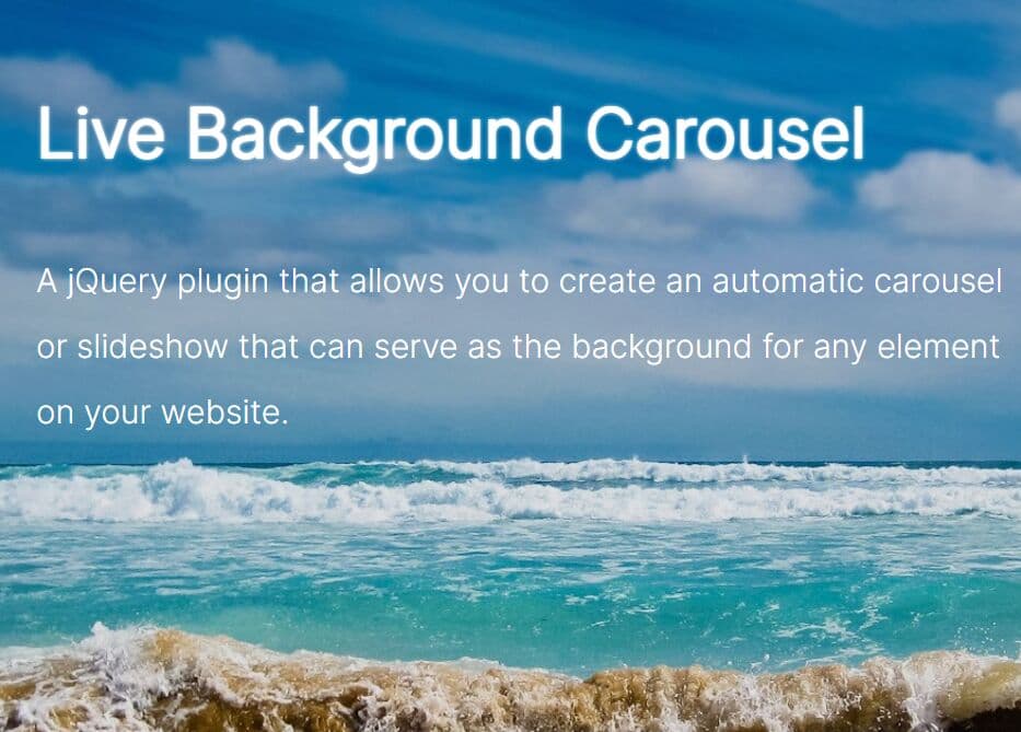
A jQuery & CSS3 based content slider/slideshow/carousel that cycles through a set of Html elements using attractive animations based on CSS3 transitions.
How to use it:
1. Create prev/next navigation for the content carousel.
<div class="nav-box">
  <span class="nav nav-prev"></span>
  <span class="nav nav-next"></span>
</div>
2. The CSS to style the prev/next navigation.
.nav-box {
  position: absolute;
  left: 3%;
  right: 3%;
}

.nav {
  display: block;
  width: 64px;
  height: 64px;
  position: absolute;
  top: 75px;
  z-index: 2;
  border: 2px solid #fff;
  border-radius: 50%;
  color: #fff;
  text-align: center;
  font-size: 48px;
  transition: background 0.75s ease;
}

.nav:hover { background: rgba(255, 255, 255, 0.25); }

.nav-prev { left: 24px; }

.nav-next { right: 24px; }

.nav-prev::before { content: '\2039'; }

.nav-next::before { content: '\203a'; }

.nav-inactive { opacity: 0.1; }
3. Insert your Html content into the carousel following the Html structure like so:
<div class="slider">

  <div class="slider-panel">
    <div class="slider-item">
      Slide 1
    </div>
  </div>

  <div class="slider-panel">
    <div class="slider-item">
      Slide 2
    </div>
  </div>

  <div class="slider-panel">
    <div class="slider-item">
      Slide 3
    </div>
  </div>

  ...

  <div class="slider-panel">
    <div class="slider-item">
      Slide n
    </div>
  </div>

</div>
4. The required CSS styles for the content carousel.
.slider {
  margin-left: 0%;
  width: 100%;
  white-space: nowrap;
  color: #fff;
  text-align: center;
  transition: margin-left 0.75s ease;
}

.slider-panel {
  display: inline-block;
  width: 100%;
}

.slider-item {
  width: 80%;
  max-width: 520px;
  margin: 0 auto;
}
5. Create a bullet pagination at the bottom of the content carousel.
<div class="tab-box"> </div>
6. The CSS to style the bottom pagination.
.tab-box {
  margin: 20px 0;
  width: 100%;
  text-align: center;
}

.tab {
  display: inline-block;
  width: 16px;
  height: 16px;
  margin: 0 4px;
  border: 1px solid #fff;
  border-radius: 50%;
  transition: background 0.75s ease;
}

.tab:hover { background: rgba(255, 255, 255, 0.25); }

.tab-active,
.tab-active:hover { background: #fff; }
7. The core JavaScript to enable the content slider. Just add the following JavaScript snippets after the jQuery library.
$(document).ready(function() {
  var margin = 0;
  var count = $('.slider').children().length;

  for (i = 0; i < count; i++) {
    $('.tab-box').append($('<span>').addClass('tab'));
  }

  $('.tab:first-child').addClass('tab-active');

  // handlers
  $('.nav-prev').on('click', function() {
    margin += 100;

    if (margin/100 > 0) {
      margin = (count - 1) * -100;
    }

    update();
  });

  $('.nav-next').on('click', function() {
    margin -= 100;

    if (margin/100 < 1 - count) {
      margin = 0;
    }

    update();
  });

  var $tabs = $('.tab');

  $tabs.toArray().forEach(function(element, index, array) {
    (function() {
      $(element).on('click', function() {
        margin = index * -100;
        update();
      });
    })();
  });

  function update() {
    $('.slider').css({'margin-left': margin + '%'});

    $('.tab-box .tab').removeClass('tab-active');
    $('.tab-box .tab:nth-child(' + (Math.abs(margin/100) + 1) + ')').addClass('tab-active');
  }
});
This awesome jQuery plugin is developed by RumyantsevMichael. For more Advanced Usages, please check the demo page or visit the official website.