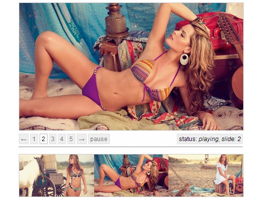
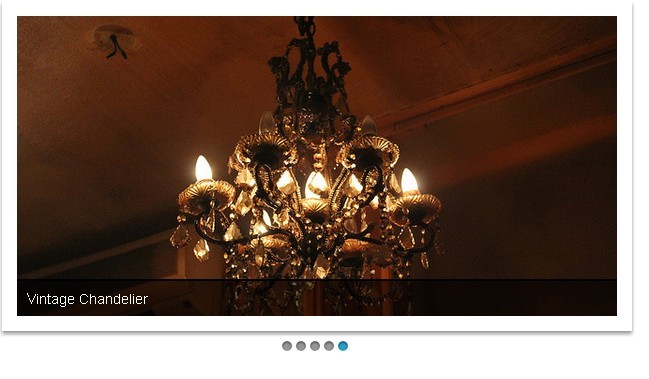
Responsive Image Carousel With Mouse Interactions
| File Size: | 3.47 KB |
|---|---|
| Views Total: | 4440 |
| Last Update: | |
| Publish Date: | |
| Official Website: | Go to website |
| License: | MIT |
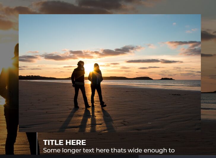
A fully responsive image carousel where the users are allowed to switch between background images and scroll through thumbnails with mouse interactions.
How to use it:
1. Add thumbnail and background images to the carousel.
<div id="wrap">
  <a href="#" class="hb">
    <div class="c">
      <img src="https://source.unsplash.com/OEMsLzuWKQc/2000x1300" alt=""/>
      <div class="txt">
        <h1>Image 1</h1>
        <p>Image Descript Here</p>
      </div>
    </div>
  </a>
  <div class="fullBg">
    <img src="https://source.unsplash.com/OEMsLzuWKQc/2000x1300" alt=""/>
  </div>
  <a href="#" class="hb">
    <div class="c">
      <img src="https://source.unsplash.com/SqAcgMAWIaM/2000x1300" alt=""/>
      <div class="txt">
        <h1>Image 2</h1>
        <p>Image Descript Here</p>
      </div>
    </div>
  </a>
  <div class="fullBg">
    <img src="https://source.unsplash.com/SqAcgMAWIaM/2000x1300" alt=""/>
  </div>
  <a href="#" class="hb">
    <div class="c">
      <img src="https://source.unsplash.com/n4fqnNWqAe0/2000x1300" alt=""/>
      <div class="txt">
        <h1>Image 3</h1>
        <p>Image Descript Here</p>
      </div>
    </div>
  </a>
  <div class="fullBg">
    <img src="https://source.unsplash.com/n4fqnNWqAe0/2000x1300" alt=""/>
  </div>
  <a href="#" class="hb">
    <div class="c">
      <img src="https://source.unsplash.com/QJZCtkeuwSo/2000x1300" alt=""/>
      <div class="txt">
        <h1>Image 4</h1>
        <p>Image Descript Here</p>
      </div>
    </div>
  </a>
  <div class="fullBg">
    <img src="https://source.unsplash.com/QJZCtkeuwSo/2000x1300" alt=""/>
  </div>
</div>
2. Make the carousel fullscreen.
body,html{
  overflow:hidden;
  height:100%;
  font-size:16px;
  background:#000;
  color:#fff;
}

#wrap{
  position:absolute;
  left:0; top:0;
  width:150%;
  height:100%;
  display:flex;
  align-items:stretch;
  margin:0 25%;
}
3. The core CSS and CSS rules for the carousel.
.hb {
  position:relative;
  width:25%;
  z-index:1;
  display:flex;
  align-items:center;
  z-index:2;
  trasnform:scale(.97);
}

.c {
  position:relative;
  display:block;
  max-width:90%;
}

.c img {
  position:relative;
  display:block;
  width:100%;
  height:auto;
  z-index:2;
}

.txt {
  position:absolute;
  top:100%; left:10%;
  width:80%;
  opacity:0;
  padding:1em 0 0 1em;
  border-left:1px solid;
  z-index:1;
  transform:scaleY(1) translateY(-50px);
  transition:transform .2s, opacity .5s;
}

h1 {
  font-size:1.2em;
  font-weight:700;
  text-transform:uppercase;
}

.hb:hover .txt {
  opacity:1;
  transform:scaleY(1) translateY(0);
}

.fullBg {
  position:fixed;top:0;left:0;width:100%;height:100%;
  opacity:0;
  transition:transform .5s, opacity .5s;
  transform:scale(1);
  z-index:1;
}

.fullBg img {
  width:100%;height:100%;
  object-fit:cover;object-position:center;
  opacity:.5;
}

.hb:hover + .fullBg {
  opacity:1;
  transform:scale(1.02);
}
4. Place the latest version of jQuery JavaScript library at the end of the document.
<script src="https://code.jquery.com/jquery-3.3.1.min.js" integrity="sha384-tsQFqpEReu7ZLhBV2VZlAu7zcOV+rXbYlF2cqB8txI/8aZajjp4Bqd+V6D5IgvKT" crossorigin="anonymous"></script>
5. The main Javascript (jQuery Script) to activate the carousel.
$(document).ready(function(){
  var docWidth = $('body').width(),
      $wrap = $('#wrap'),
      $images = $('#wrap .hb'),
      slidesWidth = $wrap.width();

  $(window).on('resize', function(){
    docWidth = $('body').width();
    slidesWidth = $wrap.width();
  })

  $(document).mousemove(function(e) {
    var mouseX = e.pageX,
        offset = mouseX / docWidth * slidesWidth - mouseX / 2;

    $images.css({
      '-webkit-transform': 'translate3d(' + -offset + 'px,0,0)',
              'transform': 'translate3d(' + -offset + 'px,0,0)'
    });
  });
})
This awesome jQuery plugin is developed by web-tiki. For more Advanced Usages, please check the demo page or visit the official website.