Super Tiny jQuery Text Resize Plugin - Squishy.js
| File Size: | 7.27 KB |
|---|---|
| Views Total: | 1819 |
| Last Update: | |
| Publish Date: | |
| Official Website: | Go to website |
| License: | MIT |

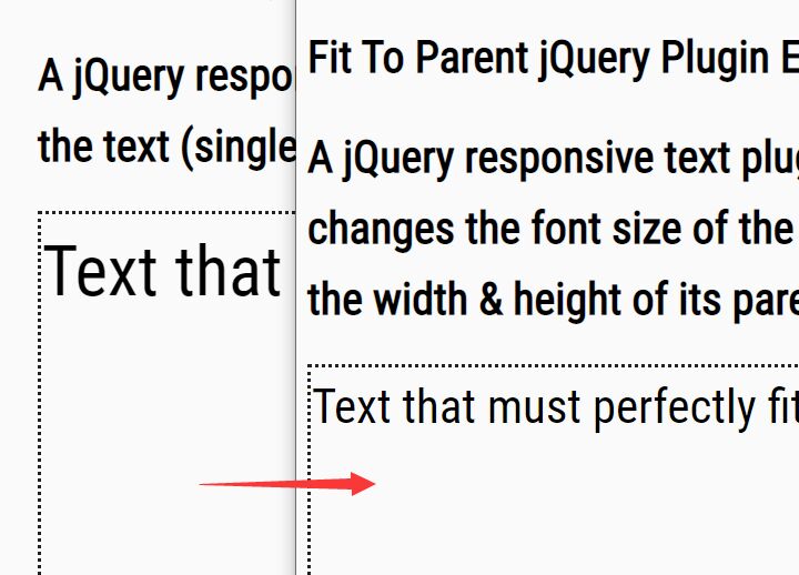
Squishy.js is a lightweight jQuery plugin for responsive web design that automatically resizes the text to exactly fit the container when window size changed.
Basic Usage:
1. Load the latest jQuery javascript library and jQuery.Squishy.js script in the bottom of your document
<script src="http://code.jquery.com/jquery-latest.min.js"></script>
<script src="jquery.squishy.js"></script>
2. The html
<div class="container">
<h1 class="squishy">Squishy</h1>
<h2 class="squishy">A jQuery Plugin</h2>
</div>
3. Just call the plugin and your're done
<script type="text/javascript">
$(".squishy").squishy();
</script>
4. Some options to customize the plugin
<script type="text/javascript">
$(".squishy").squishy({
maxWidth: 200, // sets the maximum width of the line of text
minWidth: 100, // sets the minimum width of the line of text
maxSize: 30, // set the maximum font size
minSize: 20, // set the minimum font size
runAutomatically" : true,
equalizeSizes : false, // make sure that the font-size of all squished elements will be only as large as the smallest one
callback: null,
condition: null
});
</script>
Change log:
2014-05-09
- Updated return value for callback to use array instead of object
2014-04-29
- Fixed issue with font-size declaration on span element breaking the calculation.
2014-04-16
- Added condition setting to allow user to enter a function to run to determine whether the resize should occur or not
2014-03-27
- Added a setting, equalizeSizes, that will make sure that the font-size of all squished elements will be only as large as the smallest one
This awesome jQuery plugin is developed by lemonmade. For more Advanced Usages, please check the demo page or visit the official website.