Customizable & Accessible jQuery Date Picker Plugin - asDatepicker
| File Size: | 206 KB |
|---|---|
| Views Total: | 5775 |
| Last Update: | |
| Publish Date: | |
| Official Website: | Go to website |
| License: | MIT |
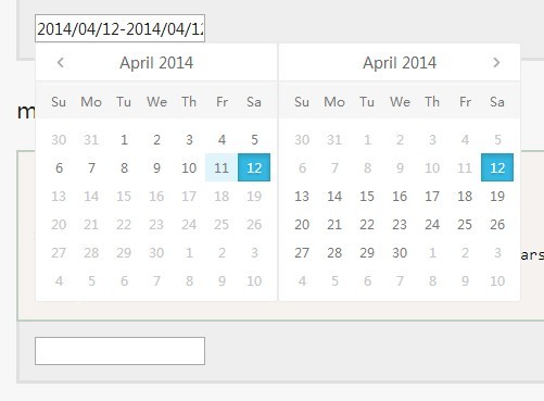
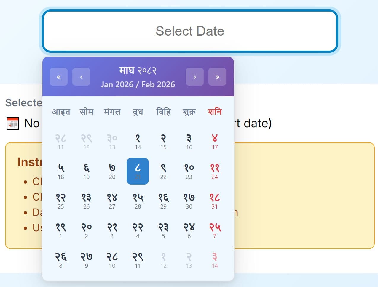
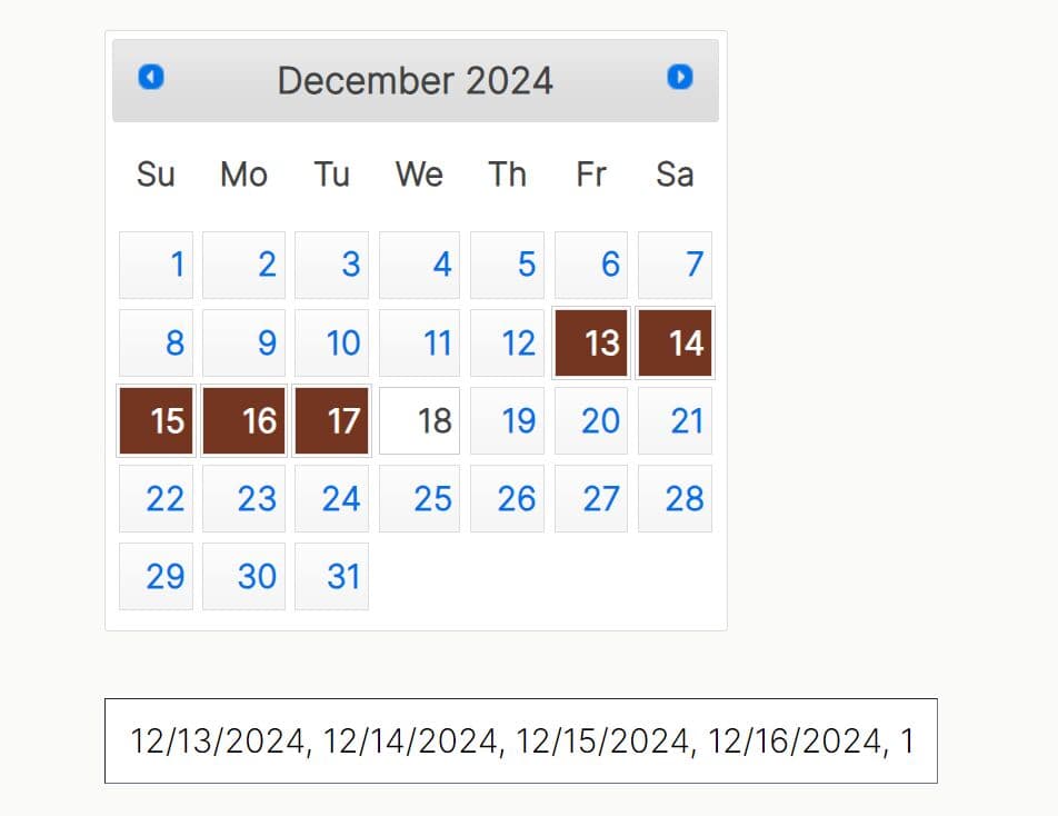
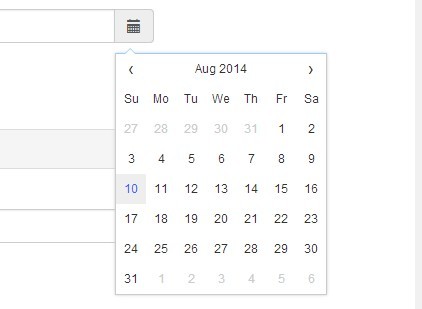
asDatepicker is a fully configurable and accessible jQuery plugin which makes it easy to pick a date or date range from a dropdown or inline date picker.
Features:
- Simple, clean and easy to implement.
- Single, date range or multiple date pickers.
- Keyboard navigation support.
- Callback events support.
Basic Usage:
1. Include the required jQuery asDatepicker plugin's stylesheet in the head section of your web page.
<link rel="stylesheet" href="css/asDatepicker.css">
2. Create an input field that will show up a dropdown date picker when focus on.
<input type="text" id="calendar">
3. Include the jQuery library and jQuery asDatepicker plugin's javascript at the bottom of your web page.
<script src="http://ajax.googleapis.com/ajax/libs/jquery/1.11.0/jquery.min.js"></script>
<script src="src/jquery-asDatepicker.js"></script>
4. Call the plugin on the input field.
<script>
$(document).ready(function(){
$("#calendar").asDatepicker();
});
<script>
5. Options and callbacks.
// 0---6 === sunday---saturday
firstDayOfWeek: 0,

// single|range|multiple
mode: 'single',

// default|section|array
limitMode: 'default',

// dropdown|inline
displayMode: 'dropdown',

calendars: 3,

// today|Date (yyyy-mm-dd)
date: 'today',

keyboard: true,
rangeSeparator: 'to',
multipleSeparator: ',',
multipleSize: 5,

container: 'body',

// top|right|bottom|left|rightTop|leftTop
position: 'bottom',
alwaysShow: false,
onceClick: false,

// min: '2012-12-1',//null|'today'|days|Date with (yyyy-mm-dd)
min: null,

// max: '2013-10-1',//null|'today'|days|Date with (yyyy-mm-dd)
max: null,

// ['2013-8-1', {from: '2013-8-5', to: '2013-8-10'}, {from: -30, to: 30}]],
selectableDate: [],

// [{from: 1980, to: 1985}, 1988, {from: 2000, to: 2010}, 2013],
selectableYear: [],

// months from 0 - 11 (jan to dec) example: [0, {from: 3, to: 9}, 11],
selectableMonth: [],

// days from 0 - 31,
selectableDay: [],

// days of week 0-6 (su to sa) [0, {from: 2, to: 4}] , [] is default all
selectableDayOfWeek: [],

lang: 'en', //'chinese'

// ['days'], ['days', 'months', 'years']
views: ['days'],

outputFormat: 'yyyy/mm/dd',

mobileMode: false,

namespace: 'calendar',
tplInputWrapper: function() {
    return '<div class="namespace-inputWrap"></div>';
},
tplWrapper: function() {
    return '<div class="namespace-wrap"></div>';
},
tplContent: function() {
    return '<div class="namespace-content">' +
    '<div class="namespace-header">' +
        '<div class="namespace-prev"></div>' +
        '<div class="namespace-caption"></div>' +
        '<div class="namespace-next"></div>' +
    '</div>' +
    '<div class="namespace-days"></div>' +
    '<div class="namespace-months"></div>' +
    '<div class="namespace-years"></div>' +
    '<div class="namespace-buttons">' +
        '<div class="namespace-button-cancel">Cancel</div>' +
        '<div class="namespace-button-enter">Okey</div>' +
    '</div>' +
'</div>';
},
tplTitle: function() {
    return '<div class="namespace-title">test</div>';
},
onInit: null,
onReady: null,
onRender: null,
onChange: null,
onBeforeShow: null,
onShow: null,
onBeforeHide: null,
onHide: null
6. Any option of the asDatepicker can also be set via data-attributes. As in:
<input type="text" id="calendar" data-mode="range" data-range-mode="section" data-selectable-year="2001>2010,2013,2015>2018">
<script>
$(document).ready(function(){
$("#calendar").asDatepicker();
});
<script>
Change logs:
2014-12-24
- fix resize position
2014-11-28
- add mobile demo.
- fixed mobileEnter bug
2014-11-27
- add mobile mode.
2014-11-04
- fix position bug, add icon click function
2014-04-15
- update.
This awesome jQuery plugin is developed by amazingSurge. For more Advanced Usages, please check the demo page or visit the official website.