Fast, Customizable Date Picker in Vanilla JS & jQuery - Air Datepicker
| File Size: | 242 KB |
|---|---|
| Views Total: | 29213 |
| Last Update: | |
| Publish Date: | |
| Official Website: | Go to website |
| License: | MIT |
Air Datepicker is a pure JavaScript date picker library that handles single dates, date ranges, multi-date selection, and time picking.
It runs on ES6, uses native CSS variables for theming, and works across all modern browsers.
Version 3 rewrites the entire library from scratch, removes the jQuery requirement, and adopts Unicode Technical Standard #35 for date formatting.
You can also download Air Datepicker v2 for legacy jQuery-based codebases.
Features:
- Native CSS variable support for full theme customization.
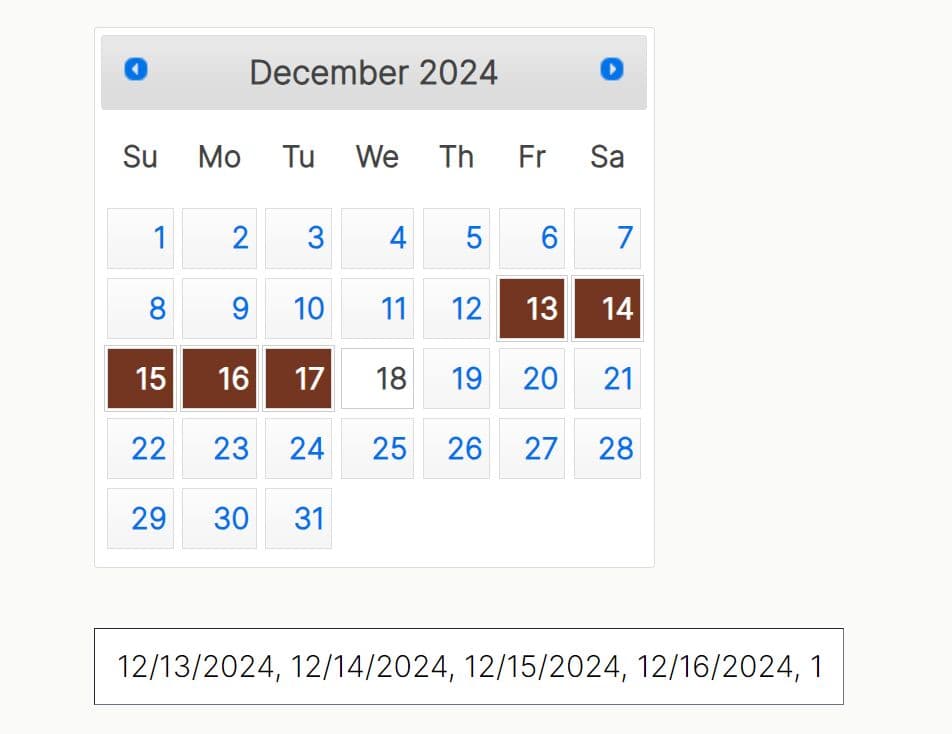
- Single date, multi-date, and date range selection modes.
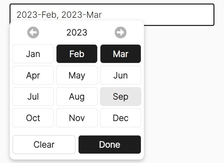
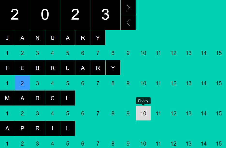
- Three calendar views: days, months, and years.
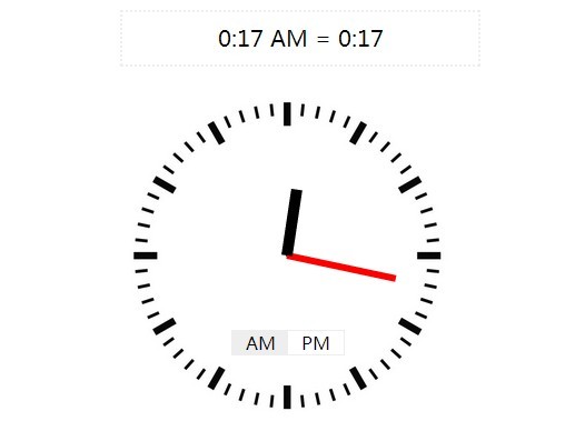
- Built-in timepicker with configurable 12-hour and 24-hour display.
- Inline display mode that keeps the calendar permanently visible.
- Keyboard navigation with shortcut keys for month, year, and decade traversal.
- Configurable minimum and maximum selectable dates.
- Custom action buttons with a built-in "Today" and "Clear" option.
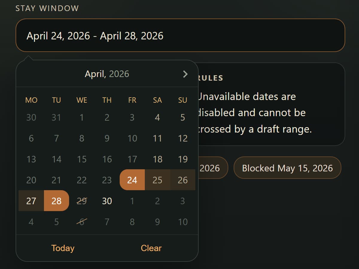
- Per-cell rendering control for disabling specific dates or adding custom HTML.
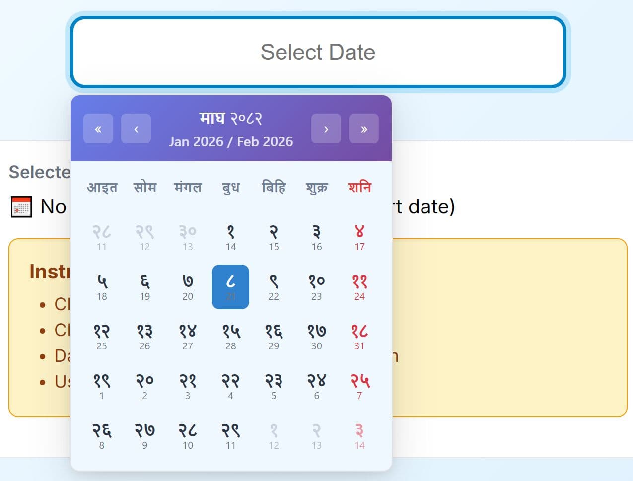
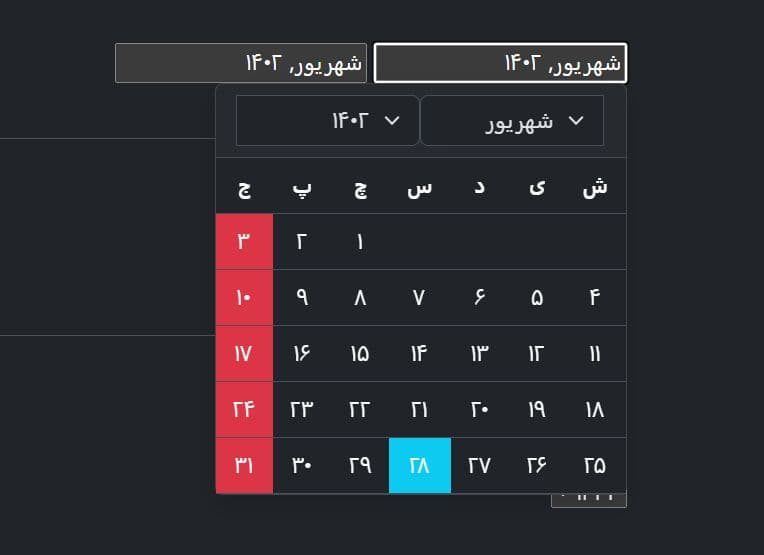
- Full localization through swappable locale objects (33+ languages included).
- Draggable date range adjustment after initial selection.
- TypeScript support with full type definitions included.
Use Cases:
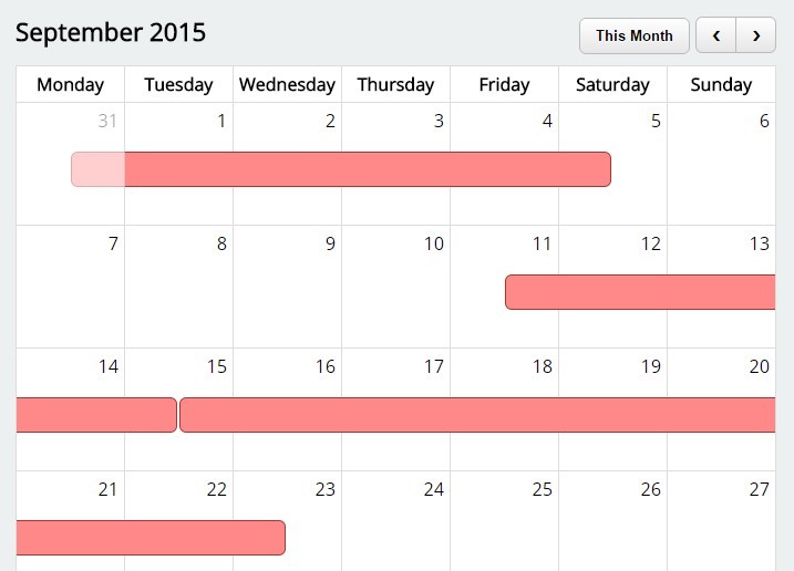
- Booking forms that need a date range picker for check‑in and check‑out.
- Admin dashboards where a time picker attaches to a date field for scheduling tasks.
- Inline calendar widgets that display available dates for appointment selection.
- Reports filters that accept multiple dates to compare metrics across days.
How to use it (Vanilla JS Version):
1. Install Air Datepicker via npm, and import both the JS module and the CSS:
# NPM
npm i air-datepicker
// Core
import AirDatepicker from 'air-datepicker';
// Local
import localeEn from 'air-datepicker/locale/en';
// Stylesheet
import 'air-datepicker/air-datepicker.css';
2. For non-module projects, load the following files directly in your HTML document:
<!-- Load the stylesheet in <head> -->
<link rel="stylesheet" href="dist/air-datepicker.css">

<!-- Load the script before closing </body> -->
<script src="dist/air-datepicker.js"></script>
<script src="dist/local/en.js"></script>
3. Attach the datepicker to any input element or container:
// Initialize on an input field
new AirDatepicker('#booking-date');
4. For a date range picker with a timepicker and action buttons:
new AirDatepicker('#trip-dates', {
  range: true,
  timepicker: true,
  buttons: ['today', 'clear']
});
5. Use onRenderCell to disable specific dates or inject custom HTML into individual cells:
new AirDatepicker('#availability', {
  onRenderCell({ date, cellType }) {
    // Disable every Monday in the day view
    if (cellType === 'day' && date.getDay() === 1) {
      return {
        disabled: true,
        classes: 'unavailable-day',
        attrs: { title: 'Mondays are unavailable' }
      };
    }
  }
});
6. Override the default dropdown positioning with a custom function:
new AirDatepicker('#meeting-date', {
  autoClose: true,
  position({ $datepicker, $target, $pointer }) {
    // Center the calendar below the input field
    let rect = $target.getBoundingClientRect();
    let dpW  = $datepicker.clientWidth;

    $datepicker.style.left = `${rect.x + rect.width / 2 - dpW / 2}px`;
    $datepicker.style.top  = `${rect.y + rect.height + window.scrollY + 8}px`;

    // Hide the default pointer arrow
    $pointer.style.display = 'none';
  }
});
7. All configuration options to customize the date picker:
classes(string): Adds extra CSS classes to the calendar element.inline(boolean, defaultfalse): Keeps the calendar permanently visible.locale(object, defaultru): Sets the calendar language. Pass a locale object fromair-datepicker/locale/.startDate(Date | string | number, defaultnew Date()): Sets the initial view date when the calendar opens.firstDay(number): Overrides the locale's first day of the week.0is Sunday,6is Saturday.weekends(array, default[6, 0]): Indexes of days marked as weekends with the.weekendclass.isMobile(boolean, defaultfalse): Renders the calendar as a modal dialog with enlarged dimensions.visible(boolean, defaultfalse): Shows the calendar immediately on initialization.dateFormat(string | function): Date display format using Unicode Technical Standard #35 tokens, or a custom function returning a string.altField(string | DOMNode): A secondary input field that receives the date inaltFieldDateFormat.altFieldDateFormat(string | function, default"T"): The format written to the alternate field.toggleSelected(boolean | function, defaulttrue): Clicking an already-selected date removes it. Pass a function for conditional behavior.keyboardNav(boolean, defaulttrue): Activates keyboard navigation on text input elements.selectedDates(Date[] | string[] | number[]): Pre-selected dates on initialization. Accepts mixed types.container(string | HTMLElement): A custom parent element for the calendar DOM node.position(string | function, default"bottom left"): Calendar position relative to the input, or a custom positioning function.view(string, default"days"): Initial calendar view. Options:"days","months","years".minView(string, default"days"): The least granular view the user can reach. Useful for month-only pickers.showOtherMonths(boolean, defaulttrue): Shows dates from adjacent months in the days view.selectOtherMonths(boolean, defaulttrue): Allows selection of dates from adjacent months.moveToOtherMonthsOnSelect(boolean, defaulttrue): Navigates to the adjacent month when a date from it is selected.minDate(Date | string | number): The earliest selectable date.maxDate(Date | string | number): The latest selectable date.disableNavWhenOutOfRange(boolean, defaulttrue): Deactivates the previous/next navigation buttons when at theminDateormaxDateboundary.multipleDates(boolean | number, defaultfalse):trueallows unlimited selections; a number caps the count.multipleDatesSeparator(string, default", "): Text separator between dates in the input field.range(boolean, defaultfalse): Activates date range selection mode.dynamicRange(boolean, defaulttrue): Allows dragging selected range endpoints to adjust the range after selection.buttons(string | object | array | false, defaultfalse): Action buttons at the bottom of the calendar. Built-in values:"today","clear". Pass an object to define a custom button.monthsField(string, default"monthsShort"): The locale field used for month names in the months view.showEvent(string, default"focus"): The DOM event that triggers the calendar to open.autoClose(boolean): Hides the calendar after a date is selected.prevHtml(string): Custom HTML for the Previous navigation button.nextHtml(string): Custom HTML for the Next navigation button.navTitles(object): Title templates for each view. Accepts HTML, date tokens, or a function returning a string.fixedHeight(boolean, defaultfalse): Fixes the calendar height to always show 6 weeks.timepicker(boolean, defaultfalse): Shows the time picker below the calendar.onlyTimepicker(boolean, defaultfalse): Shows only the time picker, no date grid.dateTimeSeparator(string, default" "): Separator between the date and time portions in the output.timeFormat(string): Time format string using Unicode tokens. Passing a 12-hour format token auto-switches the time slider to AM/PM mode.minHours(number, default0): Minimum selectable hour.maxHours(number, default24): Maximum selectable hour.minMinutes(number, default0): Minimum selectable minute.maxMinutes(number, default59): Maximum selectable minute.hoursStep(number, default1): Step increment for the hours slider.minutesStep(number, default1): Step increment for the minutes slider.
new AirDatepicker('#meeting-date', {
  classes: '',
  inline: false,
  locale: localeRu,
  startDate: new Date(),
  firstDay: '',
  weekends: [6, 0],
  dateFormat: '',
  altField: '',
  altFieldDateFormat: 'T',
  toggleSelected: true,
  keyboardNav: true,
  selectedDates: false,
  container: '',
  isMobile: false,
  visible: false,

  position: 'bottom left',
  offset: 12,

  view: consts.days,
  minView: consts.days,

  showOtherMonths: true,
  selectOtherMonths: true,
  moveToOtherMonthsOnSelect: true,

  showOtherYears: true,
  selectOtherYears: true,
  moveToOtherYearsOnSelect: true,

  minDate: '',
  maxDate: '',
  disableNavWhenOutOfRange: true,

  multipleDates: false, // Boolean or Number
  multipleDatesSeparator: ', ',
  range: false,
  dynamicRange: true,
  buttons: false,
  monthsField: 'monthsShort',

  showEvent: 'focus',
  autoClose: false,
  fixedHeight: false,

  // navigation
  prevHtml: '<svg><path d="M 17,12 l -5,5 l 5,5"></path></svg>',
  nextHtml: '<svg><path d="M 14,12 l 5,5 l -5,5"></path></svg>',
  navTitles: {
      days: 'MMMM, <i>yyyy</i>',
      months: 'yyyy',
      years: 'yyyy1 - yyyy2'
  },

  timepicker: false,
  onlyTimepicker: false,
  dateTimeSeparator: ' ',
  timeFormat: '',
  minHours: 0,
  maxHours: 24,
  minMinutes: 0,
  maxMinutes: 59,
  hoursStep: 1,
  minutesStep: 1,
});
8. Date/time format tokens:
| Token | Output |
|---|---|
T |
Timestamp in milliseconds |
E |
Short day name (from locale daysShort) |
EEEE |
Full day name (from locale days) |
d |
Day of month |
dd |
Day of month, zero-padded |
M |
Month number |
MM |
Month number, zero-padded |
MMM |
Short month name |
MMMM |
Full month name |
yy |
Two-digit year |
yyyy |
Full year |
yyyy1 |
First year of decade |
yyyy2 |
Last year of decade |
h |
Hours, 12-hour |
hh |
Hours, 12-hour, zero-padded |
H |
Hours, 24-hour |
HH |
Hours, 24-hour, zero-padded |
m |
Minutes |
mm |
Minutes, zero-padded |
aa |
AM/PM, lowercase |
AA |
AM/PM, uppercase |
9. API methods:
// Show the calendar programmatically
datepicker.show();

// Hide the calendar programmatically
datepicker.hide();

// Navigate to the next month, year, or decade (depends on current view)
datepicker.next();

// Navigate to the previous month, year, or decade
datepicker.prev();

// Select a single date or an array of dates
// opts.updateTime: true sets the timepicker to the passed date's time
// opts.silent: true skips the onSelect callback
datepicker.selectDate(new Date('2025-09-01'), { updateTime: true, silent: false });

// Deselect a specific date
datepicker.unselectDate(new Date('2025-09-01'));

// Clear all selected dates
// opts.silent: true skips the onSelect callback
datepicker.clear({ silent: false });

// Format a date using any supported token string
// Returns the formatted string
let formatted = datepicker.formatDate(new Date('2025-09-01'), 'dd/MM/yyyy');

// Destroy the calendar and remove all event listeners from the target element
datepicker.destroy();

// Update one or more options after initialization
// params.silent: true skips onSelect and onChangeView callbacks
datepicker.update({ maxDate: new Date('2025-12-31') }, { silent: false });

// Switch to a specific view (days, months, years)
// params.silent: true skips onChangeView
datepicker.setCurrentView('months', { silent: false });

// Set the displayed date without selecting it (navigates to that month/year)
datepicker.setViewDate(new Date('2026-01-01'));

// Move focus to a specific calendar cell
// opts.viewDateTransition: true updates the view if the date is outside the current one
datepicker.setFocusDate(new Date('2025-09-15'), { viewDateTransition: true });

// Switch to the next view type (days -> months -> years)
datepicker.up();

// Switch to the previous view type (years -> months -> days)
datepicker.down();

// Get all dates currently displayed in the calendar for a given view
// Returns an array of Date objects
let visibleDates = datepicker.getViewDates('days');

// Disable one or more dates to prevent selection
datepicker.disableDate(new Date('2025-09-10'));
datepicker.disableDate(['2025-09-10', '2025-09-11', new Date('2025-09-12')]);

// Re-enable previously disabled dates
datepicker.enableDate(new Date('2025-09-10'));
10. Callback functions.
// Fires when a date is selected or deselected
// Receives: date (Date or Date[]), formattedDate (string or string[]), datepicker instance
new AirDatepicker('#reservation', {
  onSelect({ date, formattedDate, datepicker }) {
      console.log('Selected:', formattedDate);
  }
});

// Fires before a cell is selected; return false to block the selection
new AirDatepicker('#reservation', {
  onBeforeSelect({ date, datepicker }) {
      // Block weekends from being selected
      const day = date.getDay();
      return day !== 0 && day !== 6;
  }
});

// Fires when the user navigates to a different month, year, or decade
new AirDatepicker('#reservation', {
  onChangeViewDate({ month, year, decade }) {
      console.log('Viewing:', year, month);
  }
});

// Fires when switching between days, months, and years views
new AirDatepicker('#reservation', {
  onChangeView(view) {
      console.log('View changed to:', view);
  }
});

// Fires for every cell render; return an object to customize the cell
new AirDatepicker('#reservation', {
  onRenderCell({ date, cellType, datepicker }) {
      // Return html, classes, disabled, or attrs to customize
  }
});

// Fires when the calendar starts to appear (isFinished: false)
// and again after the animation completes (isFinished: true)
new AirDatepicker('#reservation', {
  onShow(isFinished) {
      if (isFinished) console.log('Calendar visible');
  }
});

// Fires when the calendar starts to hide and again after it finishes
new AirDatepicker('#reservation', {
  onHide(isFinished) {
      if (isFinished) console.log('Calendar hidden');
  }
});

// Fires when a user clicks a day name header
// dayIndex: 0 = Sunday, 6 = Saturday
new AirDatepicker('#reservation', {
  onClickDayName({ dayIndex, datepicker }) {
      console.log('Day column clicked:', dayIndex);
  }
});

// Fires when a calendar cell receives keyboard or mouse focus
new AirDatepicker('#reservation', {
  onFocus({ date, datepicker }) {
      console.log('Focused on:', date);
  }
});
11. Instance properties:
$datepicker(HTMLDivElement): The calendar's root DOM element.$el(HTMLInputElement): The target element on which the datepicker was initialized.viewDate(Date): The date currently displayed in the calendar header.currentView(string): The active view:"days","months", or"years".selectedDates(Date[]): All currently selected dates as an array.focusDate(Date | false): The date cell with current keyboard focus.visible(boolean):truewhen the calendar is open.disabledDates(Set<string>): All currently disabled dates as a Set of date strings.isDestroyed(boolean):trueafterdestroy()has been called.
How to use it (jQuery Version):
1. Include the jQuery library together with the jQuery Air Datepicker plugin's CSS and JS files on your webpage.
<link href="dist/css/datepicker.css" rel="stylesheet">
<script src="//code.jquery.com/jquery-2.1.4.min.js"></script>
<script src="dist/js/datepicker.js"></script>
2. Adding the CSS class 'datepicker-here' to the target element will initialize the date picker plugin automatically. And you can pass all options via data-OPTION attributes on the html element.
<input type='text' class='datepicker-here'
       data-language='en'
       data-position='right top'
>
3. You can also initialize the plugin manually and all the options can be passed to datepicker() method as an object.
$('#selector').datepicker({

  // inline mode
  inline: false,

  // additional CSS class
  classes: '',

  // language
  language: 'ru',

  // start date
  startDate: new Date(),

  // first day
  firstDay: '',

  // array of day's indexes
  weekends: [6, 0],

  // custom date format
  dateFormat: '',

  // Alternative text input. Use altFieldDateFormat for date formatting.
  altField: '',

  // Date format for alternative field.
  altFieldDateFormat: '@',

  // remove selection when clicking on selected cell
  toggleSelected: true,

  // keyboard navigation
  keyboardNav: true,

  // position
  position: 'bottom left',
  offset: 12,

  // days, months or years
  view: 'days',
  minView: 'days',

  showOtherMonths: true,
  selectOtherMonths: true,
  moveToOtherMonthsOnSelect: true,

  showOtherYears: true,
  selectOtherYears: true,
  moveToOtherYearsOnSelect: true,

  minDate: '',
  maxDate: '',
  disableNavWhenOutOfRange: true,

  multipleDates: false, // Boolean or Number
  multipleDatesSeparator: ',',
  range: false,

  // display today button
  todayButton: false,

  // display clear button
  clearButton: false,

  // Event type
  showEvent: 'focus',

  // auto close after date selection
  autoClose: false,

  // navigation
  monthsFiled: 'monthsShort',
  prevHtml: '<svg><path d="M 17,12 l -5,5 l 5,5"></path></svg>',
  nextHtml: '<svg><path d="M 14,12 l 5,5 l -5,5"></path></svg>',
  navTitles: {
      days: 'MM, <i>yyyy</i>',
      months: 'yyyy',
      years: 'yyyy1 - yyyy2'
  },

  // timepicker
  timepicker: false,
  onlyTimepicker: false,
  dateTimeSeparator: ' ',
  timeFormat: '',
  minHours: 0,
  maxHours: 24,
  minMinutes: 0,
  maxMinutes: 59,
  hoursStep: 1,
  minutesStep: 1,

  // callback events
  onSelect: '',
  onShow: '',
  onHide: '',
  onChangeMonth: '',
  onChangeYear: '',
  onChangeDecade: '',
  onChangeView: '',
  onRenderCell: ''

})
4. Customize languages.
Datepicker.language['en'] = {
    days: ['Sunday', 'Monday', 'Tuesday', 'Wednesday', 'Thursday', 'Friday', 'Saturday'],
    daysShort: ['Sun', 'Mon', 'Tue', 'Wed', 'Thu', 'Fri', 'Sat'],
    daysMin: ['Su', 'Mo', 'Tu', 'We', 'Th', 'Fr', 'Sa'],
    months: ['January','February','March','April','May','June', 'July','August','September','October','November','December'],
    monthsShort: ['Jan', 'Feb', 'Mar', 'Apr', 'May', 'Jun', 'Jul', 'Aug', 'Sep', 'Oct', 'Nov', 'Dec'],
    today: 'Today',
    clear: 'Clear',
    dateFormat: 'mm/dd/yy',
    firstDay: 0
};
Alternatives:
- 10 Best JavaScript Calendar Plugins For Scheduled Events
- 10 Best Date And Time Picker JavaScript Plugins
Changelog:
v3.6.0 (2026-04-24)
- Rewritten in ES6.
- Updated doc & demo.
v2.2.3 (2016-09-26)
- fixed min,max dates in decade mode
v2.2.2 (2016-09-21)
- fixed min,max dates handling
v2.2.1 (2016-09-18)
- changed RegExp for recognizing date parts
- changed jquery version dependency
v2.21.0 (2016-08-29)
- added onlyTimepicker option
- added onShow and onHide callbacks
- added VERSION field to plugin's prototype
- now for selecting same date in range mode, you should set {toggleSelected: false}
- fixed dateFormat method (fixed wrong month name in Hungarian language)
- fixed second call of onRenderCallback
- fixed _getCell() throwing exception
- new language: sk
v2.1.0 (2016-07-03)
- added possibility to select single date when {range: true}
- added support of 12 hours mode in altFieldDateFormat
- improved work with minDate and maxDate when {timepicker: true}
- fixed wrong class adding when {range: true}
- new languages:
v2.0.2 (2016-05-20)
- fixed dates array in onSelect callback
v2.0.1 (2016-05-16)
- added timepicker
- added possibility to set Date in todayButton
- global variable Datepicker has been removed, now all placed in $.fn.datepicker
- improved selectDate method, now one can pass an array of dates to select
- added npm package
- fixed issue caused by placeholder on readonly inputs in IE
- fixed issue when range is true and first selected date is bigger than second
- added new languages
v1.2.1 (2016-01-24)
- tests added
- fixed if '0' is passed to 'firstDay'
- fixed 'showOtherYears' option
- fixed 'onSelect' event, when 'range' is true
- fixed case when 'range' and 'multipleDates' both set to true
2015-12-10
- fix removeDate when 1 range date is selected
2015-12-04
- added keyboard navigation
This awesome jQuery plugin is developed by t1m0n. For more Advanced Usages, please check the demo page or visit the official website.