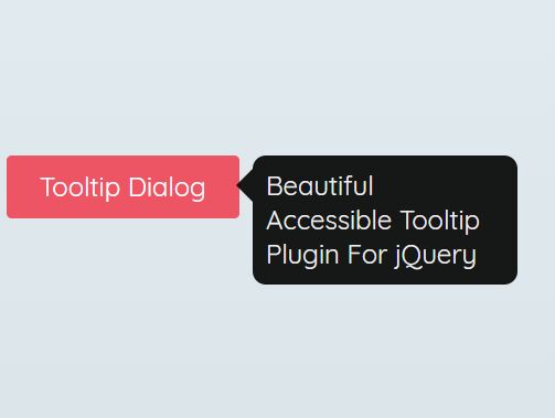
Beautiful Accessible Tooltip Plugin For jQuery
| File Size: | 9.99 KB |
|---|---|
| Views Total: | 1374 |
| Last Update: | |
| Publish Date: | |
| Official Website: | Go to website |
| License: | MIT |
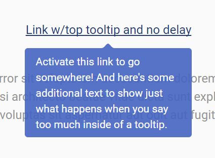
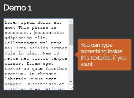
A lightweight and accessible jQuery tooltip plugin for showing beautiful, customizable, WAI-ARIA compliant tooltip popups on matched elements.
Supports both keyboard focus and mouse hover events described in the WAI-ARIA Tooltip Design Pattern.
Press the ESC key to dismiss the opened tooltip.
How to use it:
1. Download and load the JavaScript file jquery-accessible-simple-tooltip-aria.js after jQuery.
<script src="https://code.jquery.com/jquery-1.12.4.min.js"
        integrity="sha384-nvAa0+6Qg9clwYCGGPpDQLVpLNn0fRaROjHqs13t4Ggj3Ez50XnGQqc/r8MhnRDZ"
        crossorigin="anonymous">
</script>
<script src="jquery-accessible-simple-tooltip-aria.js"></script>
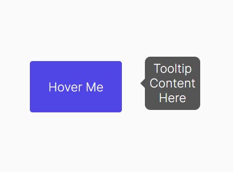
2. Add the class 'js-simple-tooltip' to the target element and define the tooltip content in the data-simpletooltip-text attribute:
<button class="js-simple-tooltip"
        data-simpletooltip-text="Tooltip Content">
        Basic Tooltip
</button>
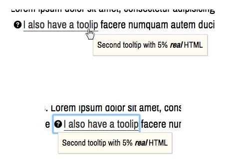
3. The plugin also has the ability to load tooltip content from another element just like the dialog.
<button class="js-simple-tooltip"
        data-simpletooltip-content-id="dialog">
        Basic Tooltip
</button>

<div id="dialog" class="hidden">
  Tooltip Content Here
</div>
4. The example CSS styles for the tooltip.
/* Tooltip hidden by default */
.simpletooltip[aria-hidden="true"],
.minimalist-simpletooltip[aria-hidden="true"],
.minimalist-left-simpletooltip[aria-hidden="true"] {
  display: none;
}

/* position relative for containers */
.simpletooltip_container,
.minimalist-simpletooltip_container,
.minimalist-left-simpletooltip_container {
  position: relative;
  display: inline;
}

/* tooltip styles */
.simpletooltip,
.minimalist-simpletooltip,
.minimalist-left-simpletooltip {
  position: absolute;
  display: inline-block;
  z-index: 666;
  width: 10em;
  border-radius: .5em;
  background: rgba( 0, 0, 0, .9 );
  color: #eee;
  padding: .5em;
  text-align: left;
  line-height: 1.3;
}

.simpletooltip,
.minimalist-simpletooltip {
  right: auto;
  left: 100%;
  margin-left: .5em;
}

.minimalist-left-simpletooltip {
  right: 100%;
  left: auto;
  margin-right: .5em;
}

/* used pseudo-element to make arrows */
.simpletooltip::before,
.minimalist-simpletooltip::before,
.minimalist-left-simpletooltip::before {
  content: '';
  speak: none;
  position: absolute;
  z-index: 666;
  width: 10px;
  height: 10px;
}

.simpletooltip::before,
.minimalist-simpletooltip::before {
  top: .5em;
  left: -10px;
  margin-left: -10px;
  border: 10px solid transparent;
  border-right: 10px solid rgba( 0, 0, 0, .9 );
}

.minimalist-left-simpletooltip::before {
  top: .5em;
  right: -10px;
  margin-right: -10px;
  border: 10px solid transparent;
  border-left: 10px solid rgba( 0, 0, 0, .9 )
}


/* for responsive design */
@media (max-width: 44.375em) {

  .simpletooltip,
  .minimalist-simpletooltip,
  .minimalist-left-simpletooltip  {
    top: 100%;
    left: 50%;
  right: 0;
    margin: 0;
  margin-top: .7em;
  margin-left: -5em;
  }

  .simpletooltip::before,
  .minimalist-simpletooltip::before,
  .minimalist-left-simpletooltip::before  {
    top: -10px;
  right: auto;
  left: 50%;
  margin-left: -5px;
    margin-top: -10px;
    border: 10px solid transparent;
    border-bottom: 10px solid rgba( 0, 0, 0, .9 );
  }

}
5. More HTML data attributes to customize the accessible tooltip plugin.
- data-simpletooltip-prefix-class: prefix class.
- data-simpletooltip-wrapper-tag: the tag used for wrapping the tooltip (default: span).
- data-simpletooltip-tag: the tag used for the tooltip (default: span).
This awesome jQuery plugin is developed by nico3333fr. For more Advanced Usages, please check the demo page or visit the official website.