Themeable Tooltip Plugin In jQuery - lyltip.js
| File Size: | 4.54 KB |
|---|---|
| Views Total: | 665 |
| Last Update: | |
| Publish Date: | |
| Official Website: | Go to website |
| License: | MIT |
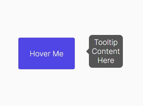
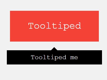
lyltip.js is a lightweight, customizable, themeable jQuery tooltip plugin that can be used to provide help text, extra product details, or simply more information about a specific element on the page.
How to use it:
1. Load the stylesheet lyltip.css and JavaScript lyltip.js in the document.
<!-- jQuery Is Required -->
<script src="/path/to/cdn/jquery.min.js"></script>

<!-- lyltip jQuery Plugin -->
<link rel="stylesheet" href="lyltip.css" />
<script src="lyltip.js"></script>
2. Initialize the tooltip plugin.
$(".tooltip").lyltip({
  // options here
});
3. Add the tooltip class to the target element and define the tooltip text in the data-tooltip attribute:
<a href="#"
   class="tooltip"
   data-tooltip="Tooltip Text">
   Default Tooltip
</a>
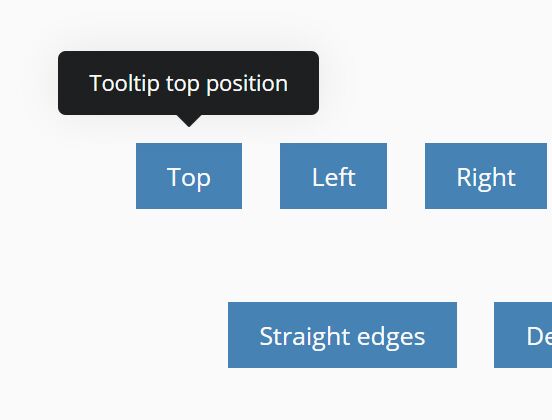
4. Determine the position of the tooltip popup using the data-tooltip-pos attribute:
<a href="#"
   class="tooltip"
   data-tooltip="Tooltip Text"
   data-tooltip-pos="left">
   Left Tooltip
</a>

<a href="#"
   class="tooltip"
   data-tooltip="Tooltip Text"
   data-tooltip-pos="right">
   Right Tooltip
</a>

<a href="#"
   class="tooltip"
   data-tooltip="Tooltip Text"
   data-tooltip-pos="bottom">
   Bottom Tooltip
</a>
5. Change the theme of the tooltip. Available themes:
- Dark (Default)
- Info
- Success
- Warning
- Danger
- Light
<a href="#"
   class="tooltip tooltip-info"
   data-tooltip="Tooltip Text">
   Info
</a>

<a href="#"
   class="tooltip tooltip-success"
   data-tooltip="Tooltip Text">
   Success
</a>

<a href="#"
   class="tooltip tooltip-warning"
   data-tooltip="Tooltip Text">
   Warning
</a>

<a href="#"
   class="tooltip tooltip-danger"
   data-tooltip="Tooltip Text">
   Danger
</a>

<a href="#"
   class="tooltip tooltip-light"
   data-tooltip="Tooltip Text">
   Light
</a>
$(".tooltip").lyltip({
  theme: "dark",  // Principal theme
  themes: {     // Custom elements themes
    "tooltip-info": "info",
    "tooltip-success": "success",
    "tooltip-warning": "warning",
    "tooltip-danger": "danger",
    "tooltip-light": "light",
  },
});
6. Determine whether to give tooltips rounded corners. Default: true.
$(".tooltip").lyltip({
  rounded: false,
});
7. Set the space between tooltips & trigger elements. Default: 18px.
$(".tooltip").lyltip({
  margin: 20,
});
Changelog:
2021-12-03
- JS update
This awesome jQuery plugin is developed by Lyrians. For more Advanced Usages, please check the demo page or visit the official website.