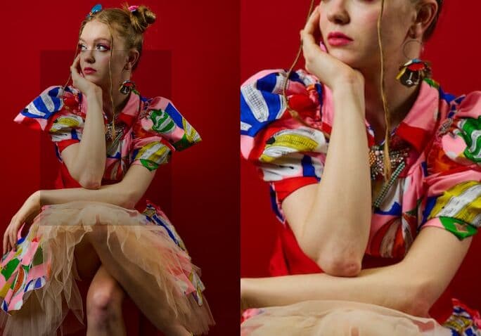
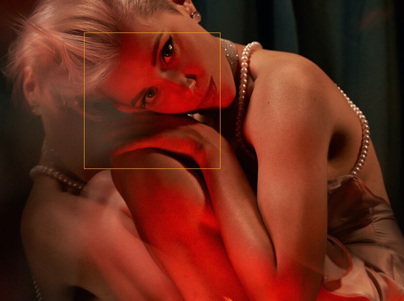
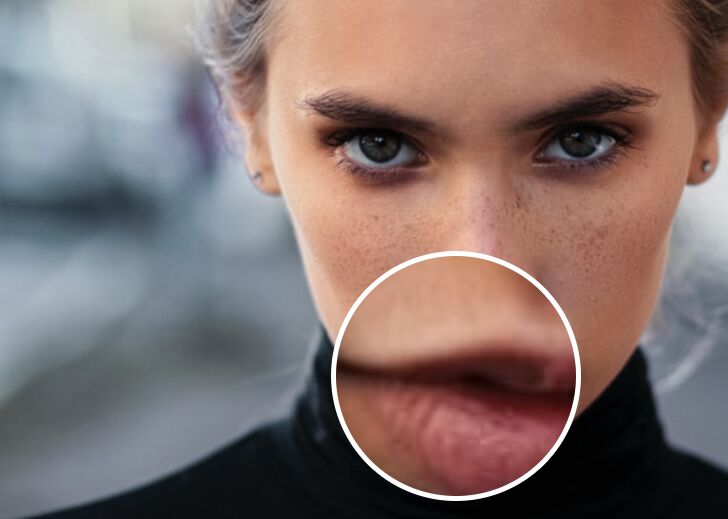
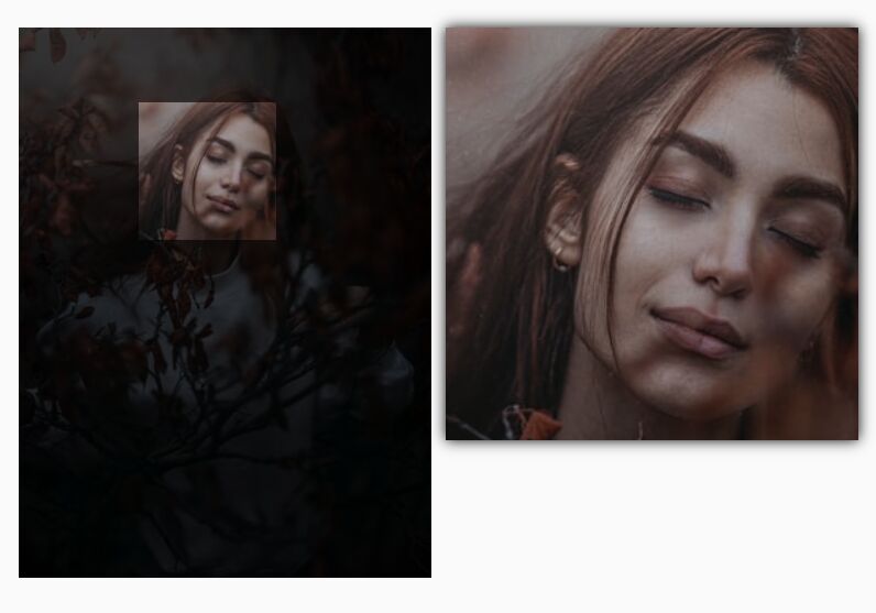
Draggable Magnifying Glass Plugin For jQuery - monocle
| File Size: | 844 KB |
|---|---|
| Views Total: | 2222 |
| Last Update: | |
| Publish Date: | |
| Official Website: | Go to website |
| License: | MIT |
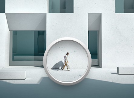
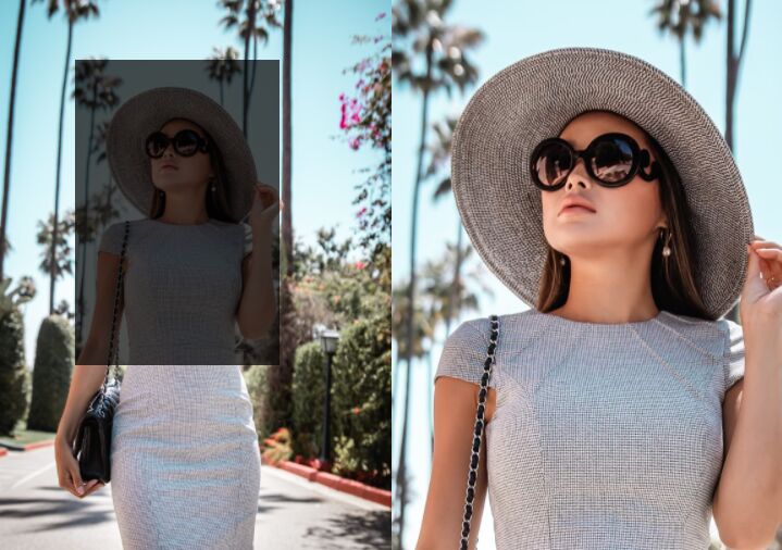
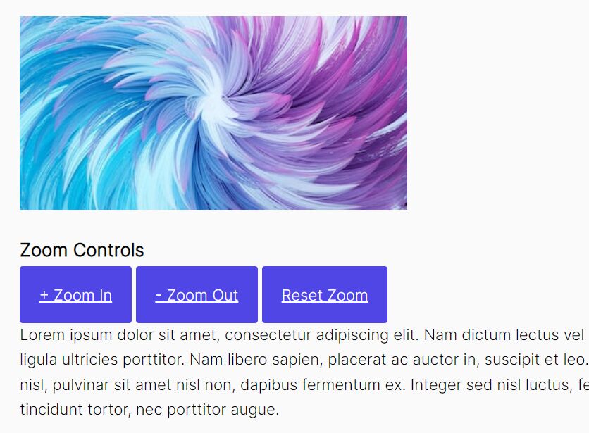
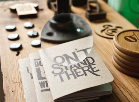
monocle is a small jQuery & jQuery UI plugin which provides an inner zoom effect on an image by dragging the magnifying glass loupe.
How to use it:
1. Include the necessary jQuery javascript library and the jQuery monocle plugin after it.
<script src="//ajax.googleapis.com/ajax/libs/jquery/1.11.1/jquery.min.js"></script>
<script src="js/monocle.js"></script>
2. Include the latest version of jQuery UI to enable draggable functionality on the magnifying glass loupe.
<script src="//ajax.googleapis.com/ajax/libs/jqueryui/1.10.4/jquery-ui.min.js"></script>
3. Insert an image into your document and enable the draggable functionality using draggable="true" attribute.
<img id="demo" src="images/1.jpg" draggable="true">
4. The required CSS to style th magnifying glass loupe.
div#lens-container.metro {
  position: absolute;
  top: 0;
  left: 0;
  height: 200px;
  width: 200px;
  border-radius: 50%;
  transition: width 0.3s, height 0.3s, margin 0.3s;
  background: #ef3c43;
  -moz-box-shadow: 0px 0px 150px rgba(0, 0, 0, 0.2);
  -webkit-box-shadow: 0px 0px 150px rgba(0, 0, 0, 0.2);
  box-shadow: 0px 0px 150px rgba(0, 0, 0, 0.2);
}

div#lens-container.metro:hover { cursor: pointer; }

div#lens-container.metro:active { cursor: none; }

div#lens-container.metro div#lens {
  position: absolute;
  width: 90%;
  height: 90%;
  top: 5%;
  left: 5%;
  border-radius: 50%;
  z-index: 1;
}

div#lens-container.metro div#lens::before {
  content: '';
  position: absolute;
  width: 50%;
  height: 20%;
  left: 25%;
  top: 5%;
  border-radius: 50%;
}

div#lens-container.metro div#lens-image-container {
  position: absolute;
  width: 90%;
  height: 90%;
  top: 5%;
  left: 5%;
  border-radius: 50%;
  overflow: hidden;
}

div#lens-container.metro div#lens-image-container img#lens-image { position: absolute; }

div#lens-container.metro div#lens { overflow: hidden; }

div#lens-container.metro div#lens::before {
  width: 90%;
  height: 90%;
  left: 5%;
  top: 5%;
  background: -moz-linear-gradient(250deg, rgba(255, 255, 255, 0.3), rgba(255, 255, 255, 0.3) 20%, rgba(255, 255, 255, 0) 20%);
  background: -webkit-linear-gradient(250deg, rgba(255, 255, 255, 0.3), rgba(255, 255, 255, 0.3) 20%, rgba(255, 255, 255, 0) 20%);
  background: linear-gradient(200deg, rgba(255, 255, 255, 0.3), rgba(255, 255, 255, 0.3) 20%, rgba(255, 255, 255, 0) 20%);
}

div#lens-container.flat {
  position: absolute;
  top: 0;
  left: 0;
  height: 200px;
  width: 200px;
  border-radius: 50%;
  transition: width 0.3s, height 0.3s, margin 0.3s;
  -moz-box-shadow: 0px 0px 1px 1px #655c3b, 0px -1px 1px 1px #efece3, 0px 3px 15px -3px black;
  -webkit-box-shadow: 0px 0px 1px 1px #655c3b, 0px -1px 1px 1px #efece3, 0px 3px 15px -3px black;
  box-shadow: 0px 0px 1px 1px #655c3b, 0px -1px 1px 1px #efece3, 0px 3px 15px -3px black;
}

div#lens-container.flat:hover { cursor: pointer; }

div#lens-container.flat:active { cursor: none; }

div#lens-container.flat div#lens {
  position: absolute;
  width: 100%;
  height: 100%;
  top: 0%;
  left: 0%;
  border-radius: 50%;
  z-index: 1;
}

div#lens-container.flat div#lens::before {
  content: '';
  position: absolute;
  width: 50%;
  height: 20%;
  left: 25%;
  top: 5%;
  border-radius: 50%;
}

div#lens-container.flat div#lens-image-container {
  position: absolute;
  width: 100%;
  height: 100%;
  top: 0%;
  left: 0%;
  border-radius: 50%;
  overflow: hidden;
}

div#lens-container.flat div#lens-image-container img#lens-image { position: absolute; }

div#lens-container.flat div#lens {
  overflow: hidden;
  -moz-box-shadow: 0px 0px 0px 1px #655c3b, 0px 0px 10px 0px rgba(201, 193, 163, 0.25) inset, 0px 0px 3px 1px rgba(201, 193, 163, 0.25) inset;
  -webkit-box-shadow: 0px 0px 0px 1px #655c3b, 0px 0px 10px 0px rgba(201, 193, 163, 0.25) inset, 0px 0px 3px 1px rgba(201, 193, 163, 0.25) inset;
  box-shadow: 0px 0px 0px 1px #655c3b, 0px 0px 10px 0px rgba(201, 193, 163, 0.25) inset, 0px 0px 3px 1px rgba(201, 193, 163, 0.25) inset;
  background: -moz-radial-gradient(center center, rgba(1, 161, 140, 0) 40%, rgba(1, 161, 140, 0.1)), -moz-radial-gradient(center center, rgba(0, 0, 0, 0) 50%, rgba(0, 0, 0, 0.3) 100%);
  background: -webkit-radial-gradient(center center, rgba(1, 161, 140, 0) 40%, rgba(1, 161, 140, 0.1)), -webkit-radial-gradient(center center, rgba(0, 0, 0, 0) 50%, rgba(0, 0, 0, 0.3) 100%);
  background: radial-gradient(center center, rgba(1, 161, 140, 0) 40%, rgba(1, 161, 140, 0.1)), radial-gradient(center center, rgba(0, 0, 0, 0) 50%, rgba(0, 0, 0, 0.3) 100%);
}

div#lens-container.flat div#lens::before {
  width: 100%;
  height: 100%;
  background: -moz-radial-gradient(center center, rgba(255, 255, 255, 0.2), rgba(255, 255, 255, 0) 70%);
  background: -webkit-radial-gradient(center center, rgba(255, 255, 255, 0.2), rgba(255, 255, 255, 0) 70%);
  background: radial-gradient(center center, rgba(255, 255, 255, 0.2), rgba(255, 255, 255, 0) 70%);
}

div#lens-container.glossy {
  position: absolute;
  top: 0;
  left: 0;
  height: 200px;
  width: 200px;
  border-radius: 50%;
  transition: width 0.3s, height 0.3s, margin 0.3s;
  background: #333333;
  background: -moz-linear-gradient(290deg, rgba(255, 255, 255, 0.5) 0%, rgba(255, 255, 255, 0.1) 50%, rgba(255, 255, 255, 0) 51%), -moz-radial-gradient(center center, #333333, #1a1a1a);
  background: -webkit-linear-gradient(290deg, rgba(255, 255, 255, 0.5) 0%, rgba(255, 255, 255, 0.1) 50%, rgba(255, 255, 255, 0) 51%), -webkit-radial-gradient(center center, #333333, #1a1a1a);
  background: linear-gradient(160deg, rgba(255, 255, 255, 0.5) 0%, rgba(255, 255, 255, 0.1) 50%, rgba(255, 255, 255, 0) 51%), radial-gradient(center center, #333333, #1a1a1a);
  -moz-box-shadow: 0px 3px 5px -3px #b3b3b3 inset, 0px -3px 5px -3px #1a1a1a inset, 0px -3px 5px -3px black inset, 0px 3px 15px -3px black, 0px 3px 1px -1px #333333, 0px 0px 1px 1px #333333;
  -webkit-box-shadow: 0px 3px 5px -3px #b3b3b3 inset, 0px -3px 5px -3px #1a1a1a inset, 0px -3px 5px -3px black inset, 0px 3px 15px -3px black, 0px 3px 1px -1px #333333, 0px 0px 1px 1px #333333;
  box-shadow: 0px 3px 5px -3px #b3b3b3 inset, 0px -3px 5px -3px #1a1a1a inset, 0px -3px 5px -3px black inset, 0px 3px 15px -3px black, 0px 3px 1px -1px #333333, 0px 0px 1px 1px #333333;
}

div#lens-container.glossy:hover { cursor: pointer; }

div#lens-container.glossy:active { cursor: none; }

div#lens-container.glossy div#lens {
  position: absolute;
  width: 90%;
  height: 90%;
  top: 5%;
  left: 5%;
  border-radius: 50%;
  z-index: 1;
}

div#lens-container.glossy div#lens::before {
  content: '';
  position: absolute;
  width: 50%;
  height: 20%;
  left: 25%;
  top: 5%;
  border-radius: 50%;
}

div#lens-container.glossy div#lens-image-container {
  position: absolute;
  width: 90%;
  height: 90%;
  top: 5%;
  left: 5%;
  border-radius: 50%;
  overflow: hidden;
}

div#lens-container.glossy div#lens-image-container img#lens-image { position: absolute; }

div#lens-container.glossy div#lens {
  -moz-box-shadow: 0px 0px 5px 0px rgba(77, 77, 77, 0.3) inset, 0px 5px 15px -5px black, 0px 0px 2px 1px black, 0px -3px 7px -3px #4d4d4d, 0px 0px 100px 0px rgba(0, 0, 0, 0.3), 0px 0px 10px 0px rgba(255, 255, 255, 0.5) inset, 0px 0px 75px 0px rgba(0, 0, 0, 0.3) inset;
  -webkit-box-shadow: 0px 0px 5px 0px rgba(77, 77, 77, 0.3) inset, 0px 5px 15px -5px black, 0px 0px 2px 1px black, 0px -3px 7px -3px #4d4d4d, 0px 0px 100px 0px rgba(0, 0, 0, 0.3), 0px 0px 10px 0px rgba(255, 255, 255, 0.5) inset, 0px 0px 75px 0px rgba(0, 0, 0, 0.3) inset;
  box-shadow: 0px 0px 5px 0px rgba(77, 77, 77, 0.3) inset, 0px 5px 15px -5px black, 0px 0px 2px 1px black, 0px -3px 7px -3px #4d4d4d, 0px 0px 100px 0px rgba(0, 0, 0, 0.3), 0px 0px 10px 0px rgba(255, 255, 255, 0.5) inset, 0px 0px 75px 0px rgba(0, 0, 0, 0.3) inset;
  background: -moz-radial-gradient(center center, rgba(1, 161, 140, 0) 40%, rgba(1, 161, 140, 0.2));
  background: -webkit-radial-gradient(center center, rgba(1, 161, 140, 0) 40%, rgba(1, 161, 140, 0.2));
  background: radial-gradient(center center, rgba(1, 161, 140, 0) 40%, rgba(1, 161, 140, 0.2));
}

div#lens-container.glossy div#lens::before {
  background: rgba(255, 255, 255, 0.3);
  background: -moz-linear-gradient(top, rgba(255, 255, 255, 0.7), rgba(255, 255, 255, 0));
  background: -webkit-linear-gradient(top, rgba(255, 255, 255, 0.7), rgba(255, 255, 255, 0));
  background: linear-gradient(to bottom, rgba(255, 255, 255, 0.7), rgba(255, 255, 255, 0));
}

div#lens-container.smooth {
  position: absolute;
  top: 0;
  left: 0;
  height: 200px;
  width: 200px;
  border-radius: 50%;
  transition: width 0.3s, height 0.3s, margin 0.3s;
  background: white;
  background: -moz-linear-gradient(top, #ffffff, #808080);
  background: -webkit-linear-gradient(top, #ffffff, #808080);
  background: linear-gradient(to bottom, #ffffff, #808080);
  -moz-box-shadow: 0px 20px 50px -20px rgba(0, 0, 0, 0.7), 0px -1px 2px -1px rgba(0, 0, 0, 0.5) inset, 0px 1px 2px -1px white inset;
  -webkit-box-shadow: 0px 20px 50px -20px rgba(0, 0, 0, 0.7), 0px -1px 2px -1px rgba(0, 0, 0, 0.5) inset, 0px 1px 2px -1px white inset;
  box-shadow: 0px 20px 50px -20px rgba(0, 0, 0, 0.7), 0px -1px 2px -1px rgba(0, 0, 0, 0.5) inset, 0px 1px 2px -1px white inset;
}

div#lens-container.smooth:hover { cursor: pointer; }

div#lens-container.smooth:active { cursor: none; }

div#lens-container.smooth div#lens {
  position: absolute;
  width: 90%;
  height: 90%;
  top: 5%;
  left: 5%;
  border-radius: 50%;
  z-index: 1;
}

div#lens-container.smooth div#lens::before {
  content: '';
  position: absolute;
  width: 50%;
  height: 20%;
  left: 25%;
  top: 5%;
  border-radius: 50%;
}

div#lens-container.smooth div#lens-image-container {
  position: absolute;
  width: 90%;
  height: 90%;
  top: 5%;
  left: 5%;
  border-radius: 50%;
  overflow: hidden;
}

div#lens-container.smooth div#lens-image-container img#lens-image { position: absolute; }

div#lens-container.smooth div#lens {
  overflow: hidden;
  z-index: 0;
  -moz-box-shadow: 0px 3px 3px -3px rgba(0, 0, 0, 0.5) inset;
  -webkit-box-shadow: 0px 3px 3px -3px rgba(0, 0, 0, 0.5) inset;
  box-shadow: 0px 3px 3px -3px rgba(0, 0, 0, 0.5) inset;
  background: -moz-linear-gradient(top, #808080, #ffffff);
  background: -webkit-linear-gradient(top, #808080, #ffffff);
  background: linear-gradient(to bottom, #808080, #ffffff);
}

div#lens-container.smooth div#lens-image-container {
  width: 85%;
  height: 85%;
  top: 7.5%;
  left: 7.5%;
  -moz-box-shadow: 0px 0px 1px #333333;
  -webkit-box-shadow: 0px 0px 1px #333333;
  box-shadow: 0px 0px 1px #333333;
}

div#lens-container.smooth div#lens-image-container::before {
  content: '';
  position: absolute;
  width: 100%;
  height: 100%;
  z-index: 3;
  border-radius: 50%;
  -moz-box-shadow: 0px 50px 50px -40px rgba(0, 0, 0, 0.5) inset, 0px 0px 15px rgba(255, 255, 255, 0.1) inset;
  -webkit-box-shadow: 0px 50px 50px -40px rgba(0, 0, 0, 0.5) inset, 0px 0px 15px rgba(255, 255, 255, 0.1) inset;
  box-shadow: 0px 50px 50px -40px rgba(0, 0, 0, 0.5) inset, 0px 0px 15px rgba(255, 255, 255, 0.1) inset;
}
5. Initialize the plugin and set the options for the magnifying glass effect.
$( document ).ready( function(){

$("#demo").monocle({

// parameters
zoom : 1.5, // level of magnification ( default is 2 )
size : "10em", // width/height of the loupe (eg "100px")
className : "smooth", // name of the CSS class to give the containing element ( defaults to 'glossy' )

// callbacks
mouseenter : function ( e ) {},
mouseleave : function ( e ) {},
drag : function ( e ) {}
});

});
This awesome jQuery plugin is developed by jonbrennecke. For more Advanced Usages, please check the demo page or visit the official website.