Mobile Friendly Bootstrap Tabs Enhancement with jQuery
| File Size: | 12.7 KB |
|---|---|
| Views Total: | 34559 |
| Last Update: | |
| Publish Date: | |
| Official Website: | Go to website |
| License: | MIT |
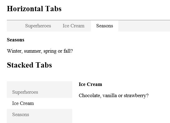
A jQuery plugin extends the Bootstrap's tabs component to make it more responsive on small screen devices. The plugin automatically converts a standard Bootstrap tabs interface into a togglable dropdown based upon specific breakpoints built in the plugin.
How to use it:
1. Load the latest jQuery library and Twitter's Bootstrap framework in your document.
<link rel="stylesheet" href="//netdna.bootstrapcdn.com/bootstrap/3.2.0/css/bootstrap.min.css">

<script src="//code.jquery.com/jquery-2.1.1.min.js"></script>
<script src="//netdna.bootstrapcdn.com/bootstrap/3.2.0/js/bootstrap.min.js"></script>
2. Load the jQuery Bootstrap Responsive Tabs plugin after jQuery library.
<link rel="stylesheet" href="path/to/bootstrap-responsive-tabs.css">
<script src="path/to/jquery.bootstrap-responsive-tabs.min.js"></script>
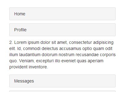
3. Create a standard tabs component using default Bootstrap 3 classes and markup.
<!-- Nav tabs -->
<ul class="nav nav-tabs responsive-tabs">
  <li class="active"><a href="#home" role="tab" data-toggle="tab">Home</a></li>
  <li><a href="#profile" role="tab" data-toggle="tab">Profile</a></li>
  <li><a href="#messages" role="tab" data-toggle="tab">Messages</a></li>
  <li><a href="#settings" role="tab" data-toggle="tab">Settings</a></li>
</ul>

<!-- Tab panes -->
<div class="tab-content">
  <div class="tab-pane active" id="home">...</div>
  <div class="tab-pane" id="profile">...</div>
  <div class="tab-pane" id="messages">...</div>
  <div class="tab-pane" id="settings">...</div>
</div>
4. Call the plugin on the navigation tabs to active the responsive Bootstrap tabs. Use accordionOn option to specify the breakpoints you wish to apply. You can also customize the breakpoints using CSS3 media queries in the bootstrap-responsive-tabs.css. Default breakpoints:
- xs: max-width: 767px
- sm: min-width: 768px and max-width: 991px
- md: min-width: 992px and max-width: 1199px
- lg: min-width: 1200px
$('.responsive-tabs').responsiveTabs({
  accordionOn: ['xs', 'sm'] // xs, sm, md, lg
});
This awesome jQuery plugin is developed by vtimbuc. For more Advanced Usages, please check the demo page or visit the official website.