Responsive & Flexible jQuery Multi-slide Slider Plugin - miSlider
| File Size: | 1.83 MB |
|---|---|
| Views Total: | 17864 |
| Last Update: | |
| Publish Date: | |
| Official Website: | Go to website |
| License: | MIT |
miSlider is a responsive, flexible and customizable jQuery & HTML5 slider plugin that displays as many slides of content as possible on your screen and enlarges the current slide with next/prev navigation.
More features:
- Fully responsive and configurable.
- Multiple sliders on one page.
- Auto play.and Carousel-like endless loop.
- Arrows & dots navigation.
- Cross-browser. Works on modern browsers and IE8+.
- Callback events supported.
How to use it:
1. Include the latest version of jQuery library in the document.
<script src="http://ajax.googleapis.com/ajax/libs/jquery/1.11.0/jquery.min.js"></script>
2. Include the JQuery miSlider plugin's files after jQuery library.
<link href="styles/mislider.css" rel="stylesheet" type="text/css" />
<script src="scripts/mislider.js" type="text/javascript"></script>
3. Create the slide elements for your slider following the markup structure like this.
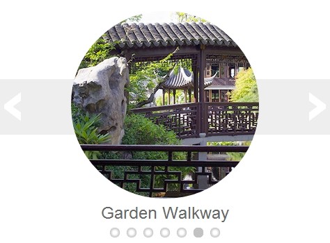
<div class="mis-stage">
<!-- The element to select and apply miSlider to - the class is optional -->
<ol class="mis-slider">
<!-- The slider element - the class is optional -->
<li class="mis-slide">
<!-- A slide element - the class is optional -->
<a href="#" class="mis-container">
<!-- A slide container - this element is optional, if absent the plugin adds it automatically -->
<figure>
<!-- Slide content - whatever you want -->
<img src="images/garden01.jpg" alt="Pink Water Lillies">
<figcaption>Pink Water Lillies</figcaption>
</figure>
</a> </li>
<li class="mis-slide"> <a href="#" class="mis-container">
<figure> <img src="images/garden02.jpg" alt="Pond with Lillies">
<figcaption>Pond with Lillies</figcaption>
</figure>
</a> </li>
<li class="mis-slide"> <a href="link" class="mis-container">
<figure> <img src="images/garden03.jpg" alt="Hidden Pond">
<figcaption>Hidden Pond</figcaption>
</figure>
</a> </li>
<li class="mis-slide"> <a href="#" class="mis-container">
<figure> <img src="images/garden04.jpg" alt="Shrine">
<figcaption>Shrine</figcaption>
</figure>
</a> </li>
<li class="mis-slide"> <a href="#" class="mis-container">
<figure> <img src="images/garden05.jpg" alt="White Water Lillies">
<figcaption>White Water Lillies</figcaption>
</figure>
</a> </li>
<li class="mis-slide"> <a href="#" class="mis-container">
<figure> <img src="images/garden06.jpg" alt="Garden Walkway">
<figcaption>Garden Walkway</figcaption>
</figure>
</a> </li>
<li class="mis-slide"> <a href="#" class="mis-container">
<figure> <img src="images/garden07.jpg" alt="Lilly with Bee">
<figcaption>Lilly with Bee</figcaption>
</figure>
</a> </li>
</ol>
</div>
4. Sample CSS to custom the styles of your slider.
.mis-stage {
background-color: #fff;
}
.mis-slider {
margin-top: 138px;
height: 80px;
background-color: #eee;
}
.mis-slider li a {
text-decoration: none;
color: #666;
display: block;
}
.mis-slider li figcaption {
font-size: 1.5em;
}
.mis-slider li img {

max-width: 270px;
width: 100%;
border-radius: 135px;
border: none;
}
.mis-slide {
width: 360px;
height: 360px;
padding: 40px;
margin-top: -138px
}
.mis-nav-buttons a {
color: #fff;
}
5. Initialize the plugin and setup the slider whatever you like.
<script type="text/javascript">
jQuery(function ($) {
var slider = $('.mis-stage').miSlider({
stageHeight: 380,
slidesOnStage: false,
slidePosition: 'center',
slideStart: 'mid',
slideScaling: 150,
offsetV: -5,
centerV: true,
navButtonsOpacity: 1,
});
});
</script>
6. All the default config options and callback events.
var slider = $('.mis-stage').miSlider({

  // The speed of the slide transition in milliseconds. Options: positive integer.
  speed: 700,

  // slide pause time between transitions in milliseconds.
  // Options: false, positive integer. false = Autoplay off.
  pause: 4000,

  // The number of slides to increment with Autoplay and Nav Buttons.
  // Options: positive or negative integer. Positive integer = Slide left.
  // Negative integer = Slide right.
  increment: 1,

  // The height of the stage in px. Options: false or positive integer.
  // false = height is calculated using maximum slide heights.
  stageHeight: false,

  // Number of slides visible at one time. Options: false or positive integer.
  // false = Fit as many as possible.
  slidesOnStage: 1,

  // Continuous motion - Boolean. true = slides loop in one direction if possible.
  slidesContinuous: true,

  // The location of the current slide on the stage. Options: "left", "right", "center".
  slidePosition: "left",

  // The slide to start on. Options: "beg", "mid", "end"
  // or slide number starting at 1 - "1","2","3", etc.
  slideStart: "beg",

  // The width of the current slide in px. Options: false or positive integer.
  // false = width is the maximum of the existing slide widths.
  slideWidth: false,

  // The relative percentage scaling factor of the current slide
  // other slides are scaled down. Options: positive number 100 or higher. 100 = No scaling.
  slideScaling: 100,

  // The vertical offset of the slide center as a percentage of slide height.
  // Options:  positive or negative number. Neg value = up. Pos value = down. 0 = No offset.
  offsetV: 0,

  // Center slide contents vertically - Boolean.
  centerV: false,

  // Transition to clicked slide instead of visting URL
  // Boolean.
  slideClickable: true,

  // Enable numbered list navigation - Boolean.
  navList: true,

  // Enable prev and next button navigation - Boolean.
  navButtons: true,

  // Always show prev and next button navigation except when transitioning - Boolean.
  navButtonsShow: false,

  // Opacity of the prev and next button navigation when not transitioning.
  // Options: Number between 0 and 1. 0 (transparent) - 1 (opaque).
  navButtonsOpacity: 0.5,

  // Randomize the order of the slides - Boolean.
  randomize: false,

  // The slides loaded call back function - called when slides have loaded.
  slidesLoaded: false,

  // The slide transition before call back function - called before the slide transition.
  beforeTrans: false,

  // The slide transition complete call back function
  // called at the end of a slide transition.
  afterTrans: false,

  // The CSS class that will be applied to the stage element.
  classStage: "mis-stage",

  // The CSS class that will be applied to the slider element.
  classSlider: "mis-slider",

  // The CSS class that will be applied to each slide element.
  classSlide: "mis-slide",

  // The CSS class that will be applied to the parent of the
  // prev and next button navigation elements.
  classNavButtons: "mis-nav-buttons",

  // The CSS class that will be applied to the parent of the
  // numbered list navigation elements
  classNavList: "mis-nav-list",

  // The selector used to select the slider element - Descendant of the stage
  selectorSlider: "ol",

  // The selector used to select each slide element - Descendant of the slider
  selectorSlide: "li"

});
Change logs:
2016-12-15
- Updates to v0.1.14.
2015-06-30
- Updates to v0.1.12.
2015-05-14
- Updates to v0.1.11.
2015-04-14
- Updates to v0.1.10.
2015-03-04
- Updates to v0.1.9.
2014-06-18
- Updates to v0.1.7.
2014-05-18
- Updates to readme and samples
This awesome jQuery plugin is developed by jbowyers. For more Advanced Usages, please check the demo page or visit the official website.


