Mobile-First jQuery Carousel Plugin - Neutron Slider
| File Size: | 37.6 KB |
|---|---|
| Views Total: | 247 |
| Last Update: | |
| Publish Date: | |
| Official Website: | Go to website |
| License: | MIT |

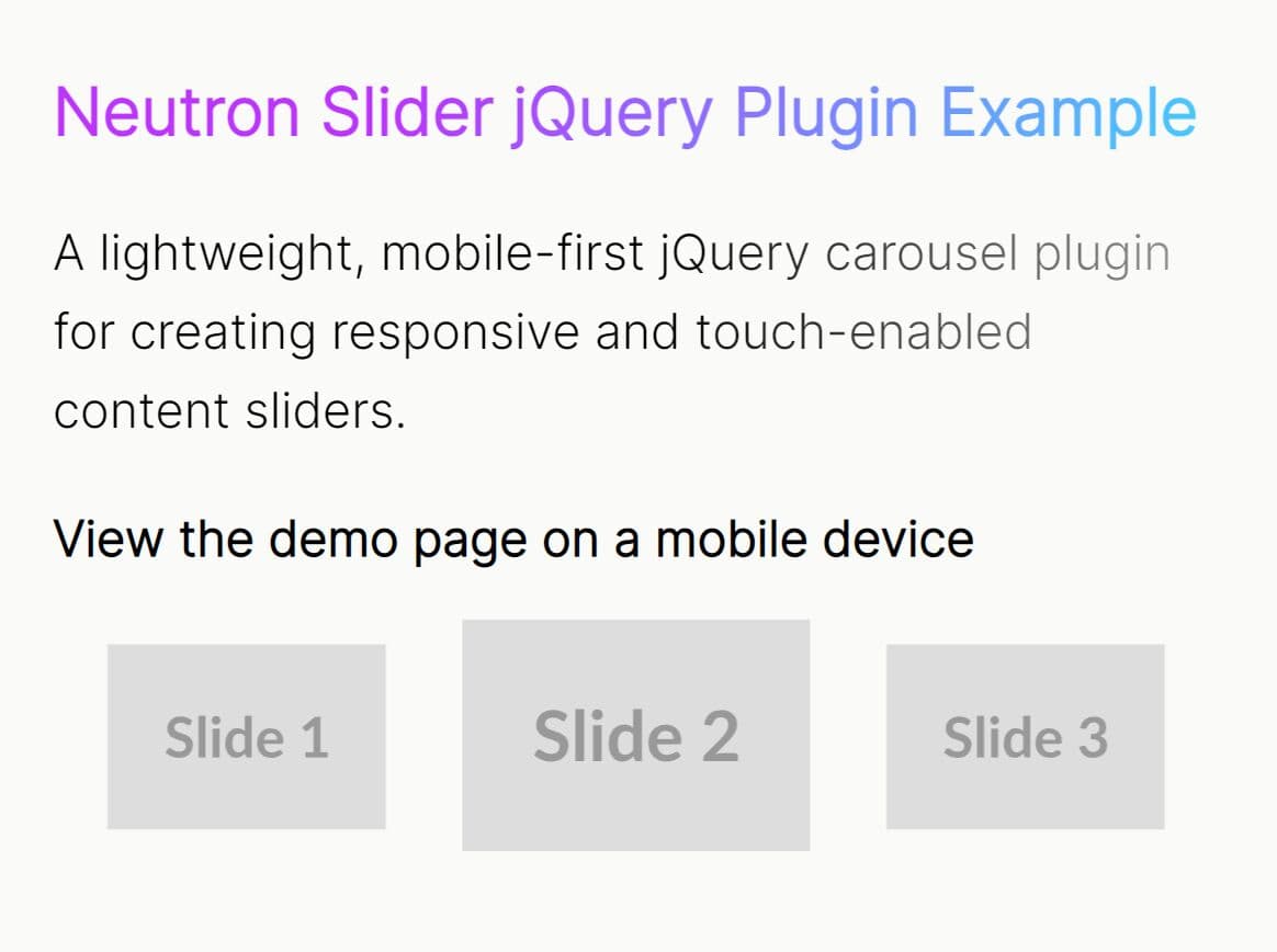
Neutron Slider is a mobile-first jQuery slider plugin that helps you create modern, responsive, touch-enabled carousels with smooth transitions.
Features:
- Mobile-first responsive design: Adapts automatically to different screen sizes with configurable breakpoints.
- Touch and swipe support: Native gesture handling for mobile devices with velocity-based scrolling.
- Center mode functionality: Highlights the active slide while showing previews of adjacent slides.
- Infinite looping capability: Seamless continuous scrolling with proper clone management.
- Autoplay with pause controls: Automatic progression with hover-to-pause functionality.
- Accessibility features: Full keyboard navigation and ARIA attributes for screen readers.
- Adaptive height option: Dynamic container sizing based on current slide content.
- Custom navigation elements: Support for external arrows and dot indicators.
- Callback Functions: Hooks for
onInit,onBeforeChange, andonAfterChangeevents to extend functionality.
How to use it:
1. Install & download the plugin with NPM.
# Yarn
$ yarn add neutron-slider

# NPM
$ npm install neutron-slider
2. Include the Neutron Slider plugin's files on the webpage.
<link rel="stylesheet" href="/path/to/index.css">
<script src="/path/to/cdn/jquery.min.js"></script>
<script src="/path/to/dist/index.umd.js"></script>
3. Create your HTML structure with a container and slide elements.
<div class="slider-container">
  <div class="neutron-slider">
    <div><img src="1.jpg"></div>
    <div><img src="2.jpg"></div>
    <div><img src="3.jpg"></div>
    ...
  </div>
</div>
4. Initialize the carousel slider with your desired configuration.
$(document).ready(function(){
  $('.neutron-slider').neutronSlider({
    slidesToShow: 3,
    centerMode: true,
    gap:20,
    dots: false,
    loop: true,
    autoplay: true
  });
});
5. All available configuration options.
slidesToShow: (number, default:1) - Sets the number of slides to display at one time.slidesToScroll: (number, default:1) - Defines how many slides to move when navigating.gap: (number, default:0) - Specifies the space between slides in pixels.centerMode: (boolean, default:false) - Enables a mode where the active slide is centered, with partial views of the previous and next slides.centerClass: (string, default:'center-slide') - The CSS class applied to the active slide whencenterModeis true.loop: (boolean, default:true) - Enables infinite looping of the slides.initialSlide: (number, default:0) - The index of the slide to start on when the slider is first initialized.duration: (number, default:500) - The speed of the slide transition animation in milliseconds.autoplay: (boolean, default:false) - When true, the slider will automatically transition through slides.autoplaySpeed: (number, default:3000) - The time in milliseconds to wait between automatic slide transitions.pauseOnHover: (boolean, default:true) - Pauses the autoplay functionality when the mouse cursor is over the slider.adaptiveHeight: (boolean, default:false) - Automatically adjusts the slider's height to match the height of the currently active slide.accessibility: (boolean, default:true) - Enables keyboard navigation (left/right arrows) and adds ARIA attributes for screen readers.prevArrow: (string | JQuery | null, default:null) - A CSS selector or jQuery object for a custom "previous" navigation arrow.nextArrow: (string | JQuery | null, default:null) - A CSS selector or jQuery object for a custom "next" navigation arrow.dots: (boolean, default:false) - Toggles the visibility of the dot navigation at the bottom of the slider.dotsClass: (string, default:'neutron-dots') - The CSS class applied to the container of the navigation dots.appendDots: (string | JQuery | null, default:null) - Specifies an element to which the navigation dots should be appended. Defaults to the slider container itself.customPaging: (function, default: a function that creates a button) - A function that allows you to create custom HTML for each navigation dot.responsive: (array, default:[]) - An array of objects to define different settings at specific breakpoints. Each object should contain abreakpoint(in pixels) and asettingsobject.onInit: (function | null, default:null) - A callback function that fires once the slider has been initialized.onBeforeChange: (function | null, default:null) - A callback that executes just before a slide transition begins.onAfterChange: (function | null, default:null) - A callback that runs after a slide transition has completed.onDuringChange: (function | null, default:null) - A callback that fires repeatedly during the slide transition animation.
$('.neutron-slider').neutronSlider({
  slidesToShow: 1,
  slidesToScroll: 1,
  centerMode: false,
  autoplay: false,
  autoplaySpeed: 3000,
  duration: 500,
  responsive: [],
  prevArrow: null,
  nextArrow: null,
  loop: true,
  dots: false,
  pauseOnHover: true,
  dotsClass: "neutron-dots",
  customPaging: (slider, i) => {
    return $('<button type="button"></button>').text(i + 1);
  },
  accessibility: true,
  adaptiveHeight: false,
  initialSlide: 0,
  /**
   * The space between slides in pixels.
   * @type {number}
   */
  gap: 0,
  /**
   * Class to add to the centered slide.
   * @type {string}
   */
  centerClass: "center-slide",
  /**
   * Fires after the slider is initialized.
   * @param {object} slider The slider instance.
   */
  onInit: null,
  appendDots: null,
  /**
   * Fires before a slide changes.
   * @param {number} oldSlide Index of the current slide.
   * @param {number} newSlide Index of the next slide.
   */
  onBeforeChange: null,
  /**
   * Fires after a slide changes.
   * @param {number} currentSlide Index of the current slide.
   */
  onAfterChange: null,
  /**
   * Fires repeatedly during the slide transition animation.
   * The interval is roughly 60fps.
   *
   * @param {object} slider The slider instance.
   */
  onDuringChange: null,
});
6. The responsive option allows different settings at various screen sizes:
$('.neutron-slider').neutronSlider({
  slidesToShow: 3,
  responsive: [
    {
      breakpoint: 768,
      settings: {
        slidesToShow: 2
      }
    },
    {
      breakpoint: 480,
      settings: {
        slidesToShow: 1
      }
    }
  ]
});
7. API methods.
const $slider = $('.neutron-slider');

// Go to the next slide
$slider.neutronSlider('next');

// Go to the previous slide
$slider.neutronSlider('prev');

// Go to a specific slide (zero-based index)
$slider.neutronSlider('goTo', 2);

// Start or stop autoplay
$slider.neutronSlider('startAutoplay');
$slider.neutronSlider('stopAutoplay');
This awesome jQuery plugin is developed by AbuBakkarSiddiqueAni. For more Advanced Usages, please check the demo page or visit the official website.


