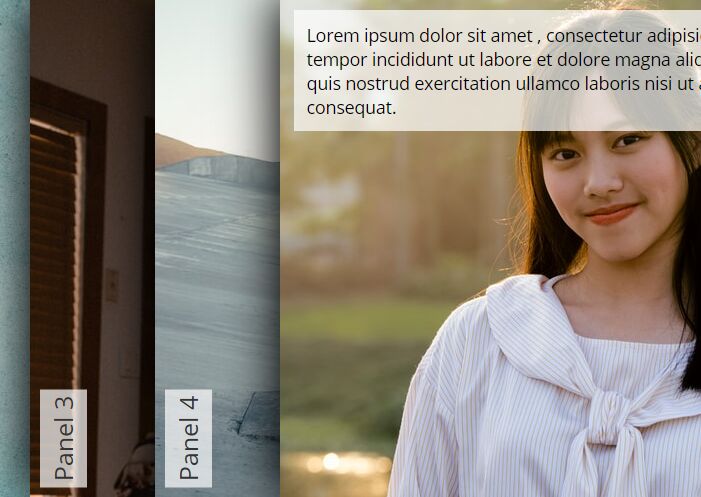
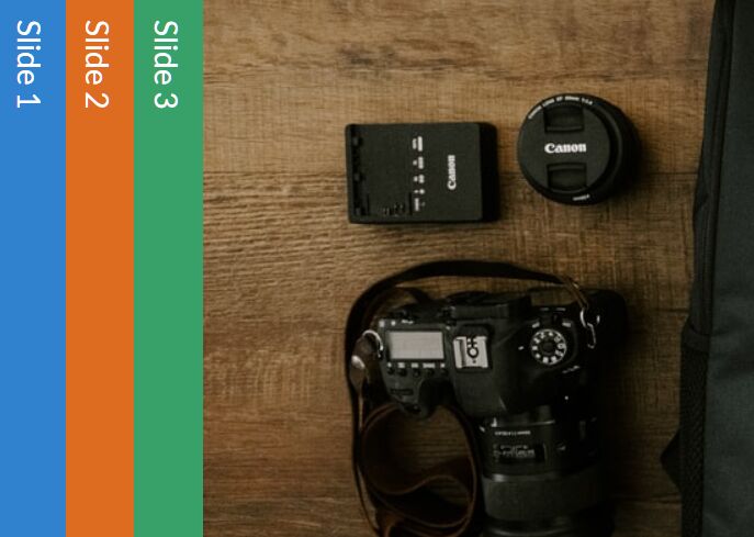
Responsive Accordion Slider With jQuery And CSS3
| File Size: | 2.63 KB |
|---|---|
| Views Total: | 22386 |
| Last Update: | |
| Publish Date: | |
| Official Website: | Go to website |
| License: | MIT |
A fancy, responsive, animated, hover-triggered accordion slider built with jQuery, JavaScript, CSS flexbox and CSS3 animations.
How to use it:
1. Add your own slides together with the content loader to the accordion slider:
<div class="flex-container">
<div class="spinner"><p>
<div class="cube1"></div>
<div class="cube2"></div>
Loading...
</p>
</div>
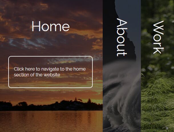
<div class="flex-slide home">
<div class="flex-title flex-title-home">Home</div>
<div class="flex-about flex-about-home"><p>Click here to navigate to the home section of the website</p></div>
</div>
<div class="flex-slide about">
<div class="flex-title">About</div>
<div class="flex-about"><p>Click here to navigate to the About section of the website</p></div>
</div>
<div class="flex-slide work">
<div class="flex-title">Work</div>
<div class="flex-about"><p>Listing relevant snippets of work:</p></div>
</div>
<div class="flex-slide contact">
<div class="flex-title">Contact</div>
<div class="flex-about"><p>Use the contact form below</p></div>
</div>
</div>
2. The primary CSS/CSS3 rules for the accordion slider.
.flex-container {
  position: absolute;
  height: 100vh;
  width: 100%;
  display: -webkit-flex;
  /* Safari */
  display: flex;
  overflow: hidden;
}

@media screen and (max-width: 768px) {

.flex-container { flex-direction: column; }
}

.flex-title {
  color: #f1f1f1;
  position: relative;
  font-size: 6vw;
  margin: auto;
  text-align: center;
  transform: rotate(90deg);
  top: 15%;
  -webkit-transition: all 500ms ease;
  -moz-transition: all 500ms ease;
  -ms-transition: all 500ms ease;
  -o-transition: all 500ms ease;
  transition: all 500ms ease;
}

@media screen and (max-width: 768px) {

.flex-title { transform: rotate(0deg) !important; }
}

.flex-about {
  opacity: 0;
  color: #f1f1f1;
  position: relative;
  width: 70%;
  font-size: 2vw;
  padding: 5%;
  top: 20%;
  border: 2px solid #f1f1f1;
  border-radius: 10px;
  line-height: 1.3;
  margin: auto;
  text-align: left;
  transform: rotate(0deg);
  -webkit-transition: all 500ms ease;
  -moz-transition: all 500ms ease;
  -ms-transition: all 500ms ease;
  -o-transition: all 500ms ease;
  transition: all 500ms ease;
}

@media screen and (max-width: 768px) {

.flex-about {
  padding: 0%;
  border: 0px solid #f1f1f1;
}
}

.flex-slide {
  -webkit-flex: 1;
  /* Safari 6.1+ */
  -ms-flex: 1;
  /* IE 10 */
  flex: 1;
  cursor: pointer;
  -webkit-transition: all 500ms ease;
  -moz-transition: all 500ms ease;
  -ms-transition: all 500ms ease;
  -o-transition: all 500ms ease;
  transition: all 500ms ease;
}

@media screen and (max-width: 768px) {

.flex-slide {
  overflow: auto;
  overflow-x: hidden;
}
}

@media screen and (max-width: 768px) {

.flex-slide p { font-size: 2em; }
}

@media screen and (max-width: 768px) {

.flex-slide ul li { font-size: 2em; }
}

.flex-slide:hover {
  -webkit-flex-grow: 3;
  flex-grow: 3;
}

.home {
  height: 100vh;
  background: linear-gradient(rgba(0, 0, 0, 0.5), rgba(0, 0, 0, 0.5)), url(https://s3-us-west-2.amazonaws.com/s.cdpn.io/769286/lake-macquarie-71208_1920.jpg);
  background-size: cover;
  background-position: center center;
  background-attachment: fixed;
}

@media screen and (min-width: 768px) {

.home {
  -moz-animation: aboutFlexSlide;
  -moz-animation-duration: 3s;
  -moz-animation-iteration-count: 1;
  -moz-animation-delay: 0s;
  -webkit-animation: aboutFlexSlide;
  -webkit-animation-duration: 3s;
  -webkit-animation-iteration-count: 1;
  -webkit-animation-delay: 0s;
  animation: aboutFlexSlide;
  animation-duration: 3s;
  animation-iteration-count: 1;
  animation-delay: 0s;
}
}

@keyframes
aboutFlexSlide {  0% {
 -webkit-flex-grow: 1;
 flex-grow: 1;
}
 50% {
 -webkit-flex-grow: 3;
 flex-grow: 3;
}
 100% {
 -webkit-flex-grow: 1;
 flex-grow: 1;
}
}

@media screen and (min-width: 768px) {

.flex-title-home {
  transform: rotate(90deg);
  top: 15%;
  -moz-animation: homeFlextitle;
  -moz-animation-duration: 3s;
  -moz-animation-iteration-count: 1;
  -moz-animation-delay: 0s;
  -webkit-animation: homeFlextitle;
  -webkit-animation-duration: 3s;
  -webkit-animation-iteration-count: 1;
  -webkit-animation-delay: 0s;
  animation: homeFlextitle;
  animation-duration: 3s;
  animation-iteration-count: 1;
  animation-delay: 0s;
}
}

@keyframes
homeFlextitle {  0% {
 transform: rotate(90deg);
 top: 15%;
}
 50% {
 transform: rotate(0deg);
 top: 15%;
}
 100% {
 transform: rotate(90deg);
 top: 15%;
}
}

.flex-about-home { opacity: 0; }

@media screen and (min-width: 768px) {

.flex-about-home {
  -moz-animation: flexAboutHome;
  -moz-animation-duration: 3s;
  -moz-animation-iteration-count: 1;
  -moz-animation-delay: 0s;
  -webkit-animation: flexAboutHome;
  -webkit-animation-duration: 3s;
  -webkit-animation-iteration-count: 1;
  -webkit-animation-delay: 0s;
  animation: flexAboutHome;
  animation-duration: 3s;
  animation-iteration-count: 1;
  animation-delay: 0s;
}
}

@keyframes
flexAboutHome {  0% {
 opacity: 0;
}
 50% {
 opacity: 1;
}
 100% {
 opacity: 0;
}
}

.about {
  background: linear-gradient(rgba(0, 0, 0, 0.5), rgba(0, 0, 0, 0.5)), url(https://s3-us-west-2.amazonaws.com/s.cdpn.io/769286/beach-2089959_1280.jpg);
  background-size: cover;
  background-position: center center;
  background-attachment: fixed;
}
3. The CSS/CSS3 rules for the content loading animations.
.spinner {
  position: fixed;
  top: 0;
  left: 0;
  background: #222;
  height: 100%;
  width: 100%;
  z-index: 11;
  margin-top: 0;
  color: #fff;
  font-size: 1em;
}

.cube1, .cube2 {
  background-color: #fff;
  width: 15px;
  height: 15px;
  position: absolute;
  top: 0;
  left: 0;
  -webkit-animation: sk-cubemove 1.8s infinite ease-in-out;
  animation: sk-cubemove 1.8s infinite ease-in-out;
}

.cube2 {
  -webkit-animation-delay: -0.9s;
  animation-delay: -0.9s;
}

@-webkit-keyframes
sk-cubemove {  25% {
 -webkit-transform: translateX(42px) rotate(-90deg) scale(0.5);
}
 50% {
 -webkit-transform: translateX(42px) translateY(42px) rotate(-180deg);
}
 75% {
 -webkit-transform: translateX(0px) translateY(42px) rotate(-270deg) scale(0.5);
}
 100% {
 -webkit-transform: rotate(-360deg);
}
}

@keyframes
sk-cubemove {  25% {
 transform: translateX(42px) rotate(-90deg) scale(0.5);
 -webkit-transform: translateX(42px) rotate(-90deg) scale(0.5);
}
 50% {
 transform: translateX(42px) translateY(42px) rotate(-179deg);
 -webkit-transform: translateX(42px) translateY(42px) rotate(-179deg);
}
 50.1% {
 transform: translateX(42px) translateY(42px) rotate(-180deg);
 -webkit-transform: translateX(42px) translateY(42px) rotate(-180deg);
}
 75% {
 transform: translateX(0px) translateY(42px) rotate(-270deg) scale(0.5);
 -webkit-transform: translateX(0px) translateY(42px) rotate(-270deg) scale(0.5);
}
 100% {
 transform: rotate(-360deg);
 -webkit-transform: rotate(-360deg);
}
}
4. Include the necessary jQuery library at the bottom of the web page.
<script src="//code.jquery.com/jquery-3.2.1.min.js"></script>
5. Include the jQuery waitForImages plugin to detect if images have been loaded.
<script src="//cdnjs.cloudflare.com/ajax/libs/jquery.waitforimages/2.2.0/jquery.waitforimages.min.js"></script>
6. The JavaScript to enable the accordion slider.
(function(){
    $('.flex-container').waitForImages(function() {
      $('.spinner').fadeOut();
  }, $.noop, true);

  $(".flex-slide").each(function(){
    $(this).hover(function(){
      $(this).find('.flex-title').css({
        transform: 'rotate(0deg)',
        top: '10%'
      });
      $(this).find('.flex-about').css({
        opacity: '1'
      });
    }, function(){
      $(this).find('.flex-title').css({
        transform: 'rotate(90deg)',
        top: '15%'
      });
      $(this).find('.flex-about').css({
        opacity: '0'
      });
    })
  });
})();
This awesome jQuery plugin is developed by Cameron Fitzwilliam. For more Advanced Usages, please check the demo page or visit the official website.