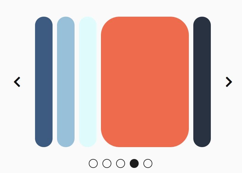
Desktop & Mobile Accordion Slider For Bootstrap 4
| File Size: | 4.05 KB |
|---|---|
| Views Total: | 3139 |
| Last Update: | |
| Publish Date: | |
| Official Website: | Go to website |
| License: | MIT |
A tiny jQuery script to help you create horizontal (desktop) and vertical (mobile) accordion sliders using Bootstrap 4's styles.
Features:
- Responsive Design.
- Auto switch between slides.
- Image zoom in/out effects.
How to use it:
1. Insert the necessary JavaScript and CSS files into the document.
<!-- Bootstrap 4 -->
<link rel="stylesheet" href="/path/to/cdn/bootstrap.min.css" />
<!-- jQuery Library -->
<script src="/path/to/cdn/jquery.min.js"></script>
<!-- Accordion Slider -->
<link rel="stylesheet" href="style.css" />
<script src="main.js"></script>
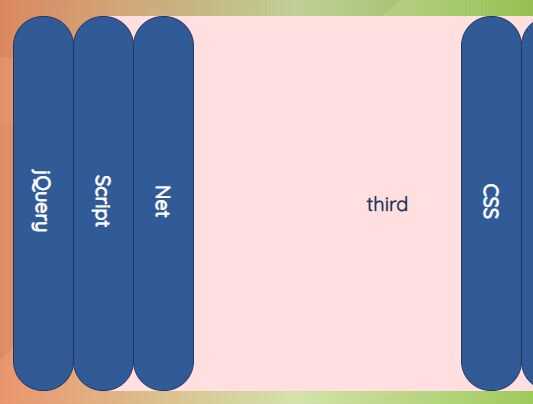
2. The HTML structure for desktop accordion slider.
<div class="slider-wrapper d-none d-md-block">
  <div data-index="0" class="slider d-flex first" style="z-index: 1">
    <h4 class="title h-100" style="background-color: blue">Slide 1</h4>
    <a href="#">
      <img
        src="1.jpg"
        alt=""
      />
    </a>
  </div>
  <div data-index="1" class="slider d-flex" style="z-index: 2; left: calc(100% - (3 * 50px))">
    <h4 class="title h-100" style="background-color: orange">Slide 2</h4>
    <a href="#">
      <img
        src="2.jpg"
        alt=""
      />
    </a>
  </div>
  <div data-index="2" class="slider d-flex" style="z-index: 3; left: calc(100% - (2 * 50px))">
    <h4 class="title h-100" style="background-color: green">Slide 3</h4>
    <a href="#">
      <img
        src="3.jpg"
        alt=""
      />
    </a>
  </div>
  <div data-index="3" class="slider d-flex" style="z-index: 4; left: calc(100% - (1 * 50px))">
    <h4 class="title h-100" style="background-color: red">Slide 4</h4>
    <a href="#">
      <img
        src="4.jpg"
        alt=""
      />
    </a>
  </div>
</div>
3. The HTML structure for mobile accordion slider.
<div class="mobile-slider-wrapper d-block d-md-none">
  <div data-index="0" class="m-slider d-flex flex-column first" style="z-index: 1">
    <h4 class="title" style="background-color: blue">Slide 1</h4>
    <a href="#">
      <img
        src="1.jpg"
        alt=""
      />
    </a>
  </div>
  <div
    data-index="1"
    class="m-slider d-flex flex-column"
    style="z-index: 2; top: calc(100% - (3 * 50px))"
  >
    <h4 class="title" style="background-color: orange">Slide 2</h4>
    <a href="#">
      <img
        src="2.jpg"
        alt=""
      />
    </a>
  </div>
  <div
    data-index="2"
    class="m-slider d-flex flex-column"
    style="z-index: 2; top: calc(100% - (2 * 50px))"
  >
    <h4 class="title" style="background-color: green">Slide 3</h4>
    <a href="#">
      <img
        src="3.jpg"
        alt=""
      />
    </a>
  </div>
  <div data-index="3" class="slider d-flex" style="z-index: 4; left: calc(100% - (1 * 50px))">
    <h4 class="title h-100" style="background-color: red">Slide 4</h4>
    <a href="#">
      <img
        src="4.jpg"
        alt=""
      />
    </a>
  </div>
</div>
This awesome jQuery plugin is developed by tomise20. For more Advanced Usages, please check the demo page or visit the official website.