Mobile-friendly News Ticker with jQuery and CSS3 - Responsive Ticker
| File Size: | 6.79 KB |
|---|---|
| Views Total: | 47908 |
| Last Update: | |
| Publish Date: | |
| Official Website: | Go to website |
| License: | MIT |

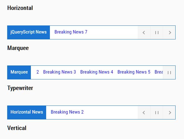
Responsive Ticker is a lightweight jQuery plugin used to create a fully responsive news ticker on the webpage that works perfectly on both desktop and mobile devices.
Features:
- Scroll through a list of news vertically and horizontally.
- Auto convert between horizontal and vertical layouts based on the screen size.
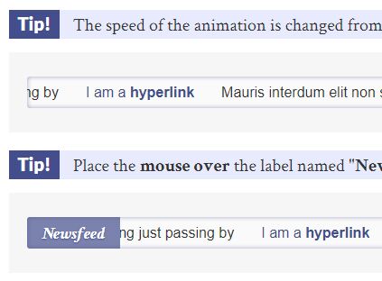
- Pause auto-scroll on mouse hover.
How to use it:
1. Load the stylesheet ticker.css in the head that will provide the basic CSS styles for the news ticker.
<link rel="stylesheet" href="ticker.css">
2. Build the html structure for the news ticker.
<div class="ticker-container">
<div class="ticker-caption">
<p>Breaking News</p>
</div>
<ul>
<div>
<li><span>Breaking News 1 – <a href="#">read more</a></span></li>
</div>
<div>
<li><span>Breaking News 2 – <a href="#">read more</a></span></li>
</div>
<div>
<li><span>Breaking News 3 – <a href="#">read more</a></span></li>
</div>
<div>
<li><span>Breaking News 4 – <a href="#">read more</a></span></li>
</div>
<div>
<li><span>Breaking News 5 – <a href="#">read more</a></span></li>
</div>
</ul>
</div>
3. Load the ticker.js script after jQuery library but before the closing body tag. That's it.
<script src="/path/to/jquery.min.js"></script>
<script src="ticker.js"></script>
This awesome jQuery plugin is developed by sburtenshaw. For more Advanced Usages, please check the demo page or visit the official website.