Nifty On Hover Blur Effect with jQuery and CSS3 - Box Blur
| File Size: | 3.28 KB |
|---|---|
| Views Total: | 6642 |
| Last Update: | |
| Publish Date: | |
| Official Website: | Go to website |
| License: | MIT |
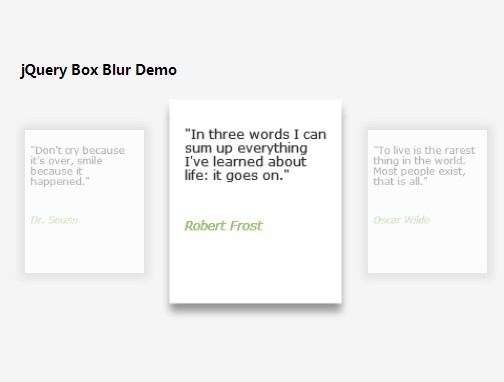
A blur effect built in jQuery and CSS3 that enlarges/highlights the hovered container to focus your users on the current content, and blurring the other containers.
How to use it:
1. Create a set of containers and wrap them into a parent element.
<section class="inner-container" id="inner-container">

  <article>
    <p> Your content goes here </p>
  </article>

  <article>
    <p> Your content goes here </p>
  </article>

  <article>
    <p> Your content goes here </p>
  </article>

  ...

</section>
2. The required CSS styles for the blur and transition effects.
.inner-container,
.container {
  position: relative;
  width: 930px;
  margin: 30px auto;
}

.inner-container:before,
.inner-container:after {
  content: "";
  display: table;
}

.inner-container:after { clear: both; }

.inner-container article {
  display: block;
  width: 180px;
  height: 220px;
  background: #fff;
  cursor: pointer;
  float: left;
  border: 10px solid white;
  text-align: left;
  text-transform: none;
  margin: 15px;
  z-index: 1;
  -webkit-backface-visibility: hidden;
  box-shadow: 0px 0px 0px 10px rgba(255,255,255,1), 1px 1px 3px 10px rgba(0,0,0,0.2);
  -webkit-transition: opacity 0.4s linear, -webkit-transform 0.4s ease-in-out, box-shadow 0.4s ease-in-out;
}

.inner-container article p {
  font-family: Verdana, sans-serif;
  font-size: 11px;
  line-height: 18px;
  color: #333;
  text-shadow: 0px 0px 0px #000;
  opacity: 0.8;
}

.inner-container p {
  -webkit-transition: opacity 0.2s linear, text-shadow 0.5s ease-in-out, color 0.5s ease-in-out;
  -moz-transition: opacity 0.2s linear, text-shadow 0.5s ease-in-out, color 0.5s ease-in-out;
  -o-transition: opacity 0.2s linear, text-shadow 0.5s ease-in-out, color 0.5s ease-in-out;
  -ms-transition: opacity 0.2s linear, text-shadow 0.5s ease-in-out, color 0.5s ease-in-out;
  transition: opacity 0.2s linear, text-shadow 0.5s ease-in-out, color 0.5s ease-in-out;
}

.inner-container article.blur {
  box-shadow: 0px 0px 20px 10px #ddd;
  -webkit-transform: scale(0.8);
  -moz-transform: scale(0.8);
  -ms-transform: scale(0.8);
  -o-transform: scale(0.8);
  transform: scale(0.8);
  opacity: 0.7;
}

.inner-container article.blur p {
 text-shadow: 0px 0px 10px rgba(51,51,51, 0.9) color : rgba(51, 51, 51, 0); opacity: 0.5; }

.inner-container article.active {
  -webkit-transform: scale(1.05);
  -moz-transform: scale(1.05);
  -ms-transform: scale(1.05);
  -o-transform: scale(1.05);
  transform: scale(1.05);
  box-shadow: 0px 0px 0px 10px rgba(255,255,255,1), 1px 11px 15px 10px rgba(0,0,0,0.4);
  z-index: 100;
  opacity: 1;
}

.inner-container article.active p { opacity: 1; }
3. Include the latest version of jQuery library at the end of the document.
<script src="//ajax.googleapis.com/ajax/libs/jquery/1.11.1/jquery.min.js"></script>
4. The jQuery script to active the on hover blur effect.
$(document).ready(function() {
var $container = $("#inner-container"), $articles = $container.children("article"), timeout;

$articles.on('mouseenter', function(event) {
var $article = $(this);
clearTimeout(timeout);
timeout = setTimeout(function() {
if ($article.hasClass('active')) return false;
$articles.not($article).removeClass('active').addClass('blur');
$article.removeClass('blur').addClass('active');
}, 75);
$container.on('mouseleave', function(event) {
clearTimeout(timeout);
$articles.removeClass('active blur');
});
});
});
This awesome jQuery plugin is developed by jeanlouocean. For more Advanced Usages, please check the demo page or visit the official website.