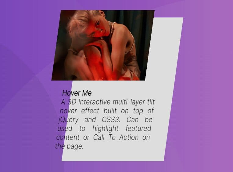
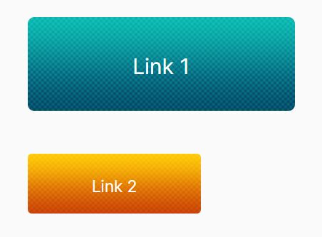
Stylish Button Hover Effect With jQuery And CSS3
| File Size: | 5.17 KB |
|---|---|
| Views Total: | 3970 |
| Last Update: | |
| Publish Date: | |
| Official Website: | Go to website |
| License: | MIT |
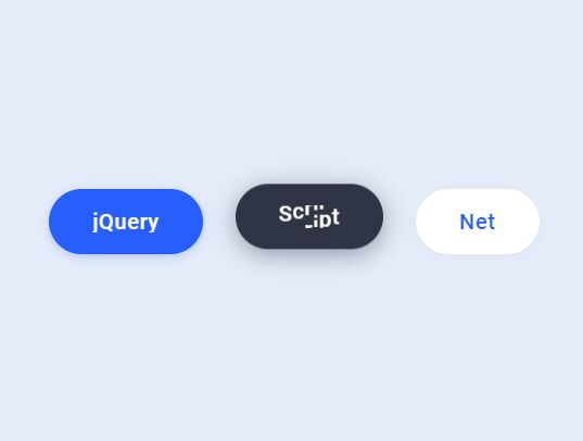
A stylish button hover effect that animates the button text character by character on hover by using jQuery and CSS3 transitions & transforms.
See It In Action:
See the Pen Button Hover Effects by Aaron Iker (@aaroniker) on CodePen.
How to use it:
1. Create a button on the page.
<a href="" class="button">
  Button Text Here
</a>
2. The necessary CSS styles for the button & hover effect.
.button {
  --background: #275efe;
  --text: #fff;
  --font-size: 16px;
  --duration: .44s;
  --move-hover: -4px;
  --shadow: 0 2px 8px -1px rgba(39, 94, 254, 0.32);
  --shadow-hover: 0 4px 20px -2px rgba(39, 94, 254, 0.5);
  --font-shadow: var(--font-size);
  padding: 16px 32px;
  font-family: 'Roboto';
  font-weight: 500;
  line-height: var(--font-size);
  border-radius: 24px;
  display: block;
  outline: none;
  text-decoration: none;
  font-size: var(--font-size);
  letter-spacing: .5px;
  background: var(--background);
  color: var(--text);
  box-shadow: var(--shadow);
  -webkit-transform: translateY(var(--y));
          transform: translateY(var(--y));
  transition: box-shadow var(--duration) ease, -webkit-transform var(--duration) ease;
  transition: transform var(--duration) ease, box-shadow var(--duration) ease;
  transition: transform var(--duration) ease, box-shadow var(--duration) ease, -webkit-transform var(--duration) ease;
}

.button span {
  display: flex;
  overflow: hidden;
  text-shadow: 0 var(--font-shadow) 0 var(--text);
}

.button span i {
  display: block;
  -webkit-backface-visibility: hidden;
          backface-visibility: hidden;
  font-style: normal;
  transition: -webkit-transform var(--duration) ease;
  transition: transform var(--duration) ease;
  transition: transform var(--duration) ease, -webkit-transform var(--duration) ease;
  -webkit-transform: translateY(var(--m));
          transform: translateY(var(--m));
}

.button span i:nth-child(1) {
  transition-delay: 0.05s;
}

.button span i:nth-child(2) {
  transition-delay: 0.1s;
}

.button span i:nth-child(3) {
  transition-delay: 0.15s;
}

.button span i:nth-child(4) {
  transition-delay: 0.2s;
}

.button span i:nth-child(5) {
  transition-delay: 0.25s;
}

.button span i:nth-child(6) {
  transition-delay: 0.3s;
}

.button span i:nth-child(7) {
  transition-delay: 0.35s;
}

.button span i:nth-child(8) {
  transition-delay: 0.4s;
}

.button span i:nth-child(9) {
  transition-delay: 0.45s;
}

.button span i:nth-child(10) {
  transition-delay: 0.5s;
}

.button span i:nth-child(11) {
  transition-delay: 0.55s;
}

.button:hover {
  --y: var(--move-hover);
  --shadow: var(--shadow-hover);
}

.button:hover i {
  --m: calc(var(--font-size) * -1);
}

.button.reverse {
  --font-shadow: calc(var(--font-size) * -1);
}

.button.reverse:hover i {
  --m: calc(var(--font-size));
}
3. Load the necessary jQuery JavaScript library in the document.
<script src="/path/to/jquery.min.js"></script>
4. The jQuery script to enable the button hover effect.
$('.button').html((i, html) => {
  return '<span><i>' + $.trim(html).split('').join('</i><i>') + '</i></span>';
});
This awesome jQuery plugin is developed by aaroniker. For more Advanced Usages, please check the demo page or visit the official website.