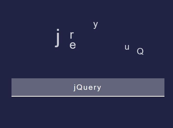
Sparkling Effect On Text Using jQuery - SparklingStars.js
| File Size: | 4.7 KB |
|---|---|
| Views Total: | 2533 |
| Last Update: | |
| Publish Date: | |
| Official Website: | Go to website |
| License: | MIT |
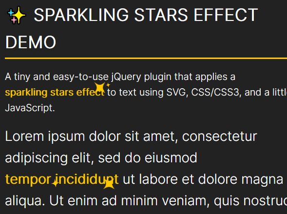
A tiny and easy-to-use jQuery plugin that applies a sparkling stars effect to text using SVG, CSS/CSS3, and a little bit JavaScript.
How to use it:
1. Insert the JavaScript SparklingStars.js and Stylesheet SparklingStars.css into the HTML page.
<link href="SparklingStars.css" rel="stylesheet" />
<script src="/path/to/cdn/jquery.slim.min.js"></script>
<script src="SparklingStars.js"></script>
2. Apply the sparkling stars effect by wrapping your text in the <span class="sparkling"></span> tag. That's it.
<p>
  Lorem ipsum dolor sit amet, <span class="sparkling">tempor incididunt</span> ut labore et dolore magna aliqua. Ut enim ad minim veniam, quis nostrud exercitation ullamco laboris nisi ut aliquip ex ea commodo consequat. Duis aute irure <span class="sparkling">dolor in reprehenderit</span> in voluptate velit esse cillum dolore eu fugiat nulla pariatur. Excepteur sint occaecat cupidatat non proident, sunt in culpa qui officia deserunt mollit anim id est laborum.
</p>
3. Customize the sparkling stars.
// color
const color = "#FFC700";

// shape
const svgPath = 'M26.5 25.5C19.0043 33.3697 0 34 0 34C0 34 19.1013 35.3684 26.5 43.5C33.234 50.901 34 68 34 68C34 68 36.9884 50.7065 44.5 43.5C51.6431 36.647 68 34 68 34C68 34 51.6947 32.0939 44.5 25.5C36.5605 18.2235 34 0 34 0C34 0 33.6591 17.9837 26.5 25.5Z';
4. Customize the animation in the CSS.
@-webkit-keyframes comeInOut {
  0% { transform: scale(0); }
  50% { transform: scale(1); }
  100% { transform: scale(0); }
}
@-moz-keyframes comeInOut {
  0% { transform: scale(0); }
  50% { transform: scale(1); }
  100% { transform: scale(0); }
}
@-o-keyframes comeInOut {
  0% { transform: scale(0); }
  50% { transform: scale(1); }
  100% { transform: scale(0); }
}
@keyframes comeInOut {
  0% { transform: scale(0); }
  50% { transform: scale(1); }
  100% { transform: scale(0); }
}

@-webkit-keyframes spin {
  0% { transform: rotate(0deg); }
  100% { transform: rotate(180deg); }
}
@-moz-keyframes spin {
  0% { transform: rotate(0deg); }
  100% { transform: rotate(180deg); }
}
@-o-keyframes spin {
  0% { transform: rotate(0deg); }
  100% { transform: rotate(180deg); }
}
@keyframes spin {
  0% { transform: rotate(0deg); }
  100% { transform: rotate(180deg); }
}
Changelog:
2021-07-11
- Removed vendor-prefixed.
This awesome jQuery plugin is developed by iseries. For more Advanced Usages, please check the demo page or visit the official website.