7 Best shadcn/ui Date Picker Components for React + TailwindCSS (2026)
Date selection represents a core interaction pattern in modern web applications. React developers building with Tailwind CSS need components that integrate with their design system while delivering the functionality users expect. The shadcn/ui library includes a Date Picker component that handles basic date selection, but production applications often require additional capabilities.
The open-source community has developed several enhanced Date Picker components that extend the shadcn/ui foundation. These components maintain the clean design and Tailwind integration developers value while adding features like range selection, time input, and preset options. Each component addresses specific use cases, from analytics dashboards requiring comparison modes to booking systems needing timezone support.
This article reviews the best shadcn/ui Date Picker components available on GitHub in 2026. Each expands the original implementation with useful enhancements suited for different development scenarios.
Discover more open-source shadcn/ui components curated for modern web developers at Next.jQueryScript.net.
Related AI tools: If you build React or shadcn UI components, these free AI tools for frontend developers can help with UI drafts, code cleanup, and documentation.
TL;DR
| Rank | Component Name | Best For | GitHub Stars (2026) |
|---|---|---|---|
| 1 | Shadcn Date Range Picker | Analytics dashboards, reporting tools | 970 |
| 2 | Flexible Date & Date Range Picker | Booking systems, scheduling apps | 350 |
| 3 | Modern Calendar Date Picker for Next.js | Next.js apps with timezone handling | 313 |
| 4 | Advanced Date, Time & Range Picker Collection | Apps needing date & time with validation | 264 |
| 5 | Beautiful Date & Time Picker | User-facing apps needing elegant UI | 258 |
| 6 | Datetime Picker with Time Zone | International projects | 196 |
| 7 | Shadcn Persian Date Picker | Projects requiring native Jalali calendar support | 27 |
About shadcn/ui Date Picker
The standard shadcn/ui Date Picker combines Popover and Calendar components to create a clean, functional date selection interface. Built on React DayPicker with Tailwind CSS styling, it provides single-date selection, date range selection, and time picking capabilities through date-fns formatting. The component uses Radix UI primitives and integrates with Tailwind utility classes.
The default implementation works well for standard use cases where users need to select dates or date ranges. It follows shadcn/ui design principles and maintains consistency with other components in the library. Developers can customize the appearance through Tailwind classes, and the component includes proper accessibility features with keyboard navigation support.
However, the base component requires developers to build their own preset systems, comparison interfaces, and advanced timezone management features. Projects requiring streamlined user experiences with preset date ranges, period-over-period comparison modes, or sophisticated timezone conversions benefit from the enhanced alternatives that the community has developed.
The official documentation is available at https://ui.shadcn.com/docs/components/date-picker.
How We Ranked These shadcn/ui Date Pickers
These components are ranked based on their number of stars and activity level on GitHub. Star count indicates community adoption and developer trust, while recent activity suggests ongoing maintenance and support. These metrics help identify components that other developers have tested and validated in production environments.
Best shadcn/ui Date Picker Components
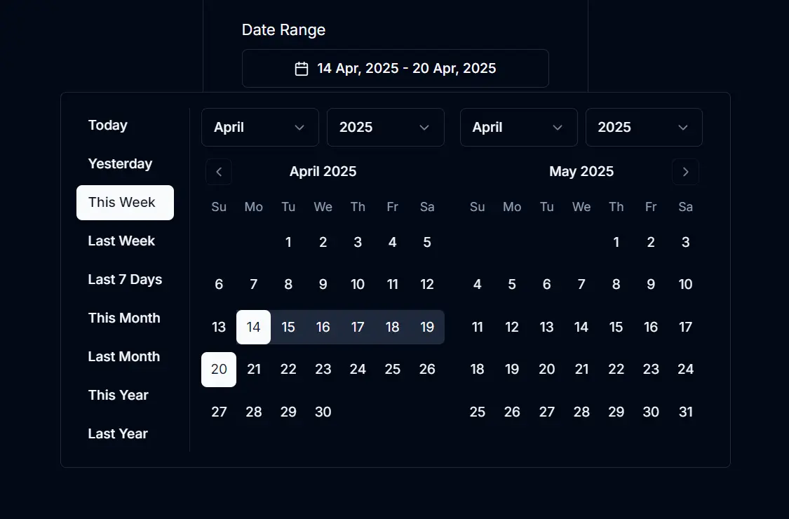
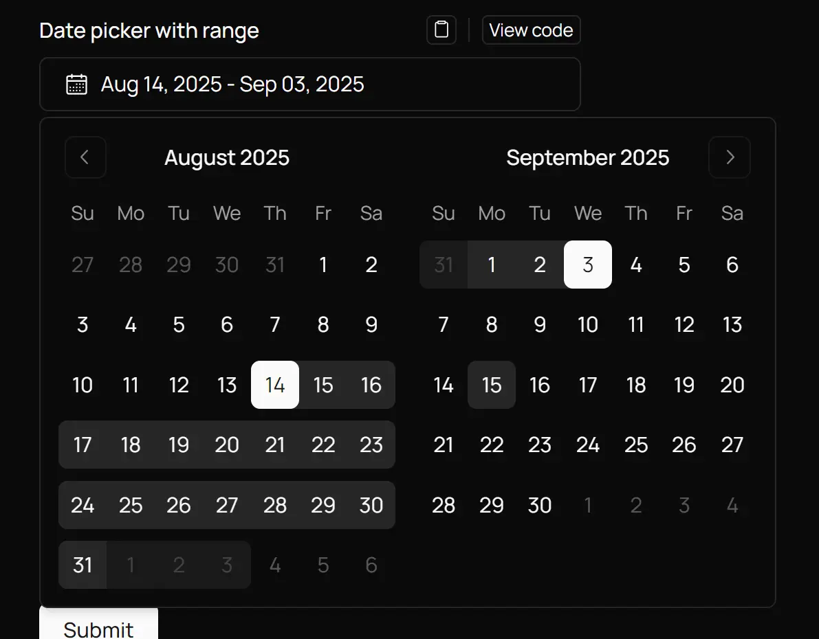
1. Shadcn Date Range Picker – Presets, Comparison & Mobile Support

Github Stars: 970
Best for: Analytics dashboards and reporting tools requiring date range selection with preset options
Overview: This component extends the shadcn/ui Date Picker to handle date ranges with predefined preset options. It adds a comparison mode that lets users select two separate date ranges simultaneously, which proves useful for analytics dashboards and reporting tools where period-over-period analysis is common.
Key Features:
- Interactive calendar widget with dual-month display that simplifies range selection across month boundaries
- Nine predefined date range presets including Today, Yesterday, Last 7/14/30 days, and monthly options for quick selection
- Optional date comparison mode for selecting two date ranges at once, ideal for period-over-period analysis
- Direct date input fields alongside calendar selection for precise date entry
- Full integration with Shadcn UI design system and Tailwind CSS styling patterns
- Locale support through date-fns integration for international date formatting and display preferences
- Configurable popover alignment and customizable initial date values
- TypeScript support with complete prop definitions and type safety
Pros: The preset options reduce user interaction time for common date selections. The comparison mode addresses a specific need in analytics and reporting interfaces without requiring custom development.
Cons: The dual-month display requires more screen space than single date pickers. The component may introduce more complexity than needed for simple date range selection.
GitHub: https://github.com/johnpolacek/date-range-picker-for-shadcn
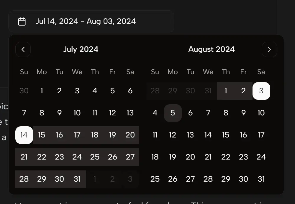
2. Flexible Date & Date Range Picker For Shadcn/ui
Github Stars: 350
Best for: Booking systems and complex scheduling applications needing granular control over date selection behavior
Overview: This custom Date Picker builds on react-day-picker and provides enhanced control over date selection. It handles both single dates and date ranges while offering developers extensive customization options for styling and behavior. The component gives developers precise control over date inputs, making it suitable for applications where accurate date handling matters.
Key Features:
- Single date and date range selection modes within the same component
- Enhanced year and month navigation through intuitive label clicking for quick movement through the calendar
- Multiple month display option for viewing and selecting across extended periods
- Customizable styling system that works seamlessly with Tailwind CSS
- Date range restrictions to enforce business rules and validation requirements
- Built-in disabled date matchers to prevent selection of invalid dates
Pros: The flexible architecture adapts to different use cases without requiring multiple components. Year and month navigation improves usability for dates far from the current date. The component maintains shadcn/ui visual consistency throughout.
Cons: The extensive customization options increase initial setup complexity. Requires updating react-day-picker to version 9 if working with older shadcn/ui setups.
GitHub: https://github.com/flixlix/shadcn-date-picker
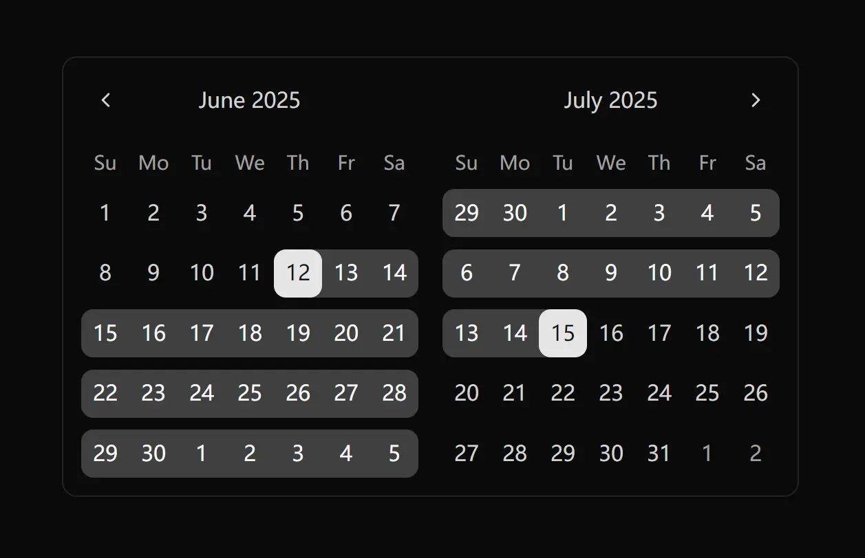
3. Modern Calendar Date Picker Component for Next.js
Github Stars: 313
Best for: Next.js applications that need predefined date ranges and timezone handling
Overview: This Date Picker component focuses on providing a clean interface with practical shortcuts for common date selections. It includes timezone support and keyboard navigation, making it suitable for applications serving international users. The component handles timezone-aware date handling, which prevents common date boundary issues.
Key Features:
- Interactive calendar UI with a clean and responsive interface for intuitive date selection
- Predefined date ranges like Today, Yesterday, Last Week, and This Month for rapid selection
- Advanced interaction including hover and scroll wheel support for quick date adjustments
- Date range support allowing selection of either single dates or complete date ranges
- Timezone support that automatically handles date conversions across different timezones
- Full keyboard navigation with accessibility features for inclusive user experience
Pros: Timezone handling eliminates manual date conversion logic. The predefined ranges accelerate user workflows for common scenarios. Advanced interaction features boost user productivity.
Cons: The Next.js-specific implementation may limit portability to other React frameworks. Timezone features add complexity for applications that do not require international support.
GitHub: https://github.com/sersavan/shadcn-calendar-component
4. Advanced Date, Time & Date Range Picker Components for shadcn/ui
Github Stars: 264
Best for: Applications requiring both date and time selection with form validation
Overview: This collection provides multiple variations of date and time pickers for different use cases. It includes single date pickers, date range selectors, and combined date and time inputs in both 12-hour and 24-hour formats. The comprehensive solution covers most date and time selection scenarios developers encounter.
Key Features:
- Responsive design that adapts seamlessly to mobile and desktop interfaces
- Consistent styling following ShadCN design principles across all component variations
- Built-in form validation support with React Hook Form and Zod integration
- Customizable styling and behavior through component props
- Accessibility features including keyboard navigation and screen reader support
- TypeScript support with full type definitions for type safety
- Combined date and time input for scheduling and deadline applications
Pros: The collection approach provides multiple components from a single package. React Hook Form integration simplifies form handling and validation. Strong form library integration saves development time.
Cons: The multiple variations may include components projects do not need. Learning which component fits specific use cases requires reviewing the documentation. Larger bundle size due to comprehensive feature set.
GitHub: https://github.com/rudrodip/shadcn-date-time-picker
5. Beautiful Date & Time Picker Component With Shadcn/UI
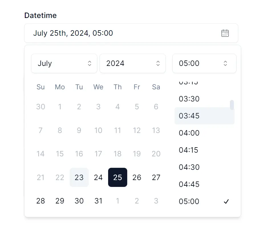
Github Stars: 258
Best for: User-facing applications where aesthetics and seamless user experience matter
Overview: This component combines date and time selection in a single interface. It prioritizes user experience with a responsive design that works across different device types. The component focuses on providing a seamless experience for both date and time selection with attention to visual detail.
Key Features:
- Date and time selection combined in a unified interface for streamlined user input
- Customizable layout that adapts to various design requirements and contexts
- Responsive design ensuring optimal user experience across different devices and screen sizes
- Intuitive visual design with smooth transitions
- Clean, focused implementation for easy integration
Pros: The combined interface reduces the number of interactions required for datetime selection. The focus on user experience makes it suitable for consumer-facing applications. Exceptional attention to visual detail and minimal learning curve for end users.
Cons: Limited documentation about advanced features and customization options. The repository shows fewer feature details compared to other options. Lacks some advanced features like presets or comparison modes.
GitHub: https://github.com/Maliksidk19/shadcn-datetime-picker
6. Shadcn/UI Datetime Picker with Time Zone and Trigger Options
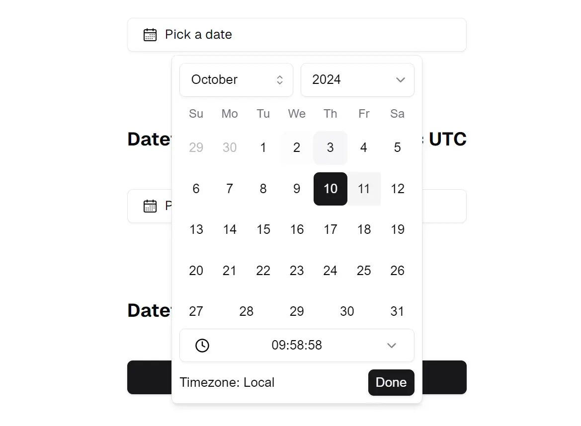
Github Stars: 196
Best for: International applications requiring timezone support and custom trigger elements
Overview: This datetime picker component emphasizes simplicity while providing timezone support and custom trigger options. It handles the complexities of timezone conversion while maintaining a straightforward interface. The component offers robust timezone handling ideal for global applications.
Key Features:
- Intuitive date selection through a straightforward calendar interface
- Timezone support that handles timezones gracefully for accurate date and time representation
- Flexible time input allowing users to easily select specific times
- Customizable triggers offering flexibility to use custom buttons or elements to activate the picker
- Clean, focused API for easy implementation
Pros: Timezone support addresses a common pain point in international applications. Custom triggers allow better integration with existing UI patterns. Flexible trigger system integrates well with existing UIs.
Cons: The feature set is more limited compared to higher-ranked alternatives. The repository has fewer stars, indicating less community validation. Limited preset options compared to specialized range pickers.
GitHub: https://github.com/huybuidac/shadcn-datetime-picker
7. Accessible shadcn/ui Persian Date Picker with RTL and Dark Mode Support
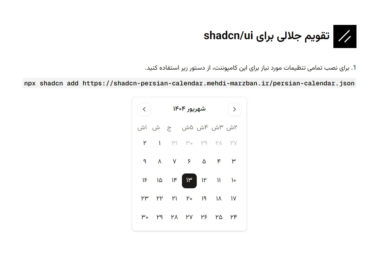
Github Stars: 30+
Best for: Developers building applications for Persian-speaking users requiring native Jalali (Shamsi) calendar support.
Overview: This component is a specialized adaptation of the Shadcn UI Date Picker, designed specifically to handle the Persian (Jalali) calendar system. It addresses the complex localization needs of Iranian and Persian interfaces by providing a drop-in solution that maintains the beautiful aesthetics, accessibility, and customization options of the original Shadcn ecosystem, complete with native RTL support.
Key Features:
- Built-in handling for the Persian (Jalali/Shamsi) calendar system with accurate date conversions.
- Supports single date, date range, and multiple date selection out of the box.
- Fully optimized for Right-to-Left (RTL) layouts and WAI-ARIA compliant for screen readers.
- Includes an intuitive year switcher interface for easier navigation across decades.
- Fully styleable using standard Tailwind CSS classes to match your application's theme.
Pros:
- Seamless integration with existing Shadcn/Radix UI projects without complex configuration.
- Comprehensive dark mode support that adapts automatically to your app's theme.
Cons:
- Specific to Persian/Jalali use cases (not intended for standard Gregorian-only applications).
GitHub: https://github.com/MehhdiMarzban/shadcn-persian-calendar
Choosing the Right Date Picker
Selecting the appropriate Date Picker component depends on specific project requirements. While the official shadcn/ui component handles basic date and range selection well, applications requiring preset shortcuts should consider the Shadcn Date Range Picker or the Flexible Date & Date Range Picker. These components provide built-in preset systems that accelerate common date selection workflows without requiring custom development.
Time support requirements affect component choice significantly. Applications needing combined date and time input should evaluate the Advanced Date, Time & Date Range Picker collection or the Beautiful Date & Time Picker Component. Projects that also need timezone handling should consider the Modern Calendar Date Picker Component or the Shadcn/UI Datetime Picker with Time Zone options.
Internationalization and accessibility considerations matter for applications serving diverse user bases. Components with locale support and keyboard navigation features work better in these contexts. The Advanced Date, Time & Date Range Picker Components include explicit accessibility features and screen reader support.
Compatibility with form libraries influences integration effort. Projects using React Hook Form benefit from the Advanced Date, Time & Date Range Picker Components, which provide built-in validation support through Zod integration. This reduces the custom code needed for form handling and validation. For Next.js applications using server actions, proper date serialization becomes important when passing dates between client and server components.
Integration Tips and Best Practices
Replacing the default shadcn/ui Date Picker with a custom component requires updating component imports and dependencies. Install the chosen component through npm or copy the source files into your project following the shadcn/ui pattern. Update import statements to reference the new component instead of the default Date Picker. Since shadcn/ui components are not installed as packages, you can directly modify the code to fit project needs.
Styling custom Date Pickers with Tailwind follows the same approach as other shadcn/ui components. Most community components maintain the Tailwind utility class pattern, allowing you to modify appearance through className props. Override default styles by passing custom classes, but ensure you understand the component's styling architecture to avoid conflicts. Use CSS variables like --cell-size to customize calendar appearance while maintaining design consistency.
State management and validation in React applications require careful consideration. Controlled components work well with React state management patterns using useState or form libraries like React Hook Form. Handle date changes through onChange callbacks and maintain the selected date in component state. For validation, integrate with your chosen validation library or implement custom validation logic that checks date formats, ranges, and business rules.
Form integration benefits from using established patterns. When working with React Hook Form, wrap your Date Picker in a Controller component and provide appropriate validation rules. This keeps your forms consistent and makes error handling easier. Implement client and server-side validation for date ranges, and use disabled date matchers to prevent selection of invalid dates. For range pickers, implement proper state handling for start and end dates, and use the onSelect callback to update application state efficiently.
Performance considerations become relevant for frequently used pickers. Consider code splitting to reduce initial bundle size, especially for comprehensive solutions like the Advanced Date & Time Picker. Store dates in UTC and convert to the user's local timezone for display to prevent off-by-one-day errors. The timeZone prop in Calendar components helps manage this conversion.
Final Thoughts
Date Picker selection impacts user experience in modern React- or Next.js-powered applications. The shadcn/ui ecosystem provides multiple options that extend the basic Date Picker with features like range selection, time input, timezone support, and preset options. Each component addresses different use cases while maintaining the design consistency and Tailwind integration developers expect.
These open-source components demonstrate the strength of the shadcn/ui community in 2026. They solve real problems that developers encounter when building production applications. The components ranked by GitHub stars show proven adoption and ongoing maintenance, reducing the risk of choosing abandoned projects.
Consider trying one of these components in your next React project. Start with the component that matches your immediate requirements, whether that involves date range selection with presets for analytics dashboards, enhanced navigation for booking systems, or combined datetime input with timezone support for international applications. The time invested in integration will improve your application's date handling capabilities and user experience.
More Resources:
- 10 Best Date And Timer Pickers In Vanilla JavaScript
- 10 Best Date Picker Components For Vue.js
- Best Date & Timer Picker Components For React & React Native
FAQs
Q: Can I use these shadcn/ui Date Picker components with other React frameworks besides Next.js?
A: Most of these components work with any React framework, including Create React App, Vite, and Remix. The Modern Calendar Date Picker Component was designed specifically for Next.js, which may affect its portability. However, the other components like the Shadcn Date Range Picker and the Flexible Date & Date Range Picker are framework-agnostic and will work in any React environment. Check each component's documentation for specific framework requirements before implementation.
Q: How do I handle date storage and timezone conversions when using these components?
A: Store dates in UTC format on your backend to avoid timezone-related issues. When displaying dates to users, convert them to the user's local timezone. Several components, like the Modern Calendar Date Picker and the Shadcn/UI Datetime Picker with Time Zone, include built-in timezone support that handles this conversion automatically. For components without timezone support, use libraries like date-fns-tz or Luxon to manage timezone conversions in your application logic.
Q: Do these Date Picker components support React Hook Form and form validation?
A: The Advanced Date, Time & Date Range Picker Components explicitly support React Hook Form and Zod validation. For other components, you can integrate them with React Hook Form by wrapping the picker in a Controller component and defining validation rules. This approach works with any of the listed components, though some require more configuration than others. The React Hook Form documentation provides examples of integrating custom input components.
Q: What happens if a Date Picker component I choose stops being maintained?
A: Since shadcn/ui components are copied directly into your project rather than installed as dependencies, you own the code. If a component stops receiving updates, you can continue using your copy without issues. You can also modify the component yourself or migrate to a different option. This copy-paste approach gives you full control over the component code, unlike traditional npm packages where abandoned dependencies can create security concerns.
Q: How do I customize the appearance of these Date Picker components to match my brand colors?
A: All listed components use Tailwind CSS, which makes customization straightforward. Modify the component's appearance by passing custom className props with Tailwind utility classes. You can also adjust CSS variables defined in your global styles to change colors, spacing, and other design tokens. Some components expose specific customization props for common styling needs. Review each component's documentation for available customization options and examples.