Creating Responsive Equal Height Columns with jQuery
| File Size: | 1.97 KB |
|---|---|
| Views Total: | 1437 |
| Last Update: | |
| Publish Date: | |
| Official Website: | Go to website |
| License: | MIT |

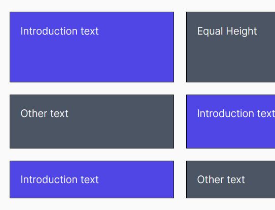
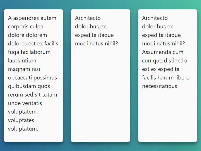
Yet another jQuery approach to making a group of block elements have the equal height depending on the tallest one. Works perfectly on responsive web layout that automatically adjusts the height when the users resize the browser window.
How to use it:
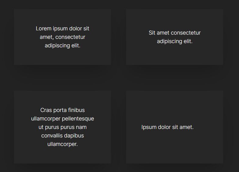
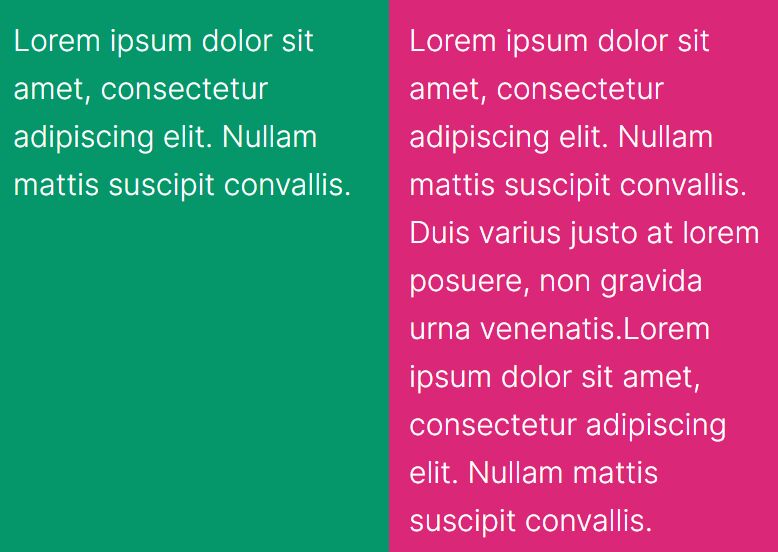
1. Create a group of block elements with the same CSS class.
<div class="container">
  <div class="column">
    Box 1
  </div>

  <div class="column">
    Box 2
  </div>

  <div class="column">
    Box 3
  </div>
</div>
2. Load the needed jQuery JavaScript library at the end of the document.
<script src="//code.jquery.com/jquery-1.11.3.min.js"></script>
3. The core function for the equal height columns.
var matchHeight = function () {

  function init() {
    eventListeners();
    matchHeight();
  }

  function eventListeners(){
    $(window).on('resize', function() {
      matchHeight();
    });
  }

  function matchHeight(){
    var groupName = $('.column');
    var groupHeights = [];

    groupName.css('min-height', 'auto');

    groupName.each(function() {
      groupHeights.push($(this).outerHeight());
    });

    var maxHeight = Math.max.apply(null, groupHeights);
    groupName.css('min-height', maxHeight);
  };

  return {
    init: init
  };

} ();
4. Initialize on document ready and done.
$(document).ready(function() {
  matchHeight.init();
});
This awesome jQuery plugin is developed by Lewitje. For more Advanced Usages, please check the demo page or visit the official website.