Dynamic Responsive Tiled Layout Plugin For jQuery - wallyti
| File Size: | 18.6 KB |
|---|---|
| Views Total: | 2830 |
| Last Update: | |
| Publish Date: | |
| Official Website: | Go to website |
| License: | MIT |
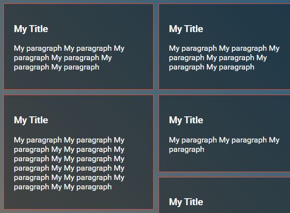
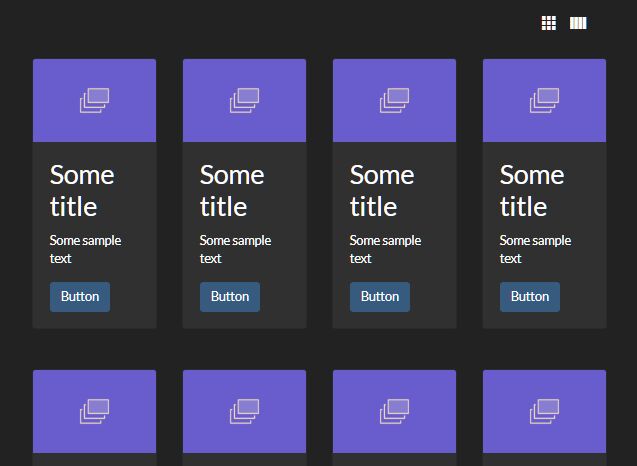
wallyti.js is a small (~3kb minified) jQuery plugin for creating a responsive, fluid grid layout that will dynamically positions tiled blocks depending on the screen width. Smooth re-position animation is based on CSS3 transition properties.
How to use it:
1. Put jQuery library and the jQuery wallyti.js script into the webpage.
<script src="//code.jquery.com/jquery-3.2.0.slim.min.js"></script>
<script src="jquery.wallyti.js"></script>
2. Add as many blocks to the tiled layout following the html structure like this:
<div id="container">
  <div class="box">
    <h3>Box 1</h3>
    <p>Content 1</p>
  </div>
  <div class="box">
    <h3>Box 2</h3>
    <p>Content 2</p>
  </div>
  <div class="box">
    <h3>Box 3</h3>
    <p>Content 3</p>
  </div>
  ...
</div>
3. Call the main function wallyti on the top container and you're done.
$('#container').wallyti();
4. Set the max/min width and margin of the tiled blocks using wallyti- attributes:
<div id="container"
     wallyti-block-margin="10"
     wallyti-block-max="300"
     wallyti-block-min="210"
>
5. Or via JavaScript during init.
$('#container').wallyti({

  // max/min width
  blockMaxWidth: 360,
  blockMinWidth: 240,

  // space between blocks
  blockMargin: 35,

  // in milliseconds
  delayOnResize: 60,

  // enable/disable transitions
  disableTransitions: false,

  // custom CSS transitions
  cssTransition: "all 0.2s ease-in-out",

  // callback
  onComplete: function(){}

});
This awesome jQuery plugin is developed by stefanocaronia. For more Advanced Usages, please check the demo page or visit the official website.