Fix Flexbox justify-content Issue With jQuery - jcsabfix
| File Size: | 3.49 KB |
|---|---|
| Views Total: | 2012 |
| Last Update: | |
| Publish Date: | |
| Official Website: | Go to website |
| License: | MIT |
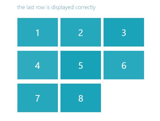
jcsabfix is a jQuery plugin used to fix the alignment issue of your grid items in the last row when your design a flexbox based grid layout using justify-content: space-between or justify-content: space-around property.
How to use it:
1. Assuming you have a responsive grid layout using CSS flexbox model as follows:
<div class="grid">
  <div class="grid-item">1</div>
  <div class="grid-item">2</div>
  <div class="grid-item">3</div>
  <div class="grid-item">4</div>
  <div class="grid-item">5</div>
  ...
</div>
.grid {
  display: flex;
  flex-wrap: wrap;
  justify-content: space-around;
  /* OR /*
  justify-content: space-between;
}

.grid-item {
  display: flex;
  align-items: center;
  justify-content: center;
  ...
}
2. Download and include the jquery.jcsabfix.min.js after jQuery library.
<script src="https://code.jquery.com/jquery-3.2.1.min.js"
        integrity="sha384-xBuQ/xzmlsLoJpyjoggmTEz8OWUFM0/RC5BsqQBDX2v5cMvDHcMakNTNrHIW2I5f"
        crossorigin="anonymous">
</script>
<script src="jquery.jcsabfix.min.js"></script>
3. Initialize the plugin by calling the function jcsabfix on the top container.
$(document).ready(function(){

  $('.grid').jcsabfix();

});
4. Re-init the plugin on window resize.
$( window ).resize(function() {

  $('.grid').jcsabfix();

});
This awesome jQuery plugin is developed by hqdrone. For more Advanced Usages, please check the demo page or visit the official website.
