Lightweight Responsive Layout Framework With jQuery - columns.js
| File Size: | 7.04 KB |
|---|---|
| Views Total: | 2041 |
| Last Update: | |
| Publish Date: | |
| Official Website: | Go to website |
| License: | MIT |

columns.js is an extremely lightweight jQuery plugin used for creating simple, responsive layout controlled by CSS classes. Similar to the Bootstrap's grid system.
How to use it:
1. Include the jQuery columns.js plugin's JS and CSS files after you've included jQuery JavaScript library.
<link rel="stylesheet" href="sass/columns.css">
<script src="jquery.min.js"></script>
<script src="js/columns.js"></script>
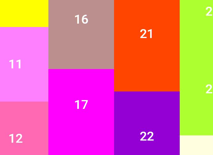
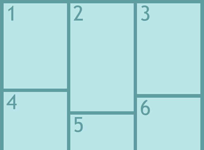
2. This jQuery & CSS layout framework consists of 5 CSS classes:
xxl: For desktop (screen size: 1441px)xl: For desktop (screen size: 1280px)l: For desktop & tablet (screen size: 1024px)m: For desktop & tablet (screen size: 800px)s: For mobile & tablet (screen size: 580px)xs: For mobile & tablet (screen size: less than 580px)
3. Make your custom layout using the CSS rules like this:
div class="col-l-1of12"></div>
<div class="col-l-11of12"></div>
<div class="col-l-2of12"></div>
<div class="col-l-10of12"></div>
<div class="col-l-3of12"></div>
<div class="col-l-9of12"></div>
<div class="col-l-4of12"></div>
<div class="col-l-8of12"></div>
<div class="col-l-5of12"></div>
<div class="col-l-7of12"></div>
<div class="col-l-6of12"></div>
<div class="col-l-6of12"></div>
This awesome jQuery plugin is developed by Bamboo3000. For more Advanced Usages, please check the demo page or visit the official website.