Masonry-like Responsive Tiled Grid Layout Plugin With jQuery - Masonry.js
| File Size: | 8.46 KB |
|---|---|
| Views Total: | 9303 |
| Last Update: | |
| Publish Date: | |
| Official Website: | Go to website |
| License: | MIT |

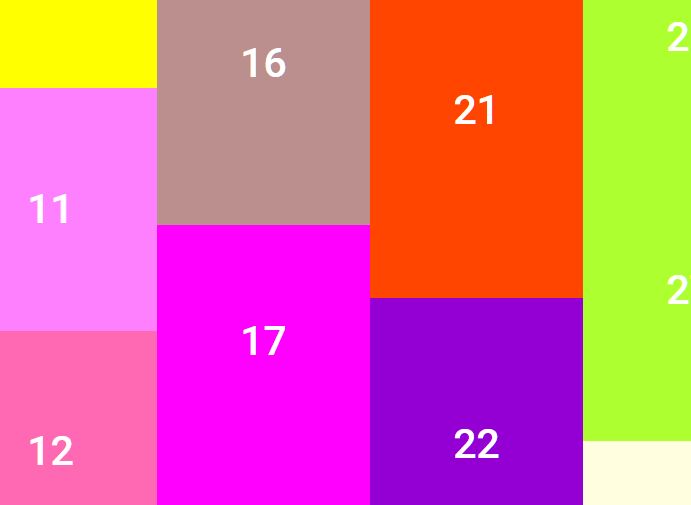
Masonry.js is an ultra-light (~1kb minified) jQuery plugin used to create responsive, cross-platform, tiled gallery/grid similar to the Masonry library. Works with Tuupola's image lazy load plugin.
How to use it:
1. Just include the jQuery Masonry.js script after loading jQuery library and we're ready to go.
<script src="//code.jquery.com/jquery.min.js"></script>
<script src="src/masonry.js"></script>
2. Load the Tuupola's lazy load plugin for image lazy loading (OPTIONAL).
<script src="jquery.lazyload.js"></script>
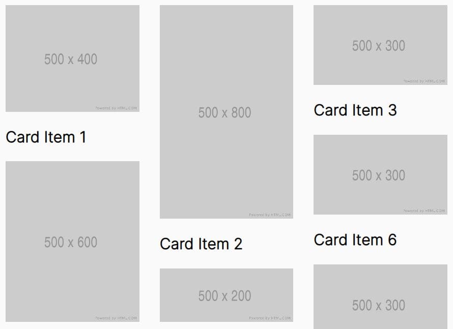
3. Add a group of images to the Masonry layout.
<div id="masonry">
  <a href="1.jpg">
    <img src="1.jpg">
  </a>

  <a href="2.jpg">
    <img src="2.jpg">
  </a>

  <a href="3.jpg">
    <img src="3.jpg">
  </a>
</div>
4. Integrate with Tuupola's image lazy load plugin.
<div id="masonry">
  <a href="1.jpg">
    <img class="lazyload" data-original="1.jpg">
  </a>

  <a href="2.jpg">
    <img class="lazyload" data-original="2.jpg">
  </a>

  <a href="3.jpg">
    <img class="lazyload" data-original="3.jpg">
  </a>
</div>
5. Initialize the plugin with default options.
$('div#masonry').masonry();
6. All configuration options.
$('div#masonry').masonry({

  // meant for supporting lazy-loading more items
  startOffset: 0,

  // minimum aspect ratio
  rowMinAspectRatio: 3.5

});
This awesome jQuery plugin is developed by Strobotti. For more Advanced Usages, please check the demo page or visit the official website.