Responsive Masonry-style Gallery Plugin With jQuery And Bootstrap - mp-mansory.js
| File Size: | 22.3 KB |
|---|---|
| Views Total: | 27265 |
| Last Update: | |
| Publish Date: | |
| Official Website: | Go to website |
| License: | MIT |
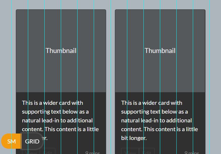
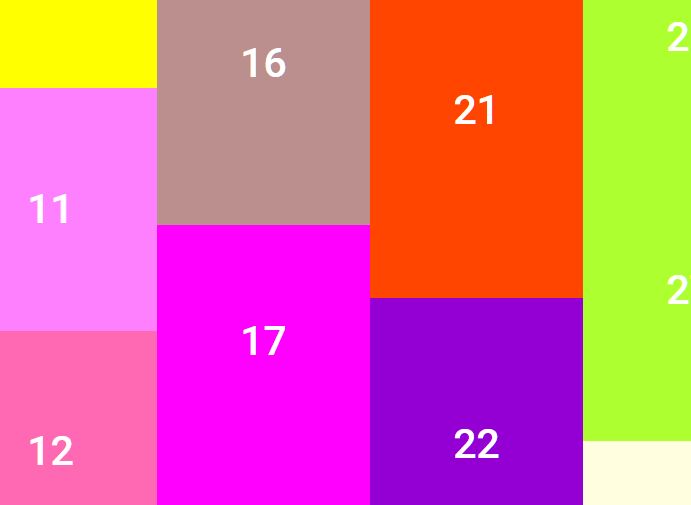
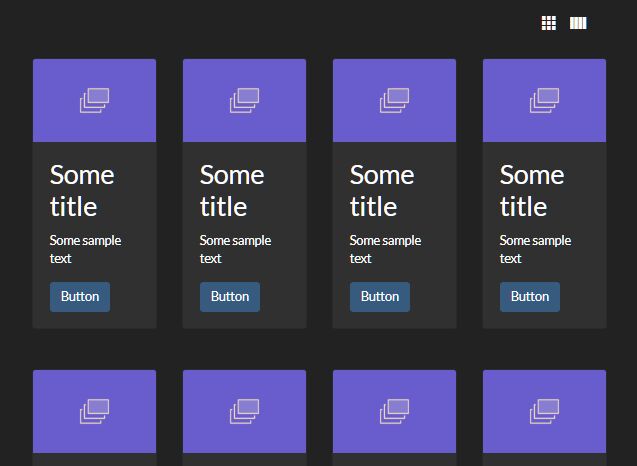
mp-mansory.js is a lightweight jQuery plugin used for creating a responsive, fluid, Masonry- and Pinterest-style grid layout / gallery using Bootstrap's grid system.
How to use it:
1. Make sure you have jQuery library and Bootstrap framework installed in the webpage.
<link rel="stylesheet" href="/path/to/bootstrap.min.css">
<script src="/path/to/jquery.min.js"></script>
<script src="/path/to/bootstrap.min.js"></script>
2. Download and put the mp.mansory.js script after jQuery library.
<script src="mp.mansory.js"></script>
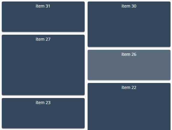
3. Add grid items to the webpage and distribute the item order using Html5 data-order attribute.
<div class="" id="my-gallery-container">

  <div class="item" data-order="6">
    <p>item 0</p>
  </div>
  <div class="item" data-order="5">
    <p>item 1</p>
  </div>
  <div class="item" data-order="4">
    <p>item 2</p>
  </div>
  <div class="item" data-order="3">
    <p>item 3</p>
  </div>
  <div class="item" data-order="2">
    <p>item 4</p>
  </div>
  <div class="item" data-order="1">
    <p>item 5</p>
  </div>
  <div class="item" data-order="0">
    <p>item 6</p>
  </div>
  ...

</div>
4. Initialize the grid/gallery plugin.
$("#my-gallery-container").mpmansory();
5. Available configuration options.
$("#my-gallery-container").mpmansory({
  childrenClass: '',
  breakpoints: {
      lg: 4,
      md: 4,
      sm: 6,
      xs: 12
  },
  distributeBy: {
    attr: 'data-order',
    attrOrder: 'asc',
    order: false,
    height: false
  },
  onload: function ( items ) {
    return true;
  }
});
This awesome jQuery plugin is developed by jmlp-131092. For more Advanced Usages, please check the demo page or visit the official website.