Responsive & Scalable Bootstrap Tabs Enhancement Plugin with jQuery
| File Size: | 9.73 KB |
|---|---|
| Views Total: | 16049 |
| Last Update: | |
| Publish Date: | |
| Official Website: | Go to website |
| License: | MIT |
A jQuery plugin extends the Bootstrap Tabs component to create a Safari-style responsive & scalable tabs interface with following features:
Features:
- More responsive and mobile-friendly.
- Tabs shrink/grow based on min and max width.
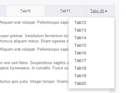
- If tabs don't fit across the container width, a dropdown appears to the right of tabs.
- For devices with screen width of < 768px, the tabs dropdown becomes an overlay.
How to use it:
1. Include the needed jQuery library and Twitter's Bootstrap 3 in your document.
<link rel="stylesheet" href="//netdna.bootstrapcdn.com/bootstrap/3.1.1/css/bootstrap.min.css">

<script src="//ajax.googleapis.com/ajax/libs/jquery/1.11.1/jquery.min.js"></script>
<script src="//netdna.bootstrapcdn.com/bootstrap/3.1.1/js/bootstrap.min.js"></script>
2. Make sure to include the jQuery Bootstrap Responsive Tabs plugin after jQuery library.
<script src="dist/bootstrap-responsive-tabs.js"></script>
3. Create a Bootstrap Tabs component following the Html structure like this:
<!-- Nav tabs -->
<ul class="nav nav-tabs demo" role="tablist">
  <li><a href="#home" role="tab" data-toggle="tab">Home</a></li>
  <li><a href="#profile" role="tab" data-toggle="tab">Profile</a></li>
  <li><a href="#messages" role="tab" data-toggle="tab">Messages</a></li>
  <li><a href="#settings" role="tab" data-toggle="tab">Settings</a></li>
</ul>

<!-- Tab panes -->
<div class="tab-content">
  <div class="tab-pane" id="home">...</div>
  <div class="tab-pane" id="profile">...</div>
  <div class="tab-pane" id="messages">...</div>
  <div class="tab-pane" id="settings">...</div>
</div>
4. The required CSS styles for the plugin.
.nav-tabs {
  width: 100%;
  float: left;
  border-bottom-color: #d9d9d9;
}

.nav-tabs > li a {
  text-align: center;
  border-width: 1px 1px 0 1px;
  border-style: solid;
  border-color: #dadae3;
  color: #555555;
  background: #eeeef2;
}

.nav-tabs > li a:hover {
  background: #F9F9F9;
  border-color: #d9d9d9;
}

.nav-tabs > li.active a,
.nav-tabs > li.active:hover a {
  color: #444444;
  background: white;
  border-color: #d9d9d9;
  border-bottom-color: transparent;
}

.tabs-dropdown .dropdown-toggle {
  border-width: 1px 1px 0 1px;
  border-style: solid;
  border-color: #dadae3;
  border-radius: 4px 4px 0 0;
  color: #555555;
  background: #eeeef2;
}

.tab-content {
  padding: 10px;
  height: 400px;
  overflow: hidden;
  overflow-y: scroll;
  background: white;
  border-width: 0 1px 1px 1px;
  border-style: solid;
  border-color: #d9d9d9;
  border-radius: 0 0 4px 4px;
}

.tab-content .tab-pane { color: #566473; }

.responsive-tabs-container { position: relative; }

.responsive-tabs-container .responsive-tabs { padding-right: 100px; }

.responsive-tabs-container .tabs-dropdown {
  position: absolute;
  right: 0;
  margin-right: 0 !important;
}

.responsive-tabs-container .tabs-dropdown.navbar-nav { margin: 0 !important; }
 @media only screen and (max-width: 767px) {

.responsive-tabs-container .tabs-dropdown .dropdown-menu {
  position: fixed;
  top: 20px;
  right: 20px;
  bottom: 20px;
  left: 20px;
  padding-top: 50px;
  overflow: hidden;
  overflow-y: scroll;
}

.responsive-tabs-container .tabs-dropdown .dropdown-menu .dropdown-header {
  position: fixed;
  left: 21px;
  right: 21px;
  background: #FFF;
  margin-top: -50px;
  padding-top: 18px;
  border-radius: 4px 4px 0 0;
}

.responsive-tabs-container .tabs-dropdown .dropdown-menu .close {
  position: absolute;
  top: 14px;
  right: 20px;
}

.responsive-tabs-container .tabs-dropdown .dropdown-menu .divider { margin: 0; }
}

.responsive-tabs-container .tabs-dropdown .dropdown-toggle {
  width: 100px;
  position: relative;
  display: block;
  padding: 10px 15px;
}

.responsive-tabs-container .tabs-dropdown .dropdown-toggle .count { margin-right: 5px; }

.responsive-tabs-container .tabs-dropdown .dropdown-toggle .caret {
  border-top: 4px solid transparent;
  border-bottom: 4px solid transparent;
  border-left: 6px solid;
  margin-left: 0;
  vertical-align: initial;
}
5. Initialize the plugin with options.
$(".demo").find("li").first().addClass("active");
$(".tab-content").find(".tab-pane").first().addClass("active");

$('.demo').bootstrapResponsiveTabs({
  minTabWidth: 80,
  maxTabWidth: 150
});
Change logs:
2015-01-12
- Fix tab sizing issue on mobile devices
2014-08-04
- Fix resizing issue for smaller screens
This awesome jQuery plugin is developed by gabrieltomescu. For more Advanced Usages, please check the demo page or visit the official website.