Simple Clean jQuery Responsive Grid Layout Plugin - Awesome Grid
| File Size: | 14.8 KB |
|---|---|
| Views Total: | 7081 |
| Last Update: | |
| Publish Date: | |
| Official Website: | Go to website |
| License: | MIT |
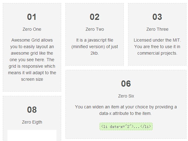
Awesome Grid is a lightweight and simple to use jQuery plugin to create a responsive & fluid grid layout which will adapt to any screen size.
How to use it:
1. Load the latest version of jQuery library and jQuery awesome grid plugin in the footer.
<script src="http://ajax.googleapis.com/ajax/libs/jquery/1.11.0/jquery.min.js"></script>
<script src="js/awesome-grid.min.js"></script>
2. Create a grid layout using Html unordered list (or any other html elements according to your actual needs.).
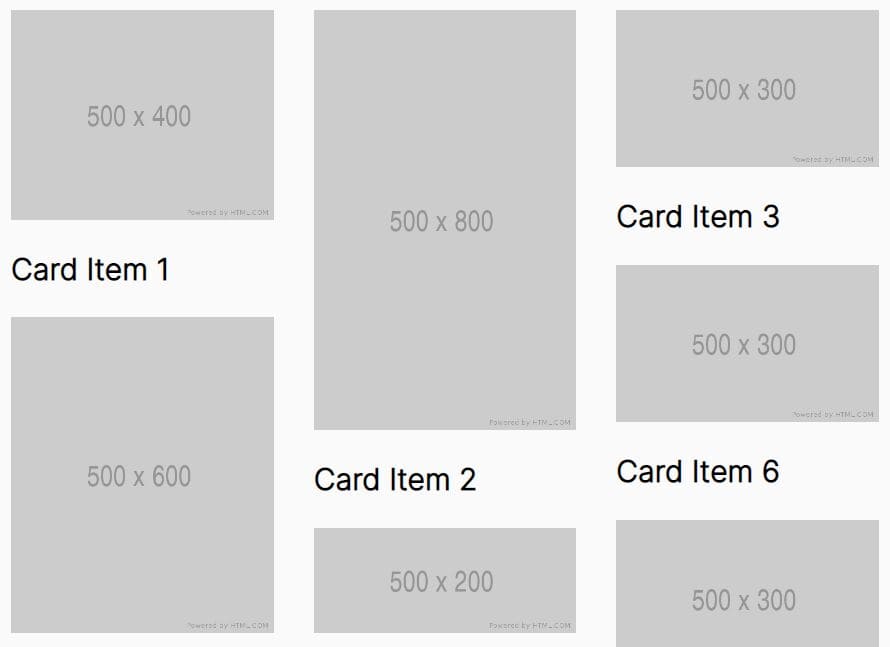
<ul class="grid">

<li>
...
<img src="images/01.png" />
</li>

<li>
...
<img src="images/02.png" />
</li>

...

</ul>
3. The sample CSS to style the grid layout.
ul.grid {
list-style: none;
margin: 42px auto;
padding: 0;
max-width: 794px;
}
ul.grid li {
width: 160px;
padding: 14px;
background-color: #f4f4f4;
border: 1px dashed #d7d7d7;
color: #525252;
text-align: center;
text-shadow: 1px 1px 1px #fff;
}
ul.grid li img {
margin-top: 14px;
display: block;
max-width: 100%;
height: auto;
}
ul.grid li img {
margin-top: 14px;
display: block;
max-width: 100%;
height: auto;
}
4. Initialize the grid layout with custom options.
$('ul.grid').AwesomeGrid({

// row gutter spacing
rowSpacing  : 20,

// column gutter spacing
colSpacing  : 20,

// apply column spacing for the first elements
initSpacing : 0,

// itching for responsiveness?
responsive  : true,

// allow fadeIn effect for an element?
fadeIn      : true,

// ignore an element having this class or false for none
hiddenClass : false,

// item selector to stack on the grid
item        : 'li',

// callback fired when an element is stacked
onReady     : function(item){},

// supply an object to display columns based on the viewport
columns     : {

  // default number of columns
  'defaults' : 4,

  // when viewport <= 800, show 2 columns
  '800'      : 2
},// you can also use an integer instead of a json object if you don't care about responsiveness

// resizing context, 'window' by default. Set as 'self' to use the container as the context.
context     : 'window'

});
Change logs:
v1.0.4 (2015-03-13)
- Added bower support.
2014-07-26
- Add context key as option
2014-07-24
- version 1.0.1
2014-05-25
- Fix responsiveness for multiple screen sizes
2014-03-22
- bug fixed.
This awesome jQuery plugin is developed by kamalkhan. For more Advanced Usages, please check the demo page or visit the official website.