Customizable And Responsive Grid System - pompeijs
| File Size: | 12.6 KB |
|---|---|
| Views Total: | 486 |
| Last Update: | |
| Publish Date: | |
| Official Website: | Go to website |
| License: | MIT |

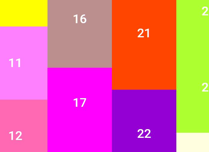
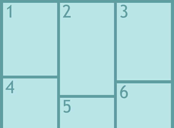
pompeijs is a jQuery layout plugin to create a responsive, flexible, highly customizable, cross-platform, 12-column grid system for modern web design.
Features:
- Auto resize columns to fit the parent container.
- Without writing any confusing CSS flexbox or grid layout rules.
- Percentage-based layout using CSS calc property.
- Also supports fixed width columns.
- Supports responsive breakpoints just like the Bootstrap layout system.
How to use it:
1. To get started, include the pompeijs jQuery plugin on your web page.
<link rel="stylesheet" href="css/pompei-VERSION.min.css">
<script src="/path/to/cdn/jquery.min.js"></script>
<script src="js/pompei-VERSION.min.js"></script>
2. Create a basic grid layout containing equal-width columns. The width of each column depends on the number of columns present within a row.
- pp-row: make the container full width
- pp-col: columns
<div class="pp-row">
  <div class="pp-col">
    Col 1
  </div>
  <div class="pp-col">
    Col 2
  </div>
  <div class="pp-col">
    Col 3
  </div>
  <div class="pp-col">
    Col 4
  </div>
  <div class="pp-col">
    Col 5
  </div>
</div>
3. Span the cell to multiple columns using the pp-colspan-* class.
<div class="pp-row">
  <div class="pp-col dark-row">
    Col 1
  </div>
  <div class="pp-col pp-colspan-4">
    Col 2
  </div>
  <div class="pp-col dark-row">
    Col 3
  </div>
</div>
4. You can offset columns using the pp-offset class.
<div class="pp-row">
  <div class="pp-col pp-offset"></div>
  <div class="pp-col">
    Col 2
  </div>
  <div class="pp-col">
    Col 3
  </div>
</div>
5. Disable the default margin (default: 5px) using the pp-no-margin class.
<div class="pp-row">
  <div class="pp-col dark-row">
    Col 1
  </div>
  <div class="pp-col light-row">
    Col 2
  </div>
  <div class="pp-col pp-no-margin">
    Col 3
  </div>
  <div class="pp-col pp-no-margin">
    Col 4
  </div>
  <div class="pp-col dark-row">
    Col 5
  </div>
  <div class="pp-col light-row">
    Col 6
  </div>
</div>
6. Disable the default padding (default: 10px) using the pp-no-padding class.
<div class="pp-row">
  <div class="pp-col">
    Col 1
  </div>
  <div class="pp-col">
    Col 2
  </div>
  <div class="pp-col pp-no-padding">
    Col 3
  </div>
  <div class="pp-col pp-no-padding">
    Col 4
  </div>
  <div class="pp-col">
    Col 5
  </div>
  <div class="pp-col">
    Col 6
  </div>
</div>
7. Default responsive breakpoints to help you create cross-platform grid system.
- Smartphone (sm): Screen size is smaller than 576px.
- Tablet (md): Between 576px and 991px.
- Desktop (lg): Larger than 991px.
<div class="pp-row" id="ex1">
  <div class="pp-col dark-row">
    Col 1
  </div>
  <div class="pp-col pp-colspan-sm-3">
    Col 2
  </div>
  <div class="pp-col dark-row">
    Col 3
  </div>
</div>
<div class="pp-row">
  <div class="pp-col-sm-5 pp-col-md-2 pp-col-lg-1 dark-row">
    Col 1
  </div>
  <div class="pp-col-sm-5 pp-col-md-2 pp-col-lg-1 light-row">
    Col 2
  </div>
  <div class="pp-col-sm-5 pp-col-md-2 pp-col-lg-1 dark-row">
    Col 3
  </div>
  <div class="pp-col-sm-5 pp-col-md-2 pp-col-lg-1 light-row">
    Col 4
  </div>
  <div class="pp-col-sm-5 pp-col-md-2 pp-col-lg-1 dark-row">
    Col 5
  </div>
  <div class="pp-col-sm-5 pp-col-md-2 pp-col-lg-1 light-row">
    Col 6
  </div>
  <div class="pp-col-sm-5 pp-col-md-2 pp-col-lg-1 dark-row">
    Col 7
  </div>
  <div class="pp-col-sm-5 pp-col-md-2 pp-col-lg-1 light-row">
    Col 8
  </div>
  <div class="pp-col-sm-5 pp-col-md-2 pp-col-lg-1 dark-row">
    Col 9
  </div>
  <div class="pp-col-sm-5 pp-col-md-2 pp-col-lg-1 light-row">
    Col 10
  </div>
  <div class="pp-col-sm-5 pp-col-md-2 pp-col-lg-1 dark-row">
    Col 11
  </div>
  <div class="pp-col-sm-5 pp-col-md-2 pp-col-lg-1 light-row">
    Col 12
  </div>
</div>
This awesome jQuery plugin is developed by philipibovo. For more Advanced Usages, please check the demo page or visit the official website.