jQuery Plugin To Scale Web Elements Based On Screen Size - Smartzoom
| File Size: | 7.62 KB |
|---|---|
| Views Total: | 919 |
| Last Update: | |
| Publish Date: | |
| Official Website: | Go to website |
| License: | MIT |
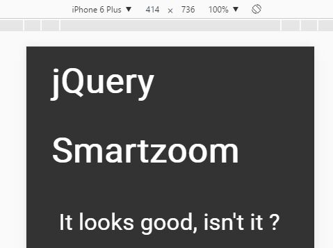
Smartzoom is a jQuery plugin that automatically scales web elements and font sizes based on the screen size to provides better readability across the platforms.
How to use it:
1. Add the following meta viewport in the head of the document.
<meta name="viewport" content="width=device-width, initial-scale=1">
<!-- OR -->
<meta name="viewport" content="width=device-width,initial-scale=1.0,maximum-scale=1.0,user-scalable=no">
2. Use relative units (e.g. em, percent) for font-size handling.
body {
  font-size: 62.5%;
}

h1 {
  font-size: 2em;
}
3. Link to jQuery library and the jQuery Smartzoom plugin like this:
<script src="//code.jquery.com/jquery.min.js"></script>
<script src="jquery.smartzoom.min.js"></script>
4. Invoke the plugin with default settings.
$.smartzoom.initialize();
5. Set the font size when scaling.
$.smartzoom.initialize({
  fontSize: 62.5 // 62.5% (1em = 10px)
});
6. Set break point (screen width) to trigger the auto scaling.
$.smartzoom.initialize({
  width:    320
});
This awesome jQuery plugin is developed by getphuture. For more Advanced Usages, please check the demo page or visit the official website.