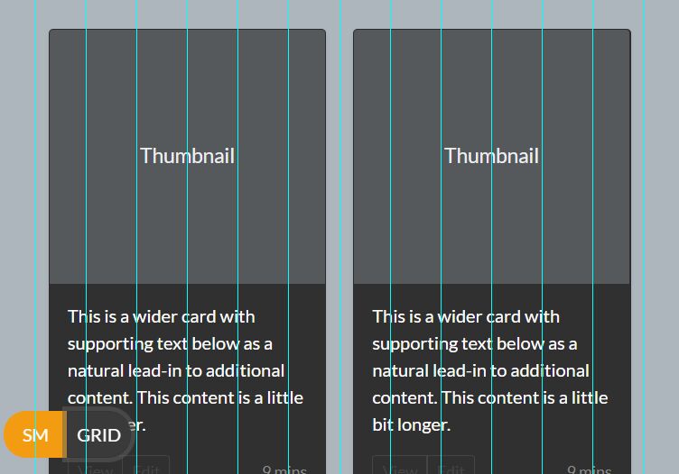
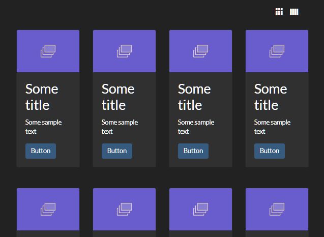
jQuery Plugin for App Showcase with Grid Overlay
| File Size: | 224KB |
|---|---|
| Views Total: | 1698 |
| Last Update: | |
| Publish Date: | |
| Official Website: | Go to website |
| License: | MIT |

In this tutorial we're going to create an iphone interface with a screenshot of an app. When clicked, it will be popuping a grid showcase with overlay effect for showing more screenshots.
How to use it:
1. The HTML
<div id="ac-wrapper" class="ac-wrapper"> <h2>Weatherous <span>Concept & UI Design</span></h2> <div class="ac-device"> <a href="#"><img src="images/screen1.jpg"/></a> <h3 class="ac-title">Gentrify small batch umami retro vegan</h3> </div> <div class="ac-grid"> <a href="#"><img src="images/screen1.jpg"/><span>Gentrify small batch umami retro vegan</span></a> <a href="#"><img src="images/screen2.jpg"/><span>Chambray squid semiotics</span></a> <a href="#"><img src="images/screen3.jpg"/><span>Fashion axe blue bottle</span></a> <a href="#"><img src="images/screen4.jpg"/><span>Photo booth single-origin coffee</span></a> <a href="#"><img src="images/screen5.jpg"/><span>Flexitarian synth keytar blog master</span></a> <a href="#"><img src="images/screen6.jpg"/><span>Next level retro flexitarian freegan</span></a> <a href="#"><img src="images/screen7.jpg"/><span>Pour-over superious meggings terry</span></a> <a href="#"><img src="images/screen8.jpg"/><span>Seitan william vinyl chillwave</span></a> </div> </div>
2. The CSS
.ac-wrapper {
width: 100%;
position: relative;
-webkit-perspective: 1000px;
-moz-perspective: 1000px;
perspective: 1000px;
-webkit-perspective-origin: 50% 25%;
-moz-perspective-origin: 50% 25%;
perspective-origin: 50% 25%;
}
.ac-wrapper h2 {
top: 20%;
width: 50%;
position: absolute;
font-weight: 300;
font-size: 4em;
text-align: right;
padding: 0 180px 0 50px;
}
.ac-wrapper h2 span {
display: block;
font-size: 60%;
color: #c0c0c0;
}
.ac-device {
background: url(../images/iPhone.png) no-repeat;
width: 288px;
height: 611px;
margin: 0 auto;
position: relative;
-webkit-transition: all 0.3s ease;
-moz-transition: all 0.3s ease;
transition: all 0.3s ease;
-webkit-transform-style: preserve-3d;
-moz-transform-style: preserve-3d;
transform-style: preserve-3d;
}
.ac-device a {
height: 440px;
width: 249px;
display: inline-block;
margin: 85px 0 0 20px;
}
.ac-device a img {
display: block;
}
.ac-device h3 {
position: absolute;
font-size: 2.5em;
left: 100%;
width: 100%;
top: 60%;
margin-left: 30px;
font-weight: 300;
color: #888;
}
.ac-grid {
position: absolute;
width: 620px;
left: 50%;
margin-left: -310px;
height: 100%;
z-index: 1000;
top: 0;
opacity: 0;
pointer-events: none;
-webkit-transform-style: preserve-3d;
-moz-transform-style: preserve-3d;
transform-style: preserve-3d;
-webkit-transition: all 0.3s ease;
-moz-transition: all 0.3s ease;
transition: all 0.3s ease;
-webkit-transform: translateZ(-350px);
-moz-transform: translateZ(-350px);
transform: translateZ(-350px);
}
.ac-grid a {
width: 145px;
display: block;
position: relative;
float: left;
margin: 10px 5px;
cursor: pointer;
}
.ac-grid a img {
display: block;
width: 100%;
}
.ac-grid a span {
position: absolute;
height: 100%;
width: 100%;
left: 0;
top: 0;
text-transform: uppercase;
padding: 3em 1em 0;
z-index: 100;
color: #ddd;
background: rgba(0,0,0,0.4);
font-weight: 700;
opacity: 0;
-webkit-transform: translateY(-5px);
-moz-transform: translateY(-5px);
transform: translateY(-5px);
-webkit-transition: all 0.2s ease;
-moz-transition: all 0.2s ease;
transition: all 0.2s ease;
}
.ac-grid a:hover span {
opacity: 1;
-webkit-transform: translateY(0);
-moz-transform: translateY(0);
transform: translateY(0);
}
.ac-wrapper.ac-gridview .ac-device {
-webkit-transform: translateZ(-350px);
-moz-transform: translateZ(-350px);
transform: translateZ(-350px);
opacity: .6;
}
.ac-wrapper.ac-gridview .ac-grid {
-webkit-transform: translateZ(0px);
-moz-transform: translateZ(0px);
transform: translateZ(0px);
opacity: 1;
pointer-events: auto;
}
 @media screen and (max-width: 63.875em) {
.ac-wrapper {
font-size: 60%;
width: 100%;
padding: 0 20px;
}
.ac-device {
margin: 0;
width: 100%;
}
.ac-device h3 {
width: 50%;
left: 290px;
}
.ac-wrapper h2 {
left: 308px;
padding: 0;
text-align: left;
margin-left: 30px;
}
}
 @media screen and (max-width: 39.8125em) {
.ac-grid {
width: 90%;
left: 5%;
margin-left: 0;
padding-top: 150px;
}
.ac-grid a {
width: 22%;
}
}
 @media screen and (max-width: 35.6875em) {
.ac-wrapper {
padding: 0 20px 100px;
}
.ac-wrapper h2 {
width: 100%;
text-align: center;
margin: 0 0 1em;
top: 0;
left: auto;
position: relative;
}
.ac-device {
margin: 0 auto;
width: 288px;
}
.ac-device h3 {
position: relative;
margin: 0;
left: auto;
width: 100%;
top: 100px;
display: block;
text-align: center;
}
}
3. Include jQuery library and appshowcase.js on your page
<script src="https://ajax.googleapis.com/ajax/libs/jquery/1.9.1/jquery.min.js"></script>
<script src="js/appshowcase.js"></script>
4. Initialize the plugin
<script>
$(function() {
AppShowcase.init();
});
</script>
This awesome jQuery plugin is developed by unknown. For more Advanced Usages, please check the demo page or visit the official website.