Auto Resize Iframe To Fit Parent - jQuery Responsive Iframe
| File Size: | 3.74 KB |
|---|---|
| Views Total: | 4308 |
| Last Update: | |
| Publish Date: | |
| Official Website: | Go to website |
| License: | MIT |

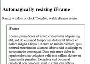
A super tiny jQuery plugin which makes iframe embedded content (Youtube/Vimeo videos, external pages) fully responsive and maintains the specific ratio on window resize.
The plugin automatically stretches or shrinks the iframe element depending on the width of its parent container when resizing the screen.
How to use it:
1. Add jQuery library (slim build is recommended) and the jquery.responsive-iframe.js script to the HTML page.
<script src="https://code.jquery.com/jquery-3.4.1.slim.min.js"
        integrity="sha384-J6qa4849blE2+poT4WnyKhv5vZF5SrPo0iEjwBvKU7imGFAV0wwj1yYfoRSJoZ+n"
        crossorigin="anonymous">
</script>
<script src="src/jquery.responsive-iframe.js"></script>
2. Attach the function responsiveIframe() to the iframe element and done.
<iframe width="560"
        height="315"
        src="https://www.youtube.com/embed/bweuBMPB8pY"
        frameborder="0"
        allow="accelerometer; autoplay; encrypted-media; gyroscope; picture-in-picture"
        allowfullscreen
        class="demo">
</iframe>
$(function(){
  $('iframe.demo').responsiveIframe();
});
3. Set the radio you'd like to maintain on resize.
$(function(){
  $('iframe.demo').responsiveIframe({
    ratio: 9/16
  });
});
This awesome jQuery plugin is developed by helixge. For more Advanced Usages, please check the demo page or visit the official website.


