Simplest Responsive Table Solution With jQuery - responsive-tables
| File Size: | 9.8 KB |
|---|---|
| Views Total: | 3394 |
| Last Update: | |
| Publish Date: | |
| Official Website: | Go to website |
| License: | MIT |
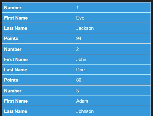
A minimalist jQuery based responsive table solution which converts a multi-column table into a 2-column list view to make your table more readable on small screens.
How to use it:
1. Download and copy the script and css into your project which has jQuery library installed.
<link rel="stylesheet" href="css/responsive-tables.min.css">
<script src="//code.jquery.com/jquery.min.js"></script>
<script src="js/jquery.responsive-tables.min.js"></script>
2. Add the required CSS class to your html table which has thead and tbody elements.
<table class="respond">
  <thead>
    ...
  </thead>
  <tbody>
    ...
  </tbody>
</table>
3. Initialize the plugin to make the html table responsive.
$(document).ready(function() {
   $.responsiveTables();
});
4. As an option, you can pass a breakpoint value at which you want the table affected.
$.responsiveTables('640px');
Changelog:
2020-01-02
- v2.2.1
2018-02-22
- CSS fixed for mobile
2017-03-28
- Improved implementation
2015-12-07
- fixed mixed merged cells issue
This awesome jQuery plugin is developed by ryanwellsdotcom. For more Advanced Usages, please check the demo page or visit the official website.


