3D Cube Page Transition Plugin With jQuery - cubeTransition.js
| File Size: | 45.4 KB |
|---|---|
| Views Total: | 16942 |
| Last Update: | |
| Publish Date: | |
| Official Website: | Go to website |
| License: | MIT |
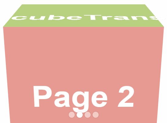
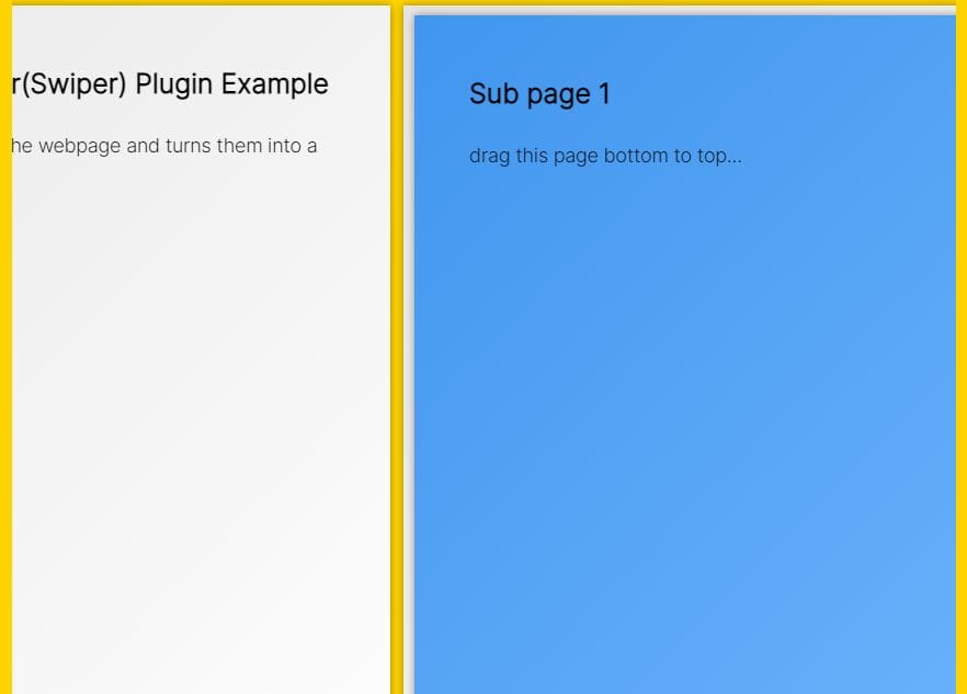
cubeTransition.js is a jQuery plugin used for creating a fullscreen, responsive, mobile-friendly page slider / presentation with an awesome 3D cube transition effect using CSS3 transitions and transforms.
How to use it:
1. Add the following html structure to your webpage.
<div id="cubeTransition">
  <div class="page1"><h2>Page 1</h2></div>
  <div class="page2"><h2>Page 2</h2></div>
  <div class="page3"><h2>Page 3</h2></div>
  <div class="page4"><h2>Page 4</h2></div>
</div>
2. Create a bottom pagination control for the page slider.
<ul id="bullets"></ul>
3. The core CSS/CSS3 rules for the page slider.
* {
  margin: 0;
  padding: 0;
}

html, body {
  overflow: hidden;
  height: 100%;
}

#cubeTransition {
  position: relative;
  width: 100%;
  height: 100%;
  -webkit-perspective: 1200px;
  -moz-perspective: 1200px;
  perspective: 1200px;
}

#cubeTransition div {
  min-height: 100%;
  width: 100%;
  position: absolute;
  top: 0;
  left: 0;
  backface-visibility: hidden;
  transform: translate3d(0, 0, 0);
  transform-style: preserve-3d;
  font-size: 5em;
  color: #fff;
  display: none;
}

#cubeTransition h2 {
  position: relative;
  top: 200px;
  margin: 0;
  font-size: 1.5em;
  text-align: center;
  text-shadow: 1px 1px 0px rgba( 0, 0, 0, 0.1 );
}

.top { z-index: 9999 }

.rotateCubeTopOut {
  transform-origin: 50% 100%;
  animation: rotateCubeTopOut .6s both ease-in;
}

.rotateCubeTopIn {
  transform-origin: 50% 0%;
  animation: rotateCubeTopIn .6s both ease-in;
}

.rotateCubeBottomOut {
  transform-origin: 50% 0%;
  animation: rotateCubeBottomOut .6s both ease-in;
}

.rotateCubeBottomIn {
  transform-origin: 50% 100%;
  animation: rotateCubeBottomIn .6s both ease-in;
}

@keyframes
rotateCubeTopOut {  50% {
animation-timing-function: ease-out;
transform: translateY(-50%) translateZ(-200px) rotateX(45deg);
}
 100% {
opacity: .3;
transform: translateY(-100%) rotateX(90deg);
}
}

@keyframes
rotateCubeTopIn {  0% {
opacity: .3;
transform: translateY(100%) rotateX(-90deg);
}
 50% {
animation-timing-function: ease-out;
transform: translateY(50%) translateZ(-200px) rotateX(-45deg);
}
}

@keyframes
rotateCubeBottomOut {  50% {
animation-timing-function: ease-out;
transform: translateY(50%) translateZ(-200px) rotateX(-45deg);
}
 100% {
opacity: .3;
transform: translateY(100%) rotateX(-90deg);
}
}

@keyframes
rotateCubeBottomIn {  0% {
opacity: .3;
transform: translateY(-100%) rotateX(90deg);
}
 50% {
animation-timing-function: ease-out;
transform: translateY(-50%) translateZ(-200px) rotateX(45deg);
}
}
4. Style the pagination bullets.
#bullets {
  position: absolute;
  width: 100%;
  bottom: 20px;
  padding: 0;
  margin: 0;
  text-align: center;
}

#bullets li {
  display: inline-block;
  width: 20px;
  height: 20px;
  border-radius: 50%;
  margin: 0 3px;
  background: rgba( 255, 255, 255, 0.5 );
  box-shadow: 0px 0px 4px rgba( 0, 0, 0, 0.2 );
  cursor: pointer;
  -webkit-tap-highlight-color: rgba( 0, 0, 0, 0 );
}

#bullets li:hover { background: rgba( 255, 255, 255, 0.8 ); }

#bullets li.active {
  cursor: default;
  background: #fff;
}
5. Include the latest version of jQuery library and the jQuery cubeTransition.js script on the webpage.
<script src="//code.jquery.com/jquery-3.1.1.min.js"></script>
<script src="js/cubeTransition.js"></script>
6. Include the jQuery mousewheel plugin for mouse wheel support.
<script src="jquery.mousewheel.js"></script>
7. Include the jQuery touchSwipe plugin for touch events support.
<script src="jquery.touchSwipe.js"></script>
Change log:
2017-11-17
- JS & CSS update
2017-04-26
- update readme
2017-04-13
- fixed for Mac.
2016-11-23
- fix
2016-10-25
- add animatiion for into and out
- add dynamic animation
This awesome jQuery plugin is developed by HTML50. For more Advanced Usages, please check the demo page or visit the official website.