Creating A Responsive Fullscreen Image Slider with jQuery
| File Size: | 5.87MB |
|---|---|
| Views Total: | 1803 |
| Last Update: | |
| Publish Date: | |
| Official Website: | Go to website |
| License: | MIT |

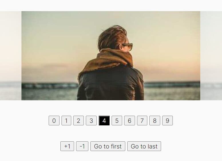
A tiny and easy jQuery plugin for creating a responsive & fullscreen image slider to showcase your designs and products.
How to use it:
1. Wrap the images in a slider wrapper.
<div class="slider">
<div class="slider-wrapper">
<section class="slide" data-imgvalue="img1"><img src="img/1.jpg" alt=""></section>
<section class="slide" data-imgvalue="img2"><img src="img/2.jpg" alt=""></section>
<section class="slide" data-imgvalue="img3"><img src="img/3.jpg" alt=""></section>
<section class="slide" data-imgvalue="img4"><img src="img/4.jpg" alt=""></section>
<section class="slide" data-imgvalue="img5"><img src="img/5.jpg" alt=""></section>
<section class="slide" data-imgvalue="img6"><img src="img/6.jpg" alt=""></section>
<section class="slide" data-imgvalue="img7"><img src="img/7.jpg" alt=""></section>
</div>
<a href="#nogo" class="control right"></a> <a href="#nogo" class="control left"></a> </div>
2. The required CSS styles.
body, html {
width: 100%;
height: 100%
}
.slider {
height: 100%;
overflow: hidden;
position: relative
}
.slider .slider-wrapper {
position: absolute;
width: 90000px;
height: 100%
}
.slider section {
float: left;
max-width: 100%;
height: 100%
}
.slider section img {
min-width: 100%;
height: 100%
}
.slider .control {
position: absolute;
display: block;
width: 100px;
height: 100%;
background-color: rgba(0,0,0,0.3)
}
.slider .control.right {
right: 0
}
.hover-img-effect section {
width: 1200px;
height: 400px;
margin: 120px auto 0
}
.hover-img-effect section .img-full {
float: left;
width: 600px;
height: 400px;
position: relative
}
.hover-img-effect section .img-full:hover .loupe-glass, .hover-img-effect section .img-full:focus .loupe-glass {
display: block
}
.hover-img-effect section .img-full .loupe-glass {
width: 50px;
height: 50px;
background-color: rgba(0,0,0,0.4);
position: absolute;
display: none;
z-index: 9999;
left: 0;
top: 0
}
.hover-img-effect section .img-full img {
width: 600px;
height: 400px
}
.hover-img-effect section .loupe {
float: left;
width: 600px;
height: 400px;
overflow: hidden;
position: relative
}
.hover-img-effect section .loupe img {
width: 600px;
height: 400px;
-webkit-transform: scale(2.4);
-ms-transform: scale(2.4);
transform: scale(2.4);
position: absolute
}
3. Load the latest jQuery javascript library at the bottom of your page.
<script src="http://ajax.googleapis.com/ajax/libs/jquery/1.10.2/jquery.min.js"></script>
4. The javascript.
$(document).ready(function () {
slider();
});

;function slider() {
var sliderWrap = $('.slider-wrapper');
var leftControl = $('.left');
var rightControl = $('.right');

var formulaLeft = 0;


var sectionValue = $('.slider-wrapper .slide').size();


var getWidth = $('.slider').width();
$('.slide').css({'width': getWidth});


var interval = setInterval(sliderTimer, 6000);


var slideWidth = $('.slide').outerWidth();
var maxLeft = slideWidth * sectionValue;

// next img event
rightControl.click(function () {

clearInterval(interval);
interval = setInterval(sliderTimer, 6000);

if(maxLeft  != (formulaLeft  + slideWidth))
{

formulaLeft = slideWidth + formulaLeft;
sliderWrap.stop().animate({'left': '-' + formulaLeft}, 600);
} else {
formulaLeft = 0;
sliderWrap.stop().animate({'left': 0}, 1000);
}
});
// /rightControl

// prev img event
leftControl.click(function () {

clearInterval(interval);
interval = setInterval(sliderTimer, 6000);

if(maxLeft != formulaLeft) {

formulaLeft = formulaLeft - slideWidth;
sliderWrap.stop().animate({'left': '-' + formulaLeft}, 600);
}

if(formulaLeft <= -1) {

formulaLeft = maxLeft - slideWidth;
sliderWrap.stop().animate({'left': '-' + formulaLeft}, 1000);
}

});
// /leftControl


function sliderTimer() {

if(maxLeft  != (formulaLeft  + slideWidth))
{

formulaLeft = slideWidth + formulaLeft;
sliderWrap.stop().animate({'left': '-' + formulaLeft}, 600);
} else {
formulaLeft = 0;
sliderWrap.stop().animate({'left': 0}, 1000);
}

};

};
This awesome jQuery plugin is developed by bonkalol. For more Advanced Usages, please check the demo page or visit the official website.