Infinite Image Carousel / Slideshow Plugin with jQuery - Handy Slider
| File Size: | 129 KB |
|---|---|
| Views Total: | 1659 |
| Last Update: | |
| Publish Date: | |
| Official Website: | Go to website |
| License: | MIT |
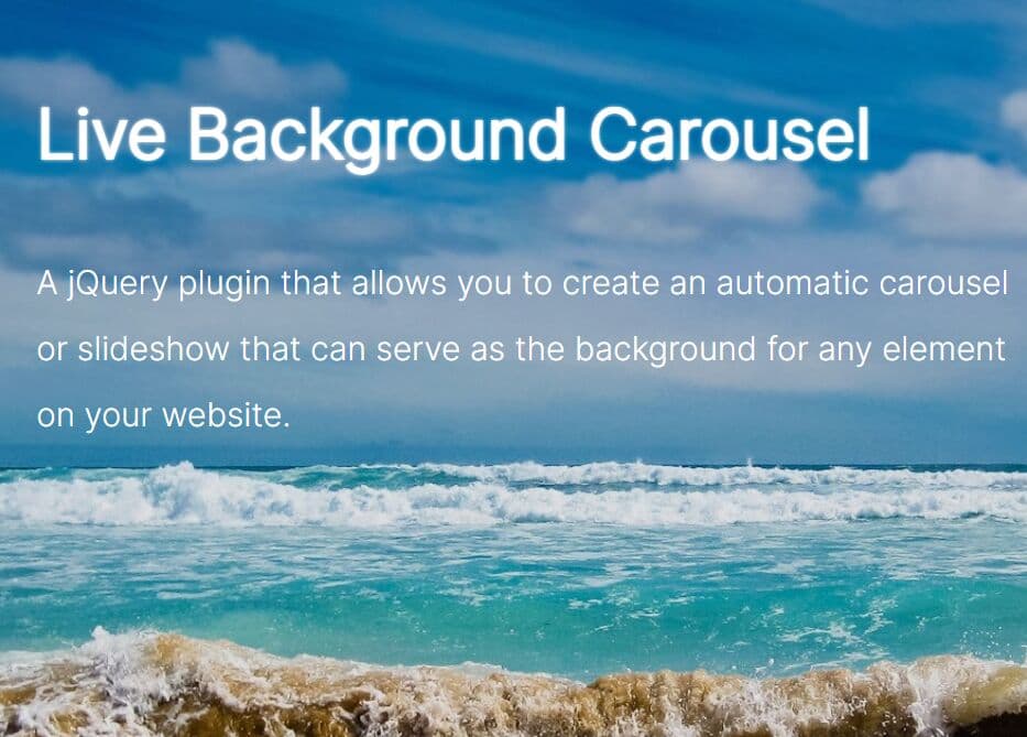
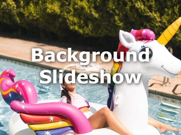
Handy Slider is a simple yet heavily configurable jQuery carousel/slideshow plugin which enables you to slide through a series of images with custom CSS3 animations.
Features:
- Supports both horizontal and vertical directions.
- Keyboard navigation.
- Displays a prev/next navigation on mouse over.
- Autoplay on mouse leave + Autopause on mouse enter.
- Custom CSS3 animation effects.
How to use it:
1. Add the jQuery Handy Slider plugin to your document.
<script src="//code.jquery.com/jquery-1.11.2.min.js"></script>
<script src="js/jquery.handyslider.js"></script>
2. Build the Html structure for the carousel/slideshow.
<div id="slider-content" class="container">
  <div id="prevButton">
    <div class="icon-lightarrowleft"></div>
  </div>
  <div id="slider">
    <div class="slide">
        <img src="1.jpg">
      </div>
      <div class="slide">
        <img src="2.jpg">
      </div>
      <div class="slide">
        <img src="3.jpg">
      </div>
      <div class="slide">
        <img src="4.jpg">
      </div>
    <div class="floatc" id="playButton-content">
      <button id="playButton">Pause</button>
    </div>
  </div>
  <div id="nextButton">
    <div class="icon-lightarrowright"></div>
  </div>
</div>
3. The required plugin styles.
.container {
  margin: auto;
  width: 960px;
  height: 100%;
  z-index: 0;
  background-color: #edecec;
  padding: 15px;
}

#slider-content {
  position: absolute;
  top: 50%;
  margin-top: -225px;
  left: 50%;
  margin-left: -475px;
  width: 960px;
  height: 450px;
}

#slider {
  position: relative;
  width: 960px;
  height: 450px;
  overflow: hidden;
}

.slide {
  position: absolute;
  top: 0;
  left: 0;
  height: inherit;
  width: inherit;
  z-index: 9;
  overflow: hidden;
}

.slide.next { left: 960px; }

.slide.previous { left: -960px; }
4. The optional CSS/CSS3 styles.
#slider:hover #playButton-content { bottom: 0px; }

#playButton-content {
  z-index: 99;
  position: absolute;
  bottom: -40px;
  width: 100%;
  height: 40px;
  background-color: rgba(0, 0, 0, 0.4);
  -webkit-transition: all 200ms cubic-bezier(0.42, 0, 0.58, 1);
  -moz-transition: all 200ms cubic-bezier(0.42, 0, 0.58, 1);
  -o-transition: all 200ms cubic-bezier(0.42, 0, 0.58, 1);
  transition: all 200ms cubic-bezier(0.42, 0, 0.58, 1);
}

#playButton {
  cursor: pointer;
  background-color: rgba(0, 0, 0, 0);
  margin: 0;
  padding: 5px;
  color: white;
  font-family: 'pt serif';
  font-style: italic;
  font-size: 1.2em;
  border: none;
  opacity: 0.6;
  -webkit-transition: opacity 200ms cubic-bezier(0.42, 0, 0.58, 1);
  /* Ease in out */

  -moz-transition: opacity 200ms cubic-bezier(0.42, 0, 0.58, 1);
  -o-transition: opacity 200ms cubic-bezier(0.42, 0, 0.58, 1);
  transition: opacity 200ms cubic-bezier(0.42, 0, 0.58, 1);
}

#playButton:hover { opacity: 1; }

#nextButton {
  width: 75px;
  height: 75px;
  position: absolute;
  z-index: 8;
  right: 0;
  top: 50%;
  margin-top: -30px;
  text-align: center;
  cursor: pointer;
  opacity: 0.8;
  -webkit-transition: all 200ms cubic-bezier(0.42, 0, 0.58, 1);
  -moz-transition: all 200ms cubic-bezier(0.42, 0, 0.58, 1);
  -o-transition: all 200ms cubic-bezier(0.42, 0, 0.58, 1);
  transition: all 200ms cubic-bezier(0.42, 0, 0.58, 1);
}

#nextButton:hover { opacity: 1; }

#prevButton {
  width: 75px;
  height: 75px;
  position: absolute;
  z-index: 8;
  left: 0;
  top: 50%;
  margin-top: -30px;
  text-align: center;
  cursor: pointer;
  opacity: 0.8;
  -webkit-transition: all 200ms cubic-bezier(0.42, 0, 0.58, 1);
  -moz-transition: all 200ms cubic-bezier(0.42, 0, 0.58, 1);
  -o-transition: all 200ms cubic-bezier(0.42, 0, 0.58, 1);
  transition: all 200ms cubic-bezier(0.42, 0, 0.58, 1);
}

#prevButton:hover { opacity: 1; }

#slider-content:hover #nextButton { right: -75px; }

#slider-content:hover #prevButton { left: -75px; }
5. The CSS for navigation icons.
@font-face {
  font-family: 'tfrere-icon';
  src: url('../typo/tfrere-icon.eot');
  src: url('../typo/tfrere-icon.eot?#iefix') format('embedded-opentype'),  url('../typo/tfrere-icon.woff') format('woff'),  url('../typo/tfrere-icon.ttf') format('truetype'),  url('../typo/tfrere-icon.svg#tfrere-icon') format('svg');
  font-weight: normal;
  font-style: normal;
  -webkit-font-smoothing: antialiased;
}
[class*="icon-"] {
 font-family: 'tfrere-icon';
 speak: none;
 font-style: normal;
 font-weight: normal;
 font-variant: normal;
 text-transform: none;
 line-height: 1;
 -webkit-font-smoothing: antialiased;
}

.icon {
  text-align: center;
  zoom: 1;
  margin: 0 auto;
}

.icon-lightarrowright:before { content: "\22"; }

.icon-lightarrowleft:before { content: "\23"; }

.icon-lightarrowright:before { font-size: 4em; }

.icon-lightarrowleft:before { font-size: 4em; }
6. Initialize the carousel/slideshow.
$(function () {
  var params = {
    enablePlayPause : true,
    onPlay : function () {$("#playButton").text("Pause");},
    onPause : function () {$("#playButton").text("Play");}
  };

  $('#slider').slider(params);
});
7. All the plugin options.
// CSS classes
prevButtonSelector : "#prevButton",
nextButtonSelector : "#nextButton",
slidesClassName : "slide",
currentSlideClassName : "currentSlide",
previousSlideClassName : "previous",
nextSlideClassName : "next",

// 'horizontal' or leave blank for 'vertical'
direction : "horizontal",

// keyboard navigation
keySupport : true,

// custom transition effect
effect : "cubic-bezier(0.42 0 0.58 1)",

// transition speed
timeEffect : 800,

// infinite loop
loop : true,

// the user actions on the slider will be only execute on the anchor setted.
onlySlideOnThisAnchor : false,

// pause the plugin on mouse over
enablePlayPause : false,

// transition delay
timeBetweenTwoSlides : 3000,

// auto play on page load
autoPlay : true,

// selector for play/pause button
playPauseButtonSelector : "#playButton",

// callbacks
onPlay: function(){},
onPause: function(){}
This awesome jQuery plugin is developed by thomaswinckell. For more Advanced Usages, please check the demo page or visit the official website.