Super Simple jQuery Responsive Image Slideshow Plugin - avenSlider
| File Size: | 529 KB |
|---|---|
| Views Total: | 787 |
| Last Update: | |
| Publish Date: | |
| Official Website: | Go to website |
| License: | MIT |

avenSlider is an extremely simple and lightweight jQuery plugin which allows you to create a fully responsive image slideshow with support for crossfade effect, autoplay and endless loop.
How to use it:
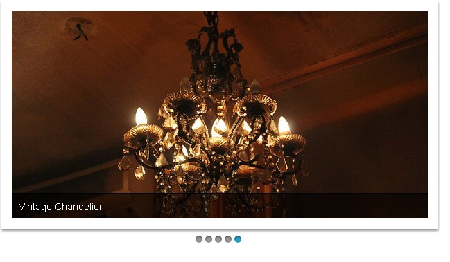
1. Wrap the images in a container element. The plugin will automatically convert data-title attribute into image captions.
<div id="slider">
<img src="img/slide1.jpg" data-title="slide 1" />
<img src="img/slide2.jpg" data-title="slide 2" />
<img src="img/slide1.jpg" data-title="slide 3" />
<img src="img/slide2.jpg" data-title="slide 4" />
</div>
2. Include the latest version of jQuery library and the jQuery avenSlider plugin at the bottom of the web page so the pages load faster.
<script src="http://ajax.googleapis.com/ajax/libs/jquery/1.11.1/jquery.min.js"></script>
<script src="js/avenSlider.js"></script>
3. The basic CSS rules to style the image slideshow.
img {
max-width: 100%;
height: auto;
}
/* SLIDER */
#slider {
position: relative;
overflow: hidden;
}
#slider img {
display: none;
z-index: 8000;
}
#slider .slide-title {
background: rgba(0,0,0,.5);
padding: 10px;
color: #fff;
display: none;
position: absolute;
bottom: 20%;
left: 0;
z-index: 8100;
}
#slider .slide-count {
padding: 10px;
color: #fff;
position: absolute;
bottom: 0;
right: 0;
z-index: 8100;
}
 @media (max-width: 480px) {
#slider .slide-title, #slider .slide-count {
display: none;
visibility: hidden;
}
}
This awesome jQuery plugin is developed by aventic. For more Advanced Usages, please check the demo page or visit the official website.