Multi-View jQuery Data Grid with Kanban - DataBox
| File Size: | 205 KB |
|---|---|
| Views Total: | 0 |
| Last Update: | |
| Publish Date: | |
| Official Website: | Go to website |
| License: | MIT |
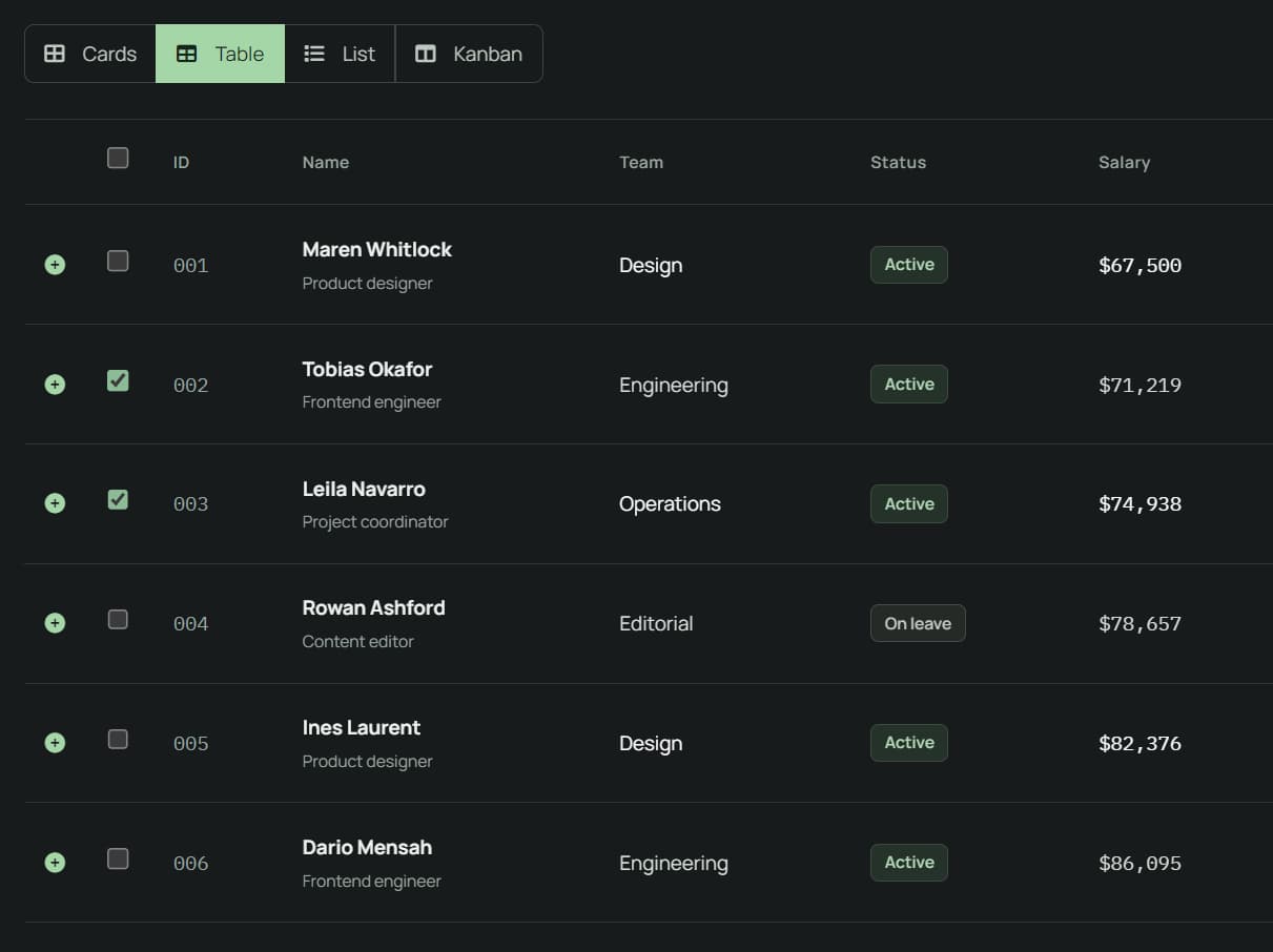
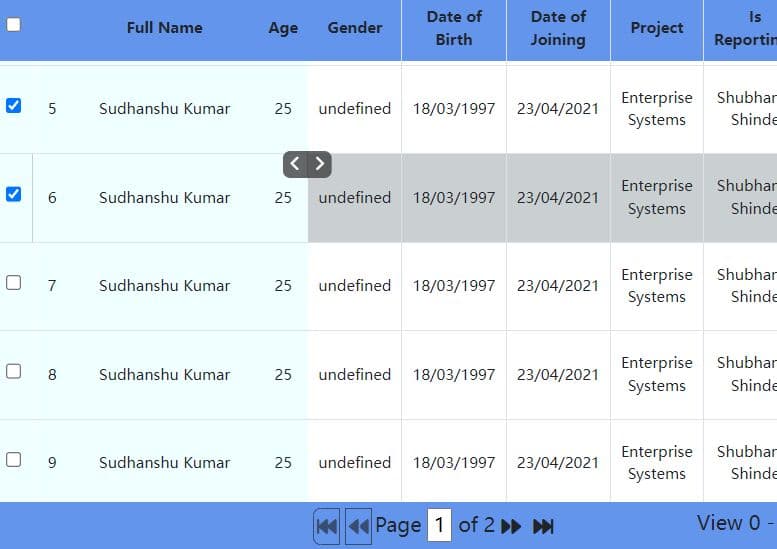
DataBox is a data display library for jQuery and Bootstrap that generates searchable tables, card grids, lists, tree views, and Kanban boards from any data.
Features
- 4 built-in views: data table, card grid, list, and Kanban board.
- Switch between enabled views through UI buttons or JavaScript.
- Global search, per-column filters, quick filters, and an AND/OR query builder.
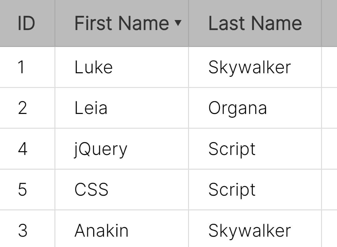
- Pagination, continuous scrolling modes, multi-column sorting, and AJAX server-side processing.
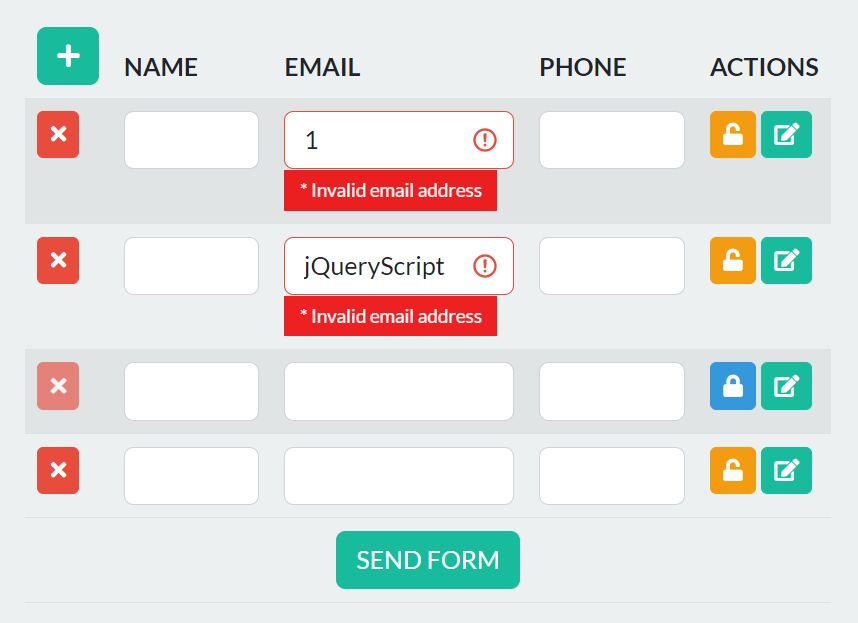
- Inline table-cell editing with text, number, date, select, and checkbox inputs.
- Single or multiple row selection and configurable bulk actions.
- CSV and Excel-compatible
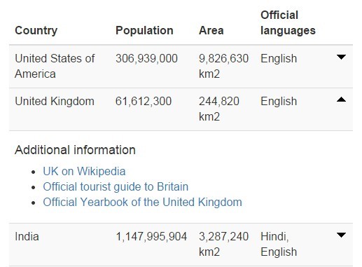
.xlsexports, clipboard copying, and browser printing or PDF saving. - Expandable row details, grouping, footer calculations, fixed columns, and column reordering.
- Drag-and-drop Kanban cards with an application callback for changes.
- Saved search, sorting, pagination, and view state, plus English and Portuguese text dictionaries.
How To Use It
Installation
Load Bootstrap CSS, jQuery, the Bootstrap JavaScript bundle, and DataBox jQuery plugin in the document. Font Awesome 6 is optional for default icons.
<link rel="stylesheet" href="https://cdn.jsdelivr.net/npm/[email protected]/dist/css/bootstrap.min.css">
<link rel="stylesheet" href="https://cdnjs.cloudflare.com/ajax/libs/font-awesome/6.5.0/css/all.min.css">

<script src="https://code.jquery.com/jquery-3.7.1.min.js"></script>
<script src="https://cdn.jsdelivr.net/npm/[email protected]/dist/js/bootstrap.bundle.min.js"></script>
<script src="./dataBox.min.js"></script>
Basic Usage
Give DataBox.init() a container ID, a record array, and the columns to display.
<div id="staff-directory"></div>

<script>
const staff = [
  { id: 1, name: 'Avery Morgan', team: 'Engineering', role: 'Developer' },
  { id: 2, name: 'Jordan Lee', team: 'Design', role: 'Designer' },
  { id: 3, name: 'Taylor Reed', team: 'Operations', role: 'Coordinator' }
];

const directory = DataBox.init({
  target: '#staff-directory',
  data: staff,
  language: 'en-US',
  views: {
    table: {
      active: true,
      title: 'Table',
      columns: [
        { data: 'name', title: 'Name' },
        { data: 'team', title: 'Team' },
        { data: 'role', title: 'Role' }
      ]
    },
    card: { active: true, title: 'Cards' }
  },
  search: { active: true, fields: ['name', 'team', 'role'] },
  pagination: { limit: 10 }
});

directory.setView('table');
</script>
Switch Between Views and Enable Kanban
Kanban groups records by a field such as status. Place <div id="project-board"></div> on the page. When a card moves, onKanbanDrop receives the record and the previous and new group values.
const board = DataBox.init({
  target: '#project-board',
  data: [
    { id: 101, name: 'Landing page', status: 'Todo' },
    { id: 102, name: 'QA review', status: 'In progress' },
    { id: 103, name: 'Release notes', status: 'Done' }
  ],
  language: 'en-US',
  views: {
    card: { active: true },
    table: {
      active: true,
      columns: [
        { data: 'name', title: 'Task' },
        { data: 'status', title: 'Status' }
      ]
    },
    kanban: {
      active: true,
      groupBy: 'status',
      allowDragDrop: true
    }
  },
  callbacks: {
    onKanbanDrop: function(item, oldGroup, newGroup) {
      console.log(item.name, oldGroup, newGroup);
      // Save the changed status to your backend if needed.
    }
  }
});

board.setView('kanban');
The card move updates the local record. Send that change to your API from onKanbanDrop when the board uses saved backend data.
Load Data From an API
Put <div id="orders"></div> in the page and configure ajax.url. Server-side mode sends pagination, sorting, and search parameters to the endpoint. The server must apply them and return the matching records and counts.
const orders = DataBox.init({
  target: '#orders',
  language: 'en-US',
  views: {
    card: { active: false },
    table: {
      active: true,
      columns: [
        { data: 'id', title: 'Order ID' },
        { data: 'customer', title: 'Customer' },
        { data: 'total', title: 'Total' }
      ]
    }
  },
  ajax: {
    url: '/api/orders',
    method: 'GET',
    serverSide: true
  },
  pagination: { limit: 20 }
});
Implement /api/orders in your application to accept those parameters. Return an object with the DataBox response fields:
{
  "data": [{ "id": 101, "customer": "Avery", "total": 125 }],
  "recordsTotal": 240,
  "recordsFiltered": 240
}
Edit Cells and Handle Changes
Place <div id="editable-orders"></div> in your page. Set inlineEdit: true, mark the editable columns, and handle onEdit. The callback receives the old and new values before DataBox writes the edited field to the record.
const editableTable = DataBox.init({
  target: '#editable-orders',
  data: [
    { id: 1, item: 'Keyboard', status: 'Pending' },
    { id: 2, item: 'Monitor', status: 'Shipped' }
  ],
  language: 'en-US',
  views: {
    card: { active: false },
    table: {
      active: true,
      inlineEdit: true,
      columns: [
        { data: 'item', title: 'Item' },
        {
          data: 'status',
          title: 'Status',
          editable: true,
          editType: 'select',
          editOptions: [
            { value: 'Pending', label: 'Pending' },
            { value: 'Shipped', label: 'Shipped' }
          ]
        }
      ]
    }
  },
  callbacks: {
    onEdit: function(newValue, oldValue, item, column) {
      console.log(item.id, column.data, oldValue, newValue);
    }
  }
});
All Configuration Options
Views and Column Definitions
| Option | Purpose and default |
|---|---|
target |
Required selector for the container, for example '#grid'. |
data |
Array of records for client-side rendering. |
views.table.active |
Enable table view. Default false. |
views.table.columns |
Table column definitions. Required for a usable table view. |
views.table.cssClass |
Table CSS classes. Default 'table table-striped table-hover'. |
views.table.title |
Optional view-switcher caption, for example 'Table'. |
views.table.responsive |
Wrap the table for horizontal scrolling. Default true. |
views.table.sortable |
Enable header sorting. Default true. |
views.table.details |
Function to render expandable row details. Default null. |
views.table.columnVisibility |
Show or hide table columns through a menu. Default false. |
views.table.columnReorder |
Enable column drag-and-drop reordering. Default false. |
views.table.fixedColumns |
Sticky columns, specified as { left: 0, right: 0 }. |
views.table.footer |
Enable table footer calculations. Default false. |
views.table.inlineEdit |
Enable editing for columns marked editable. Default false. |
views.card.active |
Enable card view. Default true. |
views.card.template |
Function returning card HTML. Default null. |
views.card.columns |
Number of cards per grid row. Default 3. |
views.card.itemCssClass |
CSS classes on each card grid item. Default 'col-md-4 mb-3'. |
views.card.cssClass |
Card grid wrapper classes. Default row. |
views.card.details |
Optional function returning expandable card details. |
views.list.active |
Enable list view. Default false. |
views.list.template |
Function returning list item HTML. Default null. |
views.list.details |
Function returning expanded list details. Default null. |
views.list.cssClass |
List wrapper classes. Default list-group. |
views.list.itemCssClass |
List item classes. Default list-group-item. |
views.kanban.active |
Enable Kanban view. Default false. |
views.kanban.groupBy |
Record field for Kanban columns. Required when Kanban is enabled. |
views.kanban.allowDragDrop |
Allow moving cards between groups. Default false. |
views.kanban.columnHeader |
Function returning group header HTML. Default null. |
views.kanban.cardTemplate |
Function returning Kanban card HTML. Default null. |
views.kanban.cssClass |
Kanban board wrapper classes. Default row. |
views.kanban.columnCssClass |
Kanban column classes. Default col-md-4. |
views.kanban.columnItemCssClass |
Kanban card-column item classes. Default col-12 mb-3. |
Table Column Properties
| Column property | Purpose and default |
|---|---|
data |
Required record key. Dot notation works for nested values. |
title |
Header text. Defaults to the data key. |
render |
Cell renderer (value, item, type), with display and export types. |
className |
Extra CSS classes for the cell. |
visible |
Initial column visibility. Default true. |
orderable |
Allow sorting by the column. Default true. |
searchable |
Permit column search. Default true. |
editable |
Allow editing when table inline editing is enabled. Default false. |
editType |
text, number, date, select, or checkbox. Default text. |
editOptions |
{ value, label } choices for a select editor. |
footer |
Footer aggregate (sum, avg, count, min, max) or formatter. Object options include type, prefix, suffix, locale, and format. |
Search, Sorting, and Pagination
| Option | Purpose and default |
|---|---|
search.active |
Enable search. Default true. |
search.global |
Declared global-search setting. Default true; the built-in search field is controlled by search.active in this build. |
search.perColumn |
Show per-column search inputs. Default false. |
search.debounce |
Input delay in milliseconds. Default 300. |
search.placeholder |
Global search placeholder. Default language label. |
search.fields |
Fields searched globally. Default []; DataBox otherwise checks table column keys. Set this explicitly for a card-only, list-only, or Kanban-only display. |
sorting.active |
Enable sorting. Default true. |
sorting.multiColumn |
Allow Shift-click multi-column sorting. Default true. |
sorting.serverSide |
Declared sorting setting. Default false; AJAX server-side behavior is controlled by ajax.serverSide. |
pagination.type |
paginated, virtual, or infinite. Default paginated. |
pagination.limit |
Records per page or batch. Default 10. |
pagination.limits |
Page-size choices. Default [10,25,50,100]. |
pagination.limiter |
Show page-size selector. Default true. |
pagination.maxButtons |
Maximum numbered page buttons. Default 5. |
pagination.showFirstLast |
First and last page buttons. Default true. |
pagination.showInfo |
Show item count information. Default true. |
pagination.scrollDirection |
vertical or horizontal. Default vertical. |
pagination.scrollSize |
Scrollable container size. Default automatic. |
AJAX and Data Processing
| Option | Purpose and default |
|---|---|
ajax.url |
URL for JSON data. Default empty string. |
ajax.method |
HTTP method. Default GET. |
ajax.dataType |
jQuery response data type. Default json. |
ajax.headers |
Request headers. Default {}. |
ajax.params |
Additional request parameters. Default {}. |
ajax.serverSide |
Delegate paging, filtering, and sorting to the server. Default false. |
ajax.beforeSend |
Request callback (xhr, params). |
ajax.success |
Optional custom success handler (response, instance). |
ajax.error |
Optional error handler (xhr, status, error). |
ajax.complete |
Request completion callback (xhr, instance). |
Selection, Export, and Advanced Filters
| Option | Purpose and default |
|---|---|
selection.active |
Enable record selection. Default false. |
selection.mode |
single or multi. Default single. |
selection.checkbox |
Show selection checkboxes. Default true. |
bulkActions.active |
Enable the selected-record action bar. Default false. |
bulkActions.actions |
Action definitions with label, optional icon and class, and action(items, ids, instance). |
export.active |
Enable export controls. Default false. |
export.buttons |
Default ['copy','csv','excel','pdf','print']. Excel writes an XML-based .xls file; PDF opens the browser print flow. |
export.filename |
Export file base name. Default databox-export. |
export.title |
Print/PDF title. Default null. |
export.orientation |
portrait or landscape. Default portrait. |
export.pageSize |
Print/PDF paper size. Default A4. |
queryBuilder.active |
Enable the AND/OR query builder. Operators include equality, contains, starts/ends with, numeric comparisons, empty checks, and between. Default false. |
queryBuilder.columns |
Fields available in advanced search. Default []. |
quickFilters.active |
Enable preset filters. Default false. |
quickFilters.filters |
Array of filter definitions. Types: dropdown, buttons, date. |
rowGroup.active |
Enable grouping in table view. Default false. |
rowGroup.dataSrc |
Group-by field. Required for grouping. |
rowGroup.startRender |
Optional group header function. |
rowGroup.endRender |
Optional group footer function. |
rowGroup.collapse |
Allow group collapse. Default true. |
stateSave.active |
Enable UI-state storage. Default false. |
stateSave.duration |
State lifetime in seconds. Default 7200. |
stateSave.storage |
localStorage or sessionStorage. Default localStorage. |
stateSave.saveCallback |
Custom state-saving function. |
stateSave.loadCallback |
Custom state-loading function. |
language |
pt-PT (default) or en-US. |
emptyState.message |
Custom empty-results message. Default locale text. |
emptyState.icon |
Icon class for empty results. Default fas fa-search. |
API Methods
Use DataBox.init(config) to create a grid. DataBox.getInstance(id) finds an existing instance by its container ID, and DataBox.destroy(id) removes it.
const instance = DataBox.getInstance('staff-directory');
instance.search('Engineering').setView('table');
instance.clearSearch();
Instance Methods
| Method | Behavior |
|---|---|
setView(view) |
Change to an enabled view. |
search(term) |
Apply global search. |
clearSearch() |
Clear the search, advanced query, and active quick filters. |
setPage(page) |
Change the current numbered page. |
reload() |
Reprocess data from page one. Server-side mode requests new data. |
sort(column, direction) |
Sort a field, using asc or desc. |
clearSort() |
Remove active sorting. |
getData() |
Return records in the active view/page. |
getAllData() |
Return the complete client-side dataset. |
getTotalItems() |
Return the filtered record count. |
getCurrentPage() |
Return the page number. |
getTotalPages() |
Return the total page count. |
getSelectedItems() |
Return selected records from the active page. |
getSelectedIds() |
Return selected record IDs. |
clearSelection() |
Clear selected records. |
addItem(item) |
Append a record to client-side data. |
removeItem(idOrFn) |
Remove records by ID or filter predicate. |
updateItem(id, updates) |
Update a record matching its ID. |
setAjaxParams(params) |
Merge additional AJAX request parameters. |
clearState() |
Remove stored UI state. |
destroy() |
Remove the rendered UI and its handlers. |
Callbacks
Register lifecycle and interaction callbacks in callbacks.
For a client-side AJAX request, onDataLoaded can run during data processing and again after the request succeeds. Avoid non-idempotent writes in this callback.
| Callback | When it runs |
|---|---|
onInitialized |
After instance initialization. |
onDataLoaded |
After data processing or loading. |
onViewChanged |
After switching views. |
onPageChanged |
After a page change. |
onSearch |
When search is invoked through the API. |
onSort |
When table sorting changes. |
onRowClick |
When a record element is clicked. |
onSelectionChanged |
After record selection changes. |
onRowExpand |
When table details expand. |
onRowCollapse |
When table details collapse. |
onColumnReorder |
After column reordering. |
onColumnVisibility |
After a column's visibility changes. |
onEdit |
When an edit is saved, before its new value is assigned to the record. |
onKanbanDrop |
After a Kanban card moves between groups. |
onBulkAction |
After a configured bulk action runs. |
onError |
On an AJAX failure. |
onStateSave |
During default UI-state saving. |
onStateLoad |
When a custom state-load callback receives saved state. |
FAQs
Does DataBox work in a project that does not use jQuery?
No. The core requires jQuery 3.6+ and Bootstrap 5.3+. A vanilla JavaScript application would need to load those dependencies or choose a different data grid.
Why is my table empty when the card view works?
A table needs views.table.columns with data keys matching your records. Cards are active by default, so disable views.card.active when you want a table-only view.
Can DataBox process filters and pagination on the server?
Yes. Set ajax.serverSide to true and implement an endpoint that accepts DataBox's pagination, sorting, and search parameters. Return data, recordsTotal, and recordsFiltered in the JSON response.
Does the PDF export create a downloadable PDF file?
The PDF action opens a printable document and invokes the browser print dialog. Choose a PDF destination in the browser to save a file. The Excel action creates an XML-based .xls export, not .xlsx.
Can I use the Tree view with the four built-in views?
Yes. Load the /dist/plugins/dataBox.tree.js after dataBox.min.js and register DataBox.Tree.createRenderer() as the tree view renderer. This plugin is not included in the four-view core.
This awesome jQuery plugin is developed by SyntaxSerenity-dev. For more Advanced Usages, please check the demo page or visit the official website.
- Prev: Automatically Number Your HTML Tables with jQuery - Autotablenumbers
- Next: None