Dynamic Interactive Data Table Plugin for Bootstrap - jQuery bs-table
| File Size: | 71.8 KB |
|---|---|
| Views Total: | 324 |
| Last Update: | |
| Publish Date: | |
| Official Website: | Go to website |
| License: | MIT |
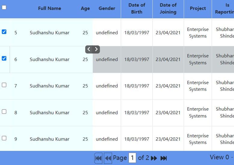
bs-table is a lightweight yet robust Bootstrap table plugin that creates dynamic, feature-rich data tables with sorting, pagination, and search functionalities.
Features:
- Data Source Flexibility: Populates from a local JavaScript array (
data) or a remote URL (url). - Pagination: Supports both client-side and server-side pagination models.
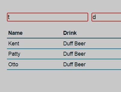
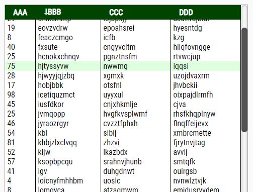
- Core Interactions: Includes built-in column sorting, text search, and a data refresh button.
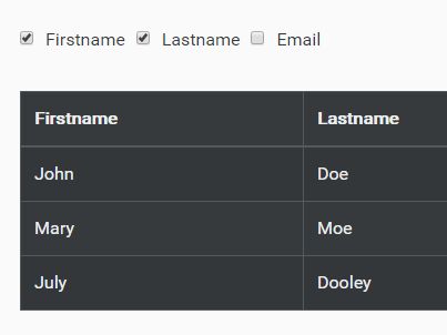
- Column Customization: Control column visibility, alignment, width, and sorting.
- Custom Formatters: Use a
formatterfunction to render custom HTML, components, or computed values in any cell. - Event-Driven API: Useful events for hooking into the table's lifecycle (e.g., on-click, on-sort, on-load).
How to use it:
1. Load the required jQuery library, Bootstrap 5 framework, and Bootstrap Icons in the document.
<link rel="stylesheet" href="/path/to/cdn/bootstrap.min.css" />
<link rel="stylesheet" href="/path/to/cdn/bootstrap-icons.min.css">
<script src="/path/to/cdn/jquery.min.js"></script>
<script src="/path/to/cdn/bootstrap.bundle.min.js"></script>
2. Create an empty <table> element with a unique ID in your document. The plugin will build the table inside this element.
<table id="example"></table>
3. Prepare your tabular data as follows:
const tableData = [
  { "id": 1, "name": "John Doe", "role": "Admin", "status": "active" },
  { "id": 2, "name": "Jane Smith", "role": "Editor", "status": "inactive" },
  // ...more data
];
4. Initialize the data table with your data:
$('#example').bsTable({
  data: tableData,
  idField: 'id',
  pagination: true,
  search: true,
  sortName: 'name',
  sortOrder: 'asc',
  columns: [{
    field: 'id',
      title: 'ID',
      sortable: true,
      width: '10'
    },
    {
      field: 'name',
      title: 'User Name',
      sortable: true
    },
    {
      field: 'role',
      title: 'Role',
      sortable: true
    },
    {
      field: 'status',
      title: 'Status',
      align: 'center',
      // A formatter is great for custom cell rendering
      formatter: function (value, row, index) {
        const badgeClass = value === 'active' ? 'bg-success' : 'bg-secondary';
        return `<span class="badge ${badgeClass}">${value}</span>`;
      }
    }
  ]
});
5. All possible plugin options to customize your data table.
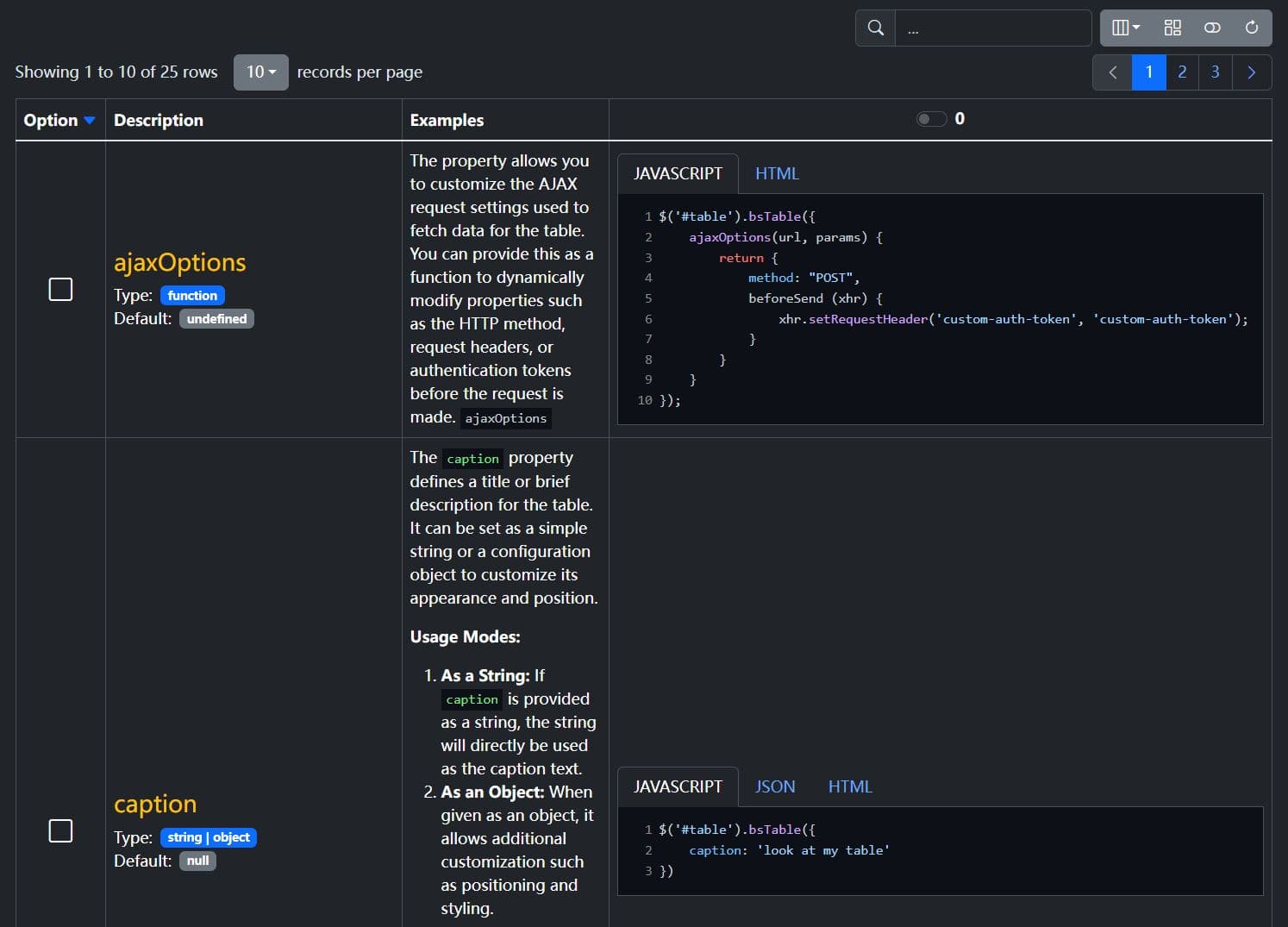
classes:string | object- Sets CSS classes for the table. A string applies to the<table>element, while an object can targettable,thead,tbody, andtfootindividually.toolbar:string | $- A selector for a toolbar element that will be moved into the table's header area.pagination:boolean- Toggles the pagination controls. Default istrue.sidePagination:string- Determines where pagination occurs.'client'for local data,'server'for API-driven data. Default is'client'.paginationVAlign:string- Vertical alignment of the pagination controls:'top','bottom', or'both'. Default is'bottom'.paginationHAlign:string- Horizontal alignment of the pagination controls:'start'or'end'. Default is'end'.pageNumber:number- Sets the initial page number on load. Default is1.pageSize:number- Defines the number of rows to display per page. Default is10.pageList:array<number>- An array of page size options for the user to select from. Default is[5, 10, 25, 50, 100, 200, 'All'].search:boolean- Toggles the search input field above the table. Default istrue.sortName:string- Thefieldname of the column to sort by default.sortOrder:string- The default sort direction,'asc'or'desc'. Default is'asc'.showRefresh:boolean- Toggles the refresh button to reload data. Default istrue.showHeader:boolean- Toggles the visibility of the table header (<thead>). Default istrue.showFooter:boolean- Toggles the visibility of the table footer (<tfoot>). Default isfalse.showColumns:boolean- Adds a dropdown menu that allows users to show or hide columns. Default isfalse.minimumCountColumns:number- The minimum number of columns that must remain visible whenshowColumnsis enabled. Default is1.url:string | function- The URL to fetch data from. Used only if thedataoption is not provided.data:array- A local array of JSON objects to populate the table.columns:array- An array of objects defining each column's properties (field,title,sortable,formatter, etc.).idField:string- Specifies the field that acts as the unique ID for each row.icons:object- An object that defines the Bootstrap Icon classes for UI elements like sort arrows, pagination, and search.caption:string | object- Adds a caption to the table. A string sets the text, while an object allows setting thetext,onTopposition, andclasses.
$('#example').bsTable({
  height: undefined,
  ajaxOptions: undefined,
  classes: 'table',
  toolbar: undefined,
  pagination: false,
  sidePagination: 'client',
  paginationVAlign: 'bottom',
  paginationHAlign: 'end',
  pageNumber: 1,
  pageSize: 10,
  pageList: [5, 10, 25, 50, 100, 200, 'All'],
  search: false,
  sortName: null,
  sortOrder: 'asc',
  showRefresh: false,
  showHeader: true,
  showFooter: false,
  showToggle: false,
  showColumns: false,
  showCheckItems: false,
  checkItemsConfig: {
    type: 'checkbox', // checkbox or radio
    field: 'id', // the value field
    name: 'btSelectItem', // When Typ Checkbox is, the name is converted to an array
    clickRowToSelect: true, // CheckItem toggle on click row
    align: 'center',
    valign: 'middle'
  },
  cardView: false,
  showCustomView: false,
  customView: false,
  onCustomView(_rows, _$td) {
  },
  url: null,
  data: null,
  columns: [], // see below
  minimumCountColumns: 1,
  icons: {
    sortAsc: 'bi bi-caret-down-fill text-primary',
    sortDesc: 'bi bi-caret-up-fill text-primary',
    sortNone: 'bi bi-caret-down',
    refresh: 'bi bi-arrow-clockwise',
    search: 'bi bi-search',
    paginationNext: 'bi bi-chevron-right',
    paginationPrev: 'bi bi-chevron-left',
    toggleOff: 'bi bi-toggle-off',
    toggleOn: 'bi bi-toggle-on',
    customViewOff: 'bi bi-columns-gap',
    customViewOn: 'bi bi-table',
    check: 'bi bi-check-square fs-4 fw-boöd',
    uncheck: 'bi bi-square fs-4',
  },
  caption: null,
  rowStyle(_row, _index, _$tr) {
  },
  queryParams(_params) {
    return _params;
  },
  responseHandler(_res) {
    return _res;
  },
  formatNoMatches() {
    return `<i class="bi bi-x-lg fs-1 text-danger"></i>`;
  },
  formatSearch() {
    return `...`
  },
  formatShowingRows(_pageFrom, _pageTo, _totalRows) {
    return `Showing ${_pageFrom} to ${_pageTo} of ${_totalRows} rows`;
  },
  formatRecordsPerPage() {
    return `records per page`;
  },
  debug: false
});
6. All available Column options.
field:string- The key from the data object that corresponds to this column.title:string- The text displayed in the column's header (<th>).sortable:boolean- Iftrue, allows the column to be sorted by clicking the header. Default isfalse.visible:boolean- Iffalse, the column will be hidden by default. Default istrue.class:string- CSS classes to apply to the column's cells (<td>).width:string | number- Sets the CSS width for the column.align:string- Sets the horizontal alignment (text-align) for the cells (<td>). Values:'left','center','right'.halign:string- Sets the horizontal alignment for the header cell (<th>). Values:'left','center','right'.falign:string- Sets the horizontal alignment for the footer cell (<td>). Values:'left','center','right'.valign:string- Sets the vertical alignment (vertical-align) for the cells. Values:'top','middle','bottom'.formatter:function- A custom function to control the HTML content of a cell. It receives four arguments:value,row,index, and$td.checkbox:boolean- Iftrue, renders a checkbox in the column for row selection.radio:boolean- Iftrue, renders a radio button in the column for single-row selection.
$('#example').bsTable({
  columns: [{
    class: undefined,
    field: undefined,
    sortable: false,
    visible: true,
    width: undefined,
    valign: 'middle',
    align: 'left',
    halign: 'start',
    falign: 'start',
    formatter: undefined,
    footerFormatter: undefined,
    events: undefined
  },
  // ...
  ]
});
7. Available events.
onAll(all.bs.table): A global callback that fires for any event triggered by the table. The first parameter is the name of the event that fired.onLoadSuccess(load-success.bs.table): Fires after data is successfully loaded into the table, whether from a local array or a remote URL.onLoadError(load-error.bs.table): Fires if there is an error while fetching data from a remote URL.onPreBody(pre-body.bs.table): Fires right before the table body (<tbody>) is rendered. Useful for manipulating data just before display.onPostBody(post-body.bs.table): Fires immediately after the table body has been rendered and appended to the DOM.onPostFooter(post-footer.bs.table): Fires after the table footer (<tfoot>) is rendered.onRefresh(refresh.bs.table): Fires when the table's refresh action is triggered.onSort(sort.bs.table): Fires when a column is sorted. It provides the column's field name and the sort order ('asc'or'desc').onClickCell(click-cell.bs.table): Fires when a single cell (<td>) is clicked. It provides the field name, cell value, the full row data object, and the jQuery element of the cell.onClickRow(click-row.bs.table): Fires when a row (<tr>) is clicked. It provides the row data object and the jQuery element of the row.onCheck(check.bs.table): Fires when a row's checkbox is checked. It provides the corresponding row data.onCheckAll(check-all.bs.table): Fires when the "check all" checkbox in the header is checked.onUncheck(uncheck.bs.table): Fires when a row's checkbox is unchecked. It provides the corresponding row data.onUncheckAll(uncheck-all.bs.table): Fires when the "check all" checkbox in the header is unchecked.
$('#example').bsTable({
  onAll(_eventName, ..._args) {
  },
  onError(_message) {
  },
  onLoadSuccess() {
  },
  onLoadError() {
  },
  onPreBody(_rows, _$table) {
  },
  onPostHeader(_$thead, _$table) {
  },
  onPostBody(_rows, _$table) {
  },
  onPostFooter(_$tfoot, _$table) {
  },
  onRefresh(_params) {
  },
  onSort(_name, _order) {
  },
  onClickCell(_field, _value, _row, _$td) {
  },
  onClickRow(_row, _$tr, _field) {
  },
  onCheck(_row, _$input) {
  },
  onCheckAll() {
  },
  onUncheck(_row, _$input) {
  },
  onUncheckAll() {
  },
});
See Also:
- bootstrap-table: This is the library that inspired
bs-table. It is more mature and has an extensive feature set and a larger community. - 10 Best Data Table/Grid Systems In JavaScript
Changelog:
2025-07-29
- Update default column visibility in bsTable
2025-07-27
- Add conditional debug logging in bsTable
2025-07-26
- Handle JSON response parsing in bsTable
2025-07-14
- Refactor table initialization and formatting logic in bsTable
2025-07-13
- Add detailView functionality to bsTable
2025-07-12
- Refactor table settings and enhance check item functionality
This awesome jQuery plugin is developed by ThomasDev-de. For more Advanced Usages, please check the demo page or visit the official website.