Mobile-first Responsive Table Solution For Bootstrap 5
| File Size: | 63.1 KB |
|---|---|
| Views Total: | 3829 |
| Last Update: | |
| Publish Date: | |
| Official Website: | Go to website |
| License: | MIT |
RWD-Table-Patterns is a lightweight, easy-to-use, mobile-first, progressive enhanced jQuery responsive table plugin for the latest Bootstrap 5 framework.
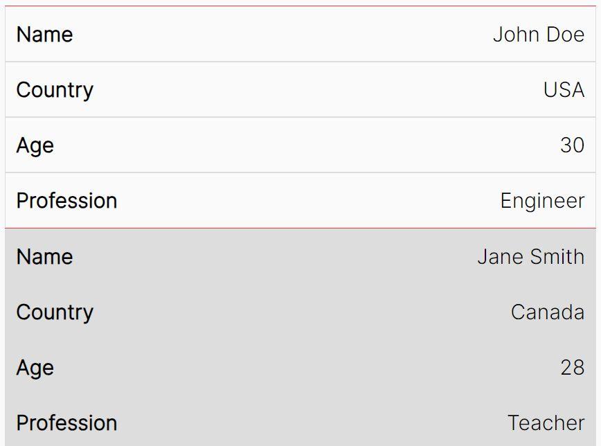
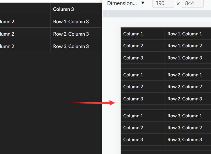
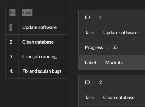
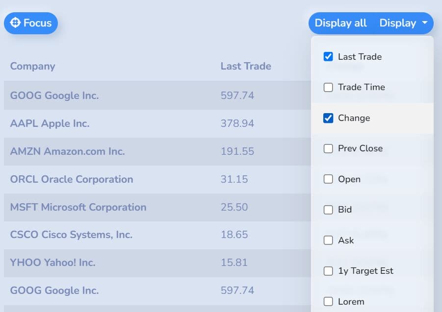
It automatically collapses table columns that exceed the screen's width into a dropdown menu. Users can then easily show or hide the desired table columns by simply clicking the corresponding checkboxes within the menu.
In addition, the plugin supports Fixed Table Header and Sortable functionalities, which enhancements further improve the usability and interaction of your large/complex HTML tables.
See Also:
How to use it:
1. Load the stylesheet rwd-table.css and JavaScript rwd-table.js in your Bootstrap 5 project.
<!-- jQuery and Bootstrap -->
<link rel="stylesheet" href="/path/to/cdn/bootstrap.min.css" />
<script src="/path/to/cdn/jquery.min.js"></script>
<script src="/path/to/cdn/bootstrap.bundle.min.js"></script>

<!-- RWD-Table-Patterns -->
<link rel="stylesheet" href="dist/css/rwd-table.css" />
<script src="dist/js/rwd-table.js"></script>
2. Wrap your HTML table into a DIV container with the CSS class of 'table-responsive'. Then Set priority for each table column via the data-priority attribute.
<div class="table-responsive">
  <table cellspacing="0" id="example-table" class="table table-small-font table-tighten table-bordered table-striped">
    <thead>
      <tr>
        <th>Index</th>
        <th data-priority="1">Last Trade</th>
        <th data-priority="2">Trade Time</th>
        <th data-priority="3">Change</th>
        ...
      </tr>
    </thead>
    <tbody>
      ...
    </tbody>
  </table>
</div>
3. Initialize the RWD-Table-Patterns plugin.
$(function() {
  $('.table-responsive').responsiveTable({
    // options here
  });
});
4. Config the responsive table with the following parameters.
$(function() {
  $('.table-responsive').responsiveTable({
    pattern: 'priority-columns',
    stickyTableHeader: true,
    fixedNavbar: '.navbar.fixed-top',
    addDisplayAllBtn: true,
    addFocusBtn: true,
    focusBtnIcon: 'fa fa-crosshairs',
    mainContainer: window,
    sortable: false,
    compareFunction: function(a, b, dir) { // for sortable
      return a[0].localeCompare(b[0], undefined, { numeric: true }) < 0 ? -dir : dir;
    },
    i18n: {
      focus     : 'Focus',
      display   : 'Display',
      displayAll: 'Display all'
    }
  });
});
5. You can also initialize the plugin and pass the options via HTML data attributes as follows:
<div data-responsive-table-toolbar="example-table"></div>
<div class="table-responsive" data-pattern="priority-columns" data-sortable="true">
  <table cellspacing="0" id="example-table" class="table table-small-font table-tighten table-bordered table-striped">
    <thead>
      <tr>
        <th>Index</th>
        <th data-priority="1">Last Trade</th>
        <th data-priority="2">Trade Time</th>
        <th data-priority="3">Change</th>
        ...
      </tr>
    </thead>
    <tbody>
      ...
    </tbody>
  </table>
</div>
6. Update the responsive table when the tabular data is changed.
$('.table-responsive').responsiveTable('update');
This awesome jQuery plugin is developed by nadangergeo. For more Advanced Usages, please check the demo page or visit the official website.