10 Best Responsive Table Plugins In JavaScript And CSS (2026 Update)
A study shows that the number of smartphone users worldwide today surpasses sever billion and is forecast to further grow by several hundred million in the next few years.
In 2026, the number of unique mobile internet users stood at 5.78 billion, indicating that over 96 percent of the global internet population use a mobile device to go online. This is why Google predominantly uses the mobile version of the content for indexing and ranking.
When you're building a website or webapp using a responsive design layout. You might find it difficult to deal with large (wider) HTML tables on small screen devices. This is because, by using the default table styles, a wide HTML table might break through the viewport and disrupt the overall layout of your page.
To address this, you might need a 3rd JavaScript solution or additional CSS styles to provide a better table view experience on mobile.
Here is a list of 10 best JavaScript and Pure CSS solutions to make your HTML table full responsive and better readability on mobile and tablet devices. Feel free to download and use them in your next modern web design to bring a better experience to existing HTML tables.
Originally Published July 09 2020, updated jan 2026
Table of contents:
jQuery Responsive Table Plugins
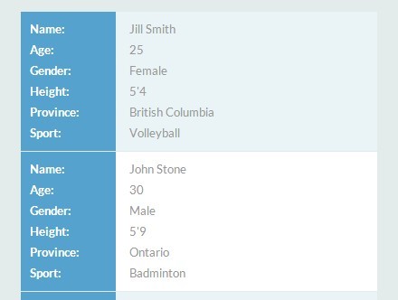
Basic Responsive Table Plugin For jQuery - Basic Table
Basic Table is an ultra-light jQuery plugin to create responsive, mobile-readable data tables using JS resize() method and CSS3 media queries.
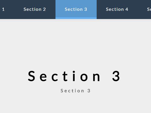
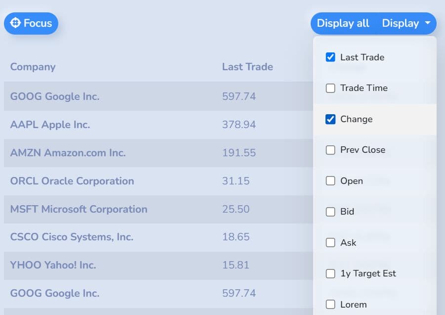
Mobile-first Responsive Table Solution For Bootstrap 5
A lightweight, easy-to-use, mobile-first, progressive enhanced jQuery responsive table plugin for the latest Bootstrap 5 framework.
It automatically collapses table columns that exceed the screen's width into a dropdown menu. Users can then easily show or hide the desired table columns by simply clicking the corresponding checkboxes within the menu.
In addition, the plugin supports Fixed Table Header and Sortable functionalities, which enhancements further improve the usability and interaction of your large/complex HTML tables.
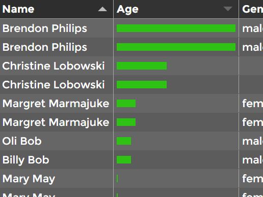
FooTable - jQuery Responsive HTML Table Plugin
FooTable is a jQuery Plugin that makes HTML tables on smaller devices look awesome without breaking the functionality and design.
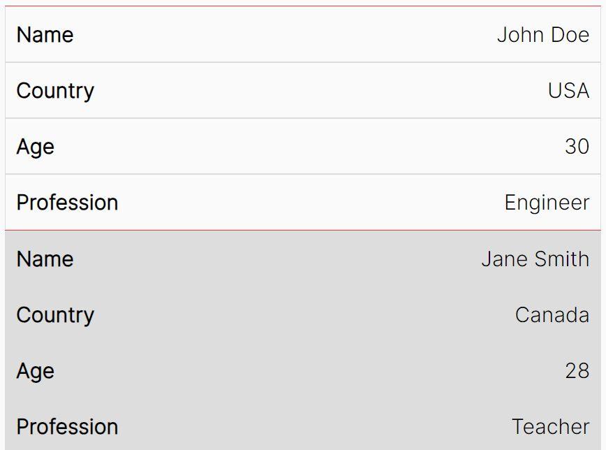
Minimal Accessible Responsive Table Plugin - jQuery Easy Table A11Y
A minimal(~1kb minified), accessible, responsive table jQuery plugin designed to elevate the table-viewing experience on smaller screens like mobile and tablet devices.
It works by transforming multi-column tables into concise two-column formats when viewing on small screens to improve readability without compromising on information.
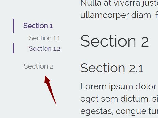
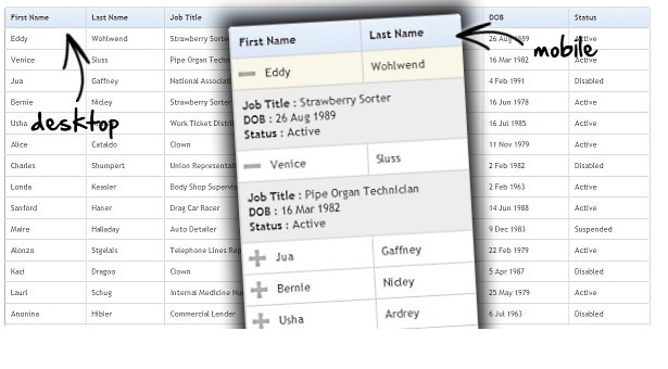
Stacking Tables On Small Screens with jQuery - stacktable
A jQuery Plugin for equalizing the height or width of elements. With this plugin, the wide tables will be converted to a format that works better on small screens.
Vanilla JS Responsive Table Plugins
Make Bootstrap 5 Tables More Readable On Mobile Devices – AvalynxTable.js
A tiny JavaScript library that makes Bootstrap 5 HTML tables look good and function well on mobile devices.

Convert HTML Table To Card View On Mobile Using JavaScript
A plain JavaScript responsive table solution that transforms HTML tables into user-friendly card view on mobile (screen size is less than 426px).

Collapse Overflowing Table Columns Into A Dropdown – Podtablejs
A brand new responsive table solution that automatically collapses overflowing table columns into a dropdown when there is no enough space.

Pure CSS Responsive Table Solutions
Pure CSS Mobile-friendly Responsive Table
Yet another pure CSS responsive table solution that transforms a normal html table into several separated tables in mobile view.

Pure HTML5 / CSS3 Responsive Table Solution
A pure HTML5 / CSS3 solution to make your html table more readable on small screens, without any JavaScript.

Conclusion:
Seeking more JavaScript and CSS solutions to create Responsive HTML tables on the web & mobile? See jQuery Responsive Table and JavaScript Responsive Table sections for more details.
See Also:
- Best JavaScript Plugins For Responsive Text
- Best Responsive Menu Systems In jQuery/JavaScript/CSS
- Best Table Pagination Plugins
- Best Data Table/Grid Systems In JavaScript
- Best Tree Table Plugins In JavaScript
- Best JavaScript Plugins To Sort Table By Columns
- Best Table Filtering Plugin In JavaScript
- Best Table Export Plugins In JavaScript
- Best JavaScript Plugins For Sticky Table Header