Basic Responsive Table Plugin For jQuery - Basic Table
| File Size: | 103 KB |
|---|---|
| Views Total: | 21127 |
| Last Update: | |
| Publish Date: | |
| Official Website: | Go to website |
| License: | MIT |
Basic Table is an ultra-light jQuery plugin to create responsive, mobile-readable data tables using JS resize() method and CSS3 media queries.
See also:
- Small jQuery Plugin For Responsive Table On Mobile Devices
- Lightweight jQuery Responsive Table Plugin - ReStable
- Simple jQuery Responsive Table Plugin - Responsive Tables
How to use it:
1. Include the required jQuery basic table plugin's stylesheet in the head section of your web page.
<link rel="stylesheet" href="basictable.css">
2. Include the jQuery basic table plugin's script after you've installed jQuery library.
<script src="jquery.min.js"></script>
<script src="jquery.basictable.min.js"></script>
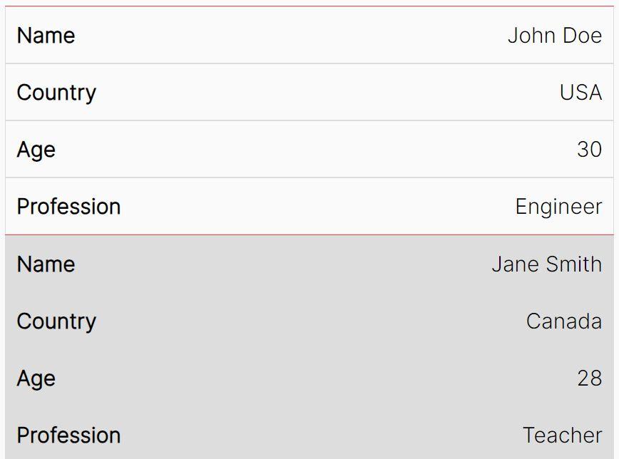
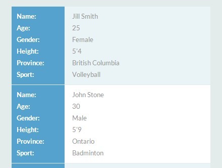
3. Create a standard table on your web page.
<table id="table">
  <thead>
    <tr>
      <th>Name</th>
      <th>Age</th>
    </tr>
  </thead>
  <tbody>
    <tr>
      <td>Jill Smith</td>
      <td>25</td>
    </tr>
  </tbody>
</table>
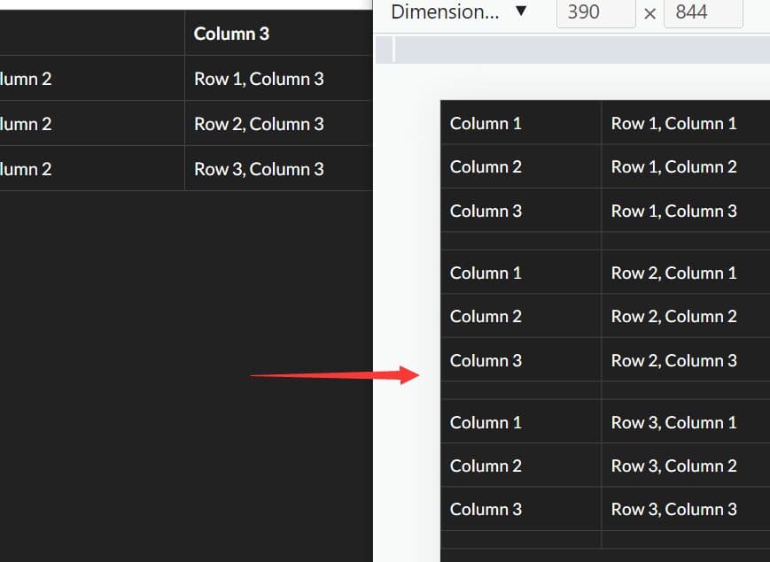
4. The basic implementation using all default settings. Use breakpoint option to custom the viewport's width when the table will engage in responsive mode.
$('#table').basictable({breakpoint: 641});
5. Use CSS3 media queries instead of breakpoint option.
@media only screen and (max-width: 568px) {
  #table thead {
      display: none;
  }

  #table tbody td {
      border: none !important;
      display: block;
      vertical-align: top;
  }

  #table tbody td:before {
      content: attr(data-th) ": ";
      display: inline-block;
      font-weight: bold;
      width: 6.5em;
  }

  #table tbody td.bt-hide {
      display: none;
  }
}
6. All the default settings.
breakpoint: 568: Custom breakpointcontentWrap: true: Wraps the original content within the cell in a span with class .bt-content, to help with CSS selection.forceResponsive: true: The library will always force the table into responsive mode once the breakpoint is met. If this is set to false the table will only change mode when the table itself is larger than its immediate parent's inner width.noResize: false: Disable Basic Table's JS resize. The table won't engage in responsive mode unless media query or another resize bind outside of Basic Table is defined.tableWrap: false: When the library is initialize create a div wrapper around the table with class .bt-wrapper. This wrapper will toggle an active class when the table mode changes.showEmptyCells: false:When true, empty cells will be shown.containerBreakpoint: null: Define the breakpoint of the table's container when the table will engage in responsive mode.header: true: Set to false if table does not have a header row. Table will just be responsive with table body and optional footer.
7. Available methods.
$('table').basictable('start');
$('table').basictable('stop');
$('table').basictable('destroy');
Changelog:
v2.0.4 (2023-09-08)
- Fix Vanilla JS Parent Container Calculation
v2.0.3 (2023-03-08)
- Updated the fallback selectors were not validate
- Updated dependencies
v2.0.2 (2021-01-30)
- Just cleaning up the source code, commits and documentation. No impact on functionality.
2019-03-13
- Add restart method
2018-03-15
- Changed the compression so it's a smaller min file. Also added to NPM registry.
2018-02-09
- Support for tables without any headers.
2016-12-09
- Support for changing the table to responsive mode when the container reaches a certain breakpoint rather than the viewport.
2016-07-20
- Support longer table cell text on modern mobile browsers.
- Fix tables not properly rendering in IE9.
2016-03-27
- Some bug fixes supporting multiple table selector and force show empty cell.
2016-03-25
- Fixed Multiple table selection
2016-01-31
- Added multiple heading row support with colspan heading. Also better tfoot support
2016-01-06
- Added support for tfoot and duplicated bt-content wrappers
2015-12-21
- Fixed missing second parameter
This awesome jQuery plugin is developed by jerrylow. For more Advanced Usages, please check the demo page or visit the official website.