jQuery Plugin for Mobile-Friendly HTML Tables - makeTableResponsive.js
| File Size: | 4.24 KB |
|---|---|
| Views Total: | 924 |
| Last Update: | |
| Publish Date: | |
| Official Website: | Go to website |
| License: | MIT |
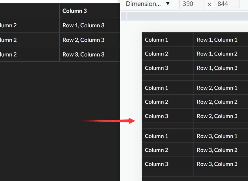
Just another jQuery plugin designed to create fully responsive HTML tables that adapt gracefully to mobile devices.
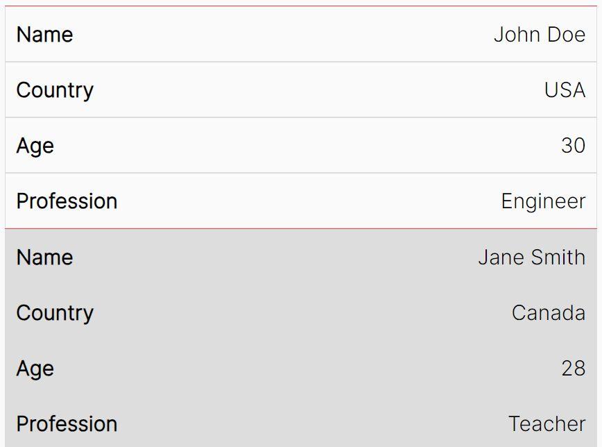
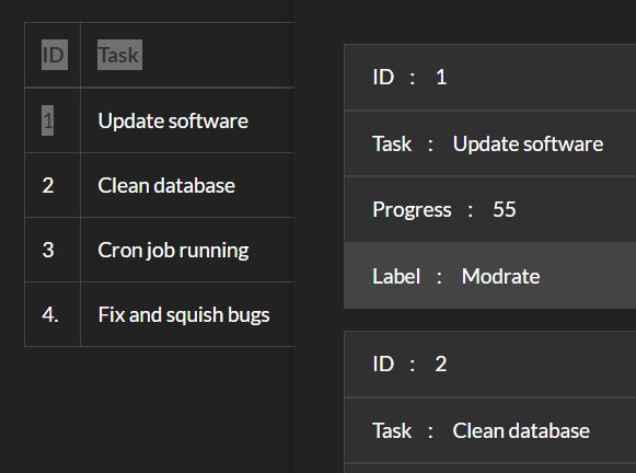
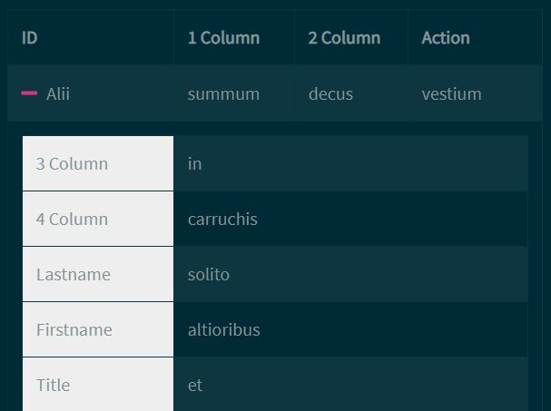
It works by converting wider tables into two-column compact tables using CSS media queries, providing a good user experience for mobile users without compromising the table layout on desktop.
How to use it:
1. Download and place the makeTableResponsive.js script after jQuery library.
<script src="/path/to/cdn/jquery.slim.min.js"></script>
<script src="/path/to/makeTableResponsive.js"></script>
2. Attach the plugin to your HTML table and specify the breakpoint to hide certain columns on small screens and create an optimal two-column table layout.
<table class="table">
 <thead>
    <tr>
      <th>Column 1</th>
      <th>Column 2</th>
      <th>Column 3</th>
    </tr>
  </thead>
  <tbody>
    <tr>
      <td>Row 1, Column 1</td>
      <td>Row 1, Column 2</td>
      <td>Row 1, Column 3</td>
    </tr>
    <tr>
      <td>Row 2, Column 1</td>
      <td>Row 2, Column 2</td>
      <td>Row 2, Column 3</td>
    </tr>
    <tr>
      <td>Row 3, Column 1</td>
      <td>Row 3, Column 2</td>
      <td>Row 3, Column 3</td>
    </tr>
  </tbody>
</table>
$('.table').makeTableResponsive({
  // default: "500px"
  "breakpoint": "728px",
});
3. Set the number of header rows to preserve. Default: -1.
$('.table').makeTableResponsive({
  headingRow: 1,
});
4. Customize the styles of the mobile version of the HTML table.
.cfmobile-table {
  /* mobile styles here */
}
This awesome jQuery plugin is developed by cfullerton. For more Advanced Usages, please check the demo page or visit the official website.