Responsive Table Solution For jQuery - TableCards.js
| File Size: | 6.2 KB |
|---|---|
| Views Total: | 2129 |
| Last Update: | |
| Publish Date: | |
| Official Website: | Go to website |
| License: | MIT |
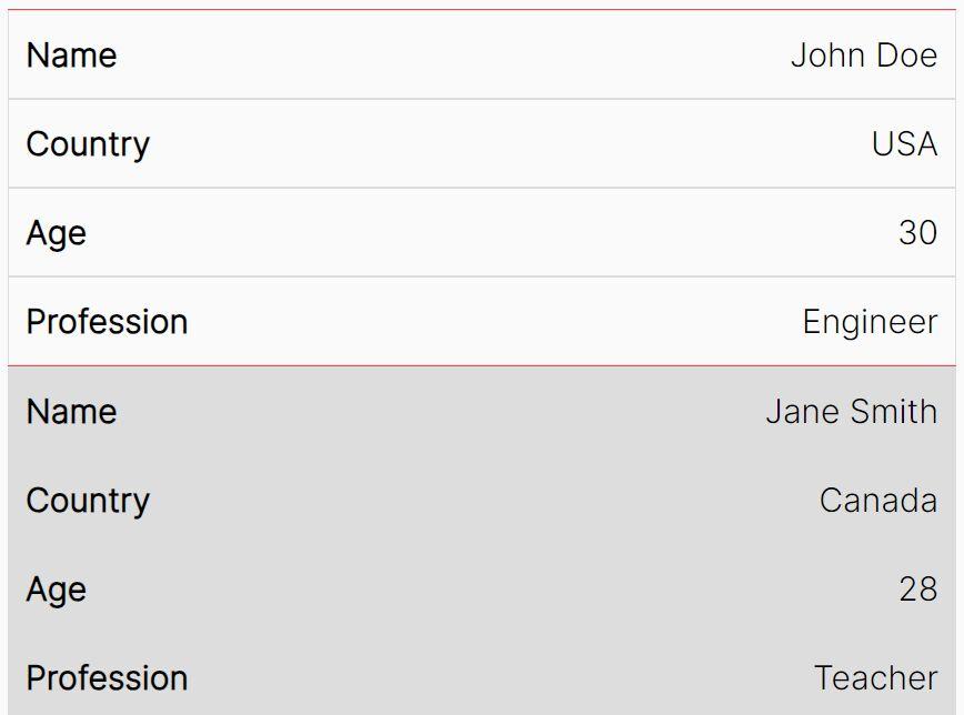
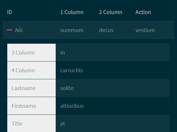
TableCards.js is a jQuery based responsive table solution for making your wide HTML tables mobile friendly.
The plugin detects the screen size and converts your HTML table into a mobile-friendly card layout where the tabular data is rendered using a string-based template.
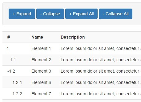
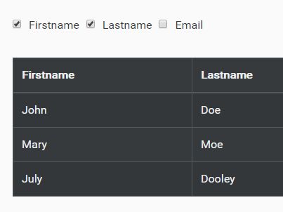
See Also:
How to use it:
1. To get started, include jQuery JavaScript library and the TableCards plugin's files on the HTML page.
<link rel="stylesheet" href="/path/to/jquery.tablecards.css" />
<script src="/path/to/cdn/jquery.min.js"></script>
<script src="/path/to/jquery.tablecards.js"></script>
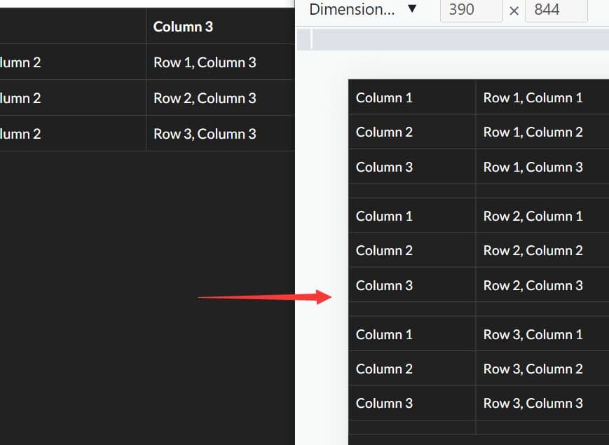
2. Call the function on the HTML table and determine at which breakpoint the plugin converts the table into cards.
$('#mytable').TableCards({
  width: 468
});
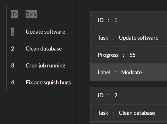
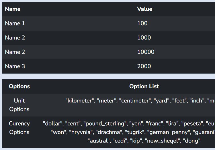
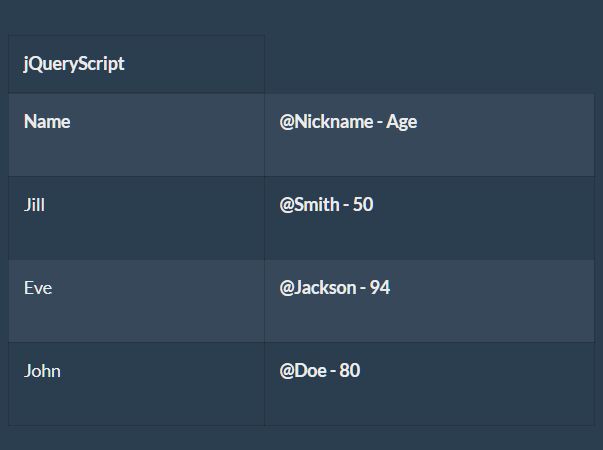
3. Determine how to render the tabular data when running on the card layout.
$('#mytable').TableCards({
  width: 468,
  head: "Custom Header",
  body: "<b>@%2 - %3</b><br>%5<br>%6",
  foot: 'Custom Footer'
  tokenstart: '%'
});
4. Determine which columns should be retained in the header.
$('#mytable').TableCards({
  extracols: [1]
});
5. Trigger a function on init.
$('#mytable').TableCards({
  postinit: function(){}
});
6. Event handlers.
$('#mytable')
.on('tablecards:mode', function() {
  $(this).trigger('table:columnschanged');
})
.on('table:datachanged', function() {
  $(this).trigger('tablecards:datachanged');
})
.on('table:resized', function() {
  $(this).trigger('tablecards:resize');
});
This awesome jQuery plugin is developed by cubiclesoft. For more Advanced Usages, please check the demo page or visit the official website.