Small jQuery Plugin For Responsive Table On Mobile Devices
| File Size: | 2.74 KB |
|---|---|
| Views Total: | 1552 |
| Last Update: | |
| Publish Date: | |
| Official Website: | Go to website |
| License: | MIT |
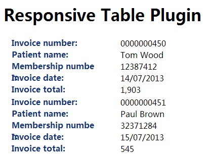
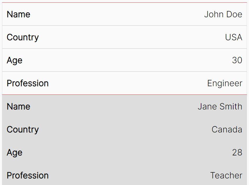
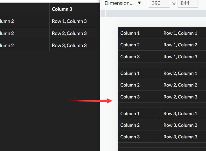
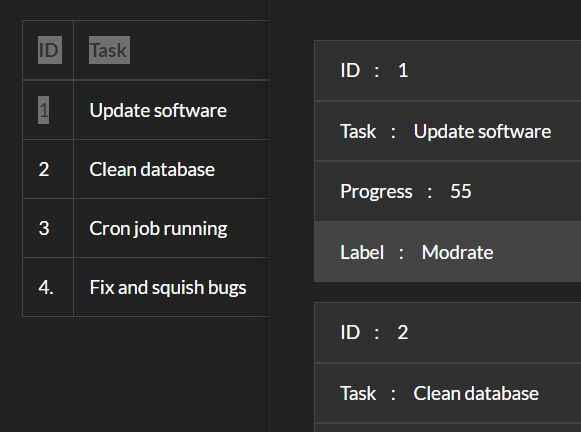
A responsive table jQuery plugin that turns a multi-column table into a two-column data list for better readable on mobile devices. The plugin will automatically get the column header text for each column and assign the column title as a data-attr to each table cell.
How to use it:
1. Include the jQuery library and jQuery responsive table plugin on the web page.
<script type="text/javascript" src="http://ajax.googleapis.com/ajax/libs/jquery/1.11.0/jquery.min.js"></script>
<script type="text/javascript" src="js/jquery.responsiveTable.js"></script>
2. Create a standard table using data-title attribute to specify the column titles.
<table class="table">

<thead>
<tr>
<th scope="col"> Col 1 </th>
<th scope="col"> Col 2 </th>
<th scope="col"> Col 3 </th>
<th scope="col"> Col 4 </th>
</tr>
</thead>

<tbody>
<tr>
<td data-title="Col 1">0000000450</td>
<td data-title="Col 2">Tom Wood</td>
<td data-title="Col 3">12387412</td>
<td data-title="Col 4">14/07/2013</td>
</tr>
<tr>
<td data-title="Col 1">0000000451</td>
<td data-title="Col 2">Paul Brown</td>
<td data-title="Col 3">32371284</td>
<td data-title="Col 4">15/07/2013</td>
</tr>
<tr>
<td data-title="Col 1">0000000454</td>
<td data-title="Col 2">Tom Wood</td>
<td data-title="Col 3">12387412</td>
<td data-title="Col 4">25/07/2013</td>
</tr>
<tr>
<td data-title="Col 1">0000000452</td>
<td data-title="Col 2">Jill Harris</td>
<td data-title="Col 3">82371645</td>
<td data-title="Col 4">15/07/2013</td>
</tr>
</tbody>

...

</table>
3. The CSS rules to custom the max-width via CSS3 media queries.
.table tbody td::before {
content: attr(data-title) ": ";
display: none;
}
 @media only screen and (max-width: 638px) {
.table thead {
display: none;
}
.table tbody td {
float: left;
width: 100%;
position: relative;
padding-left: 56%;
word-break: break-all;
-moz-box-sizing: border-box;
-webkit-box-sizing: border-box;
box-sizing: border-box;
}
.table tbody td::before {
content: attr(data-title) ": ";
display: block;
position: absolute;
top: 0;
left: 14px;
max-width: 40%;
font-weight: bold;
color: #103184;
}
}
4. Call the plugin on the table and you're done.
<script type="text/javascript">
$(function() {
$('.table').responsiveTable();
});
</script>
This awesome jQuery plugin is developed by cssmonkey. For more Advanced Usages, please check the demo page or visit the official website.