Responsive Text Resizing Plugin With jQuery - FlowText
| File Size: | 9.12 KB |
|---|---|
| Views Total: | 525 |
| Last Update: | |
| Publish Date: | |
| Official Website: | Go to website |
| License: | MIT |
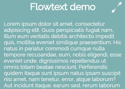
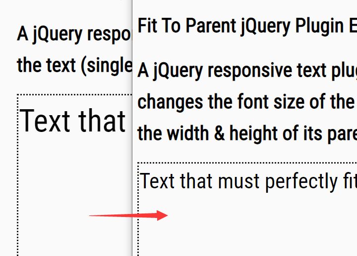
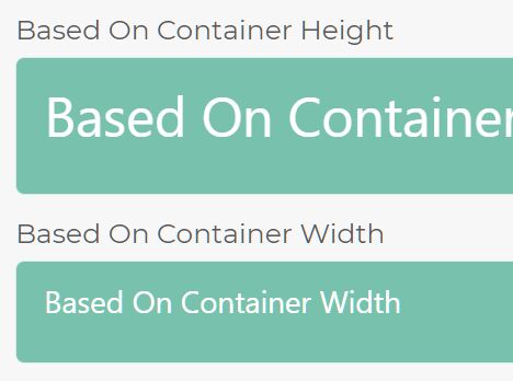
FlowText is a very small jQuery responsive text plugin which dynamically scales the font sizes of your text according to the container or screen width.
How to use it:
1. Download the plugin and include the jquery.flowtext.min.js script after jQuery JavaScript library.
<script src="//code.jquery.com/jquery.min.js"></script>
<script src="dist/jquery.flowtext.min.js"></script>
2. Just call the function on the target container and we're done.
$('.container').flowtext();
3. Change the maximum and minimum font sizes.
$('.container').flowtext({
  minFontSize: 16,
  maxFontSize: 20
});
4. Change the maximum and minimum screen sizes to trigger the font resizing.
$('.container').flowtext({
  minScreenWidth: 320,
  maxScreenWidth: 1024
});
This awesome jQuery plugin is developed by libeo-vtt. For more Advanced Usages, please check the demo page or visit the official website.